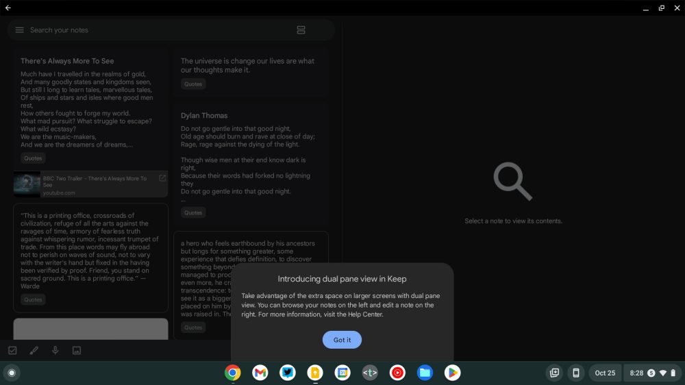
At the start of last month, Google announced that Keep was getting a dual-pane view on large-screen devices. We’ve now encountered it on a Chromebook, but an annoying limitation restricts availability on Android foldables and tablets.
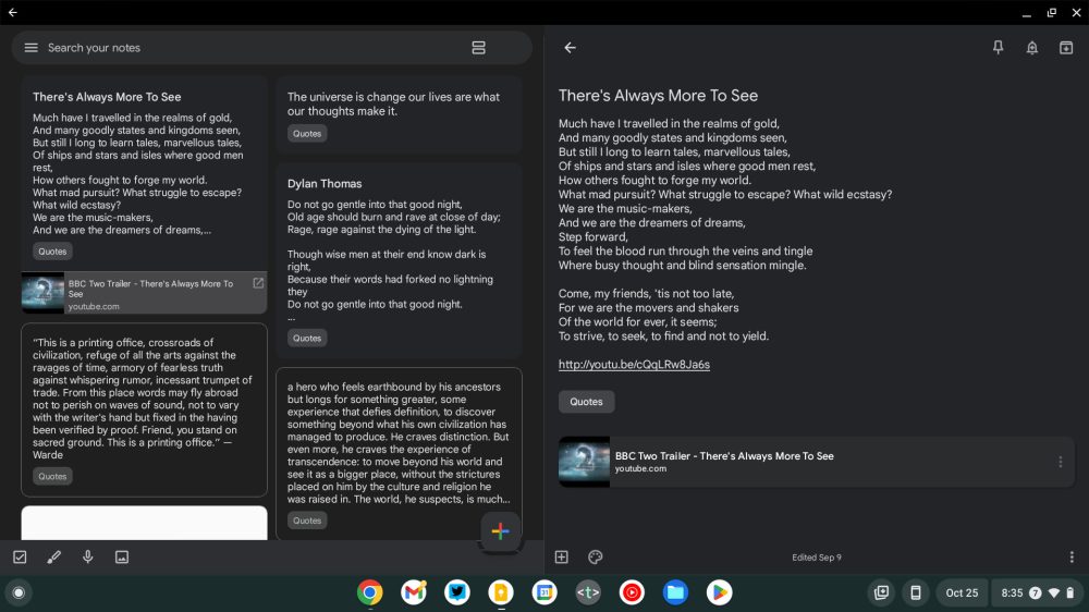
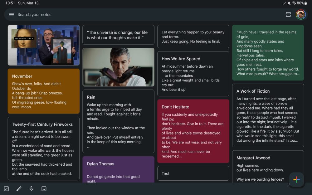
On large screens, this dual pane view sees Google Keep go from four columns of notes to two at the left side of your screen. The “Select a note to view its contents” prompt exists at the right until you open something. This gets you the text, list, or drawing/picture in full instead of as a pop-up that maintains the background.
You’re able to close a note and empty the right panel by tapping back. There is no option to disable the dual pane view in app settings.
The first device we’ve encountered with this large screen optimization is on a 14-inch (1920×1080) Chromebook (with version 5.22.402.02.90). It’s not live on a pair of Samsung tablets with 11-inch screens that we checked.


Google explicitly says this “dual pane is available if your device screen is >840 dp and you use the Google Keep app in landscape mode.” Most Android tablets have a dp (device-independent pixel) that is lower than the specified threshold. For example, the 11-inch Tab S8 at its smallest “screen zoom” setting has a minimum width of 805 dp. (You can check by enabling Developer options.)
Meanwhile, setting it higher than 840 dp (e.g., 900 dp) still does not trigger Keep’s dual pane view in our testing. It could be that the feature is not yet widely rolled out, but if Google sticks to the greater than 840 dp requirement, more than a few tablets and foldables wouldn’t be able to benefit.

More on Google Keep:
- Google Keep for Wear OS updated with Material You redesign [Gallery]
- Google optimizing widgets for Android tablets, starting with Drive and Keep
- Google Tasks upgrade brings Assistant integration and will replace ‘Reminders’
- Google Keep adds Wear OS 3 tile to quickly create notes
Author: Abner Li
Source: 9TO5Google


