Earlier this year, Google announced a new feature called “Entertainment Space,” a way to offer Android tablets a specialized media experience that organizes content in one place. For the past few weeks, we’ve had a chance to try out the feature, and it has some clear potential, at least when paired with the right hardware.
On supported devices, Entertainment Space is not an app, but something built into the launcher. The Space is in the same place that Google Discover would be on smartphones, and there’s a small icon showing that the experience is available off to the left.
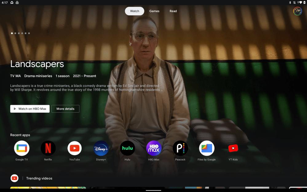
Google Entertainment Space is designed with three tabs – Watch, Games, and Read. Each section is self-explanatory, and the first feels the most useful to me. Built on the same ideas as Google TV, the Watch tab has a carousel of movie and TV show recommendations at the top, but only content recommendations. Unlike Google TV, there are no ads here.
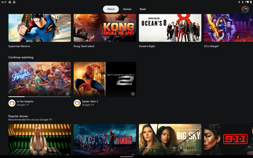
Below that, a list of video-centric apps installed on your device appears including the likes of YouTube, Netflix, Disney+, Google TV, and more. The list reorganizes itself based on what you’ve used most recently. Below that you’ll see rows full of content recommendations based on your watch history and the apps installed on your device and/or connected to your account in the Google TV app. This feels virtually identical to Google TV’s homescreen UI. Notably, these sections cannot be rearranged, but occasionally it will just rearrange itself.
In between all of this, there’s a “Continue Watching” row, which is designed to do exactly what the name implies. With the Google TV app and your purchased shows/movies, it does show content you were watching previously, even syncing where you left off on other devices such as an Android TV or a phone. Unfortunately, I’ve yet to find any third-party apps that can tap into this row. Even YouTube won’t show videos here, though that one is probably for the best. But Netflix, Disney+, and other popular streaming apps I’ve tried simply won’t insert content into this row. That very much limits the potential of this feature.
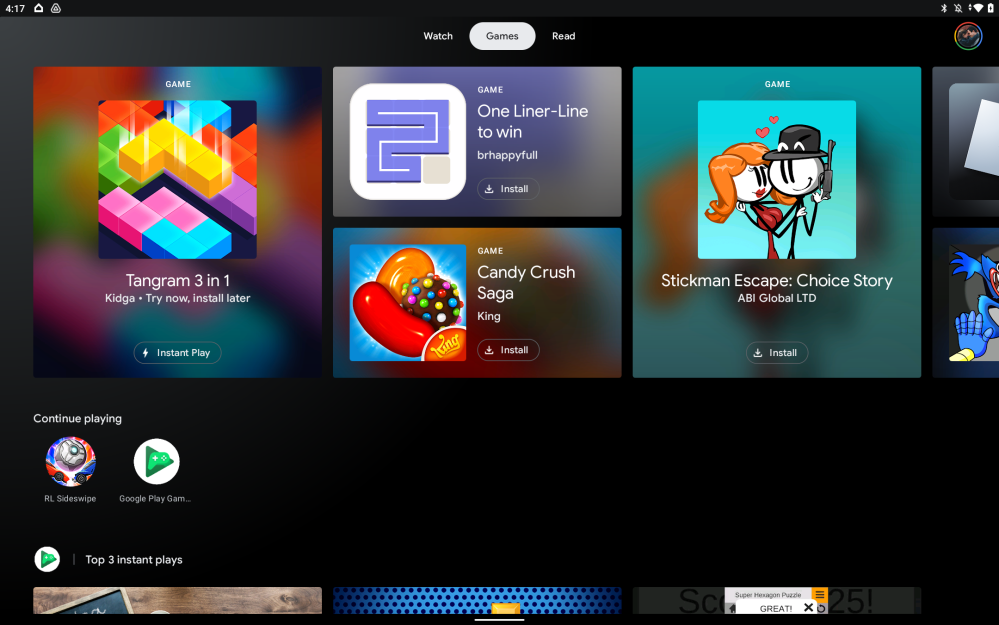
Beyond just video media, Google also sends recommendations for games and books through Entertainment Space, each with their own tab. The Games tab is essentially a glorified Play Store recommendation page, but it does have a handy row that puts all of your games in one place – an easy task in my case, since Rocket League Sideswipe is the only Android game I’m remotely interested in right now. Annoyingly, the page excludes all cloud gaming services, even Google’s own Stadia.
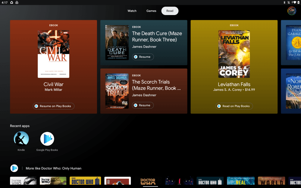
And finally, there’s the Read tab. This could have a lot of uses with downloaded media, apps for study, and simply various sources of reading. Google News, for example, seems like a no-brainer. Unfortunately, this is also underused. Google Play Books, a service that is 11 years old as of today, is really the only thing that integrates. The page will show apps including Kindle in the row, but recommendations for content come almost solely from Play Books.
Despite those shortcomings, the biggest problem with Entertainment Space, really, is its limited availability. It can’t be installed on a tablet you already own, not officially anyway, and there’s no clear list of devices that actually support it. The latest Lenovo devices offer support, as does Nokia’s T20 slate. Samsung, though, one of the biggest names in Android tablets, doesn’t support Entertainment Space at all.
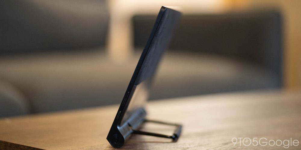
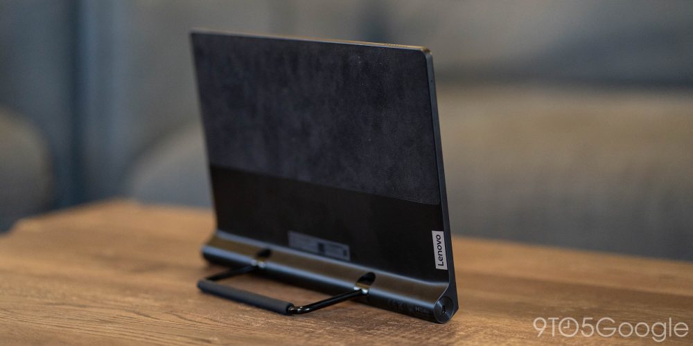
That said, Lenovo was a pretty ideal partner for this experience in my book, and the Yoga Tab 13 I’ve been using Entertainment Space on is a great example of how it can shine. The large media-oriented tablet has been a fantastic desk companion for the past few weeks as a media machine while I work. Whether it’s yet another viewing of Tick Tick… Boom, a Spider-Man marathon in preparation for No Way Home, or just catching up on YouTube subscriptions over lunch, it’s been a pleasure using this tablet for media.
The integrated kickstand and large, solid display, excellent speakers, and huge battery make the Yoga Tab 13 a perfect showcase for Google’s Entertainment Space. The hardware is overall very premium with a nice fabric backing. My complaints are few and far between. Android is… still Android, meaning that many apps just don’t take great advantage of this larger canvas. Hopefully, that’s something Android 12L will help to fix, and this tablet will likely be getting that update. Currently, it’s on Android 11 with a minor skin over top. Another thing I wasn’t too big a fan of was the biometrics, because there really aren’t any. There’s no fingerprint sensor, just camera-based face unlock which, while very quick, isn’t very secure.
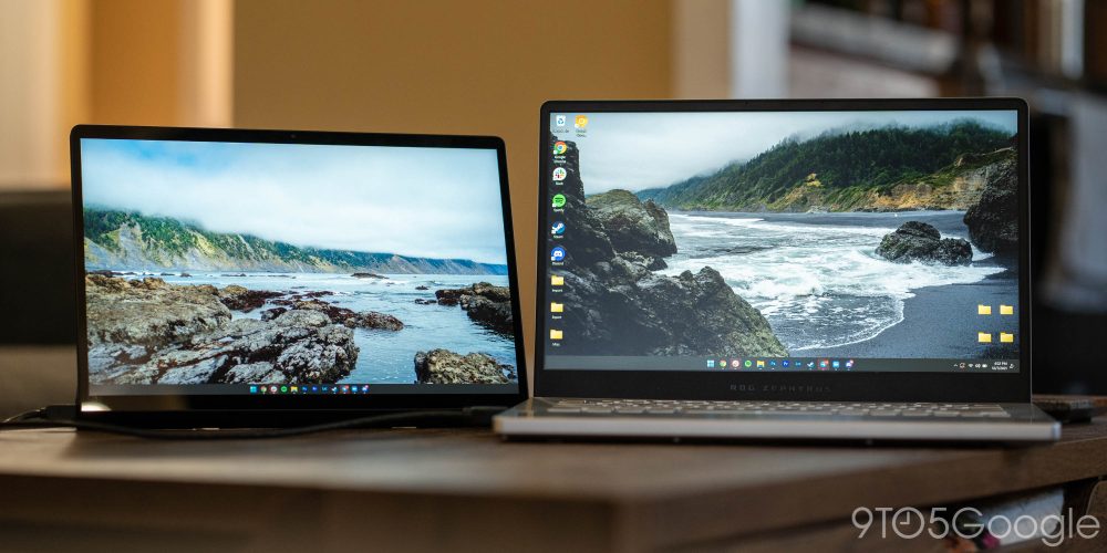
Perhaps the best part of the Yoga Tab 13 outside of its Entertainment Chops is that it features an HDMI port, but for HDMI in. That means you can hook a laptop up to this tablet to use it as a second screen, which is a great addition. The functionality works well, but it does require the pretty uncommon microHDMI format.
The Lenovo Yoga Tab 13 is available for $679 (, ), a pretty tall order, but considerably more affordable than equally sized tablets from Apple and Samsung. For something smaller and more affordable, the Lenovo Yoga Tab 11 offers a similar form factor and Entertainment Space support .
More on Android:
- Android 12L Developer Preview 1 is now available for the Lenovo Tab P12 Pro
- Nokia T20 Android tablet launches under $250 w/ 3 years of updates promised
- Galaxy Tab S7+ Impressions: Samsung’s hardware emphasizes Android’s tablet problem
Author: Ben Schoon
Source: 9TO5Google


