
An Apple Watch has been on my wrist nearly every day since I took the first generation out of its box on launch day in April 2015. It quickly became an indispensable gadget, and I feel naked whenever it’s on its charger. watchOS went through a ton of changes during the first few releases, most notably with watchOS 3. Since then, it’s received a number of new apps and features but the user interface itself hasn’t quite been perfected. I’ve always attributed this to the lack of a real competitor. No one has been able to show off a better way to do things on a smartwatch. Now, nearly seven years after the Apple Watch was born, Google and Samsung have teamed up to build the first real competitive platform. Here’s what I think about it.
Earlier this year, Google announced that they were partnering with Samsung to build a new operating system for watches. This new operating system, Wear OS 3.0, has just launched on Samsung’s Galaxy Watch 4 and Galaxy Watch 4 Classic. Samsung has tried many different things with their watches over the years, but they’ve never cracked it. This is in large part due to their proprietary operating system, Tizen. Wear OS 3.0 is an almost perfect combination of Wear OS and Tizen. It’s the best of both worlds in a single elegant package.
Hardware
The watch itself is less interesting to me than the software. But Samsung has done a wonderful job building something that feels substantial and high end. I’ve got a silver 42mm Galaxy Watch 4 Classic paired with a Pixel 3a. It weighs just the right amount, has an excellent clicky bezel that rotates around the display, solid metal buttons, and even includes standard watch pinholes, so just about any 20mm watch band will fit this thing.
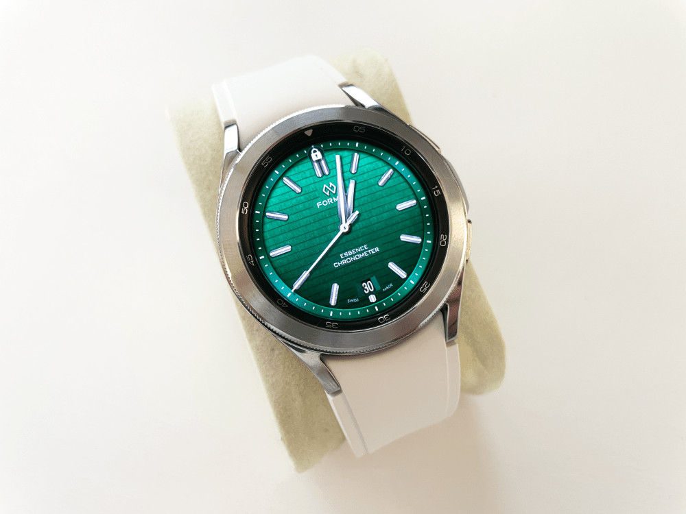
The display is gorgeous. It’s bright and colorful in typical Samsung fashion. It also happens to be slightly recessed so the display is less likely to scratch when you bump your arm up against a wall or railing. The only thing I don’t like about the hardware is the watch band that comes out of the box. It’s flimsy and feels like cheap pressed silicone. It doesn’t hold a candle to the Apple Sport band or even Fitbit’s silicone bands. The charger that ships with the Galaxy Watch 4 is a lot like Apple’s, but it’s black instead of white. Like the Apple Watch, the Galaxy Watch 4 doesn’t charge on Qi mats so you’ll need to use Samsung’s chargers. At the end of the day, the Galaxy Watch 4 Classic is really well designed. Traditional watch wearers will love it, but you’ll probably want to swap out the band for something much nicer.
Software
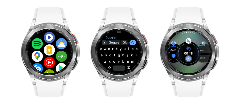
The software is where things get interesting. The version of Wear OS 3.0 that runs on the Galaxy Watch 4 isn’t necessarily “stock” Android. It’s got a bunch of One UI design tweaks across the system, but you can still find things obviously designed by Google. This watch is at its best in my opinion when you mix Samsung’s OS design with Google’s apps. While Wear OS 3.0 is far from perfect, it’s finally in a place where it stacks up to the Apple Watch. This is without a doubt “the Apple Watch for Android users.” Google and Samsung’s partnership shows a renewed commitment to the platform so I expect it to see continuous updates. Functionally, there’s little that watchOS could learn from Wear OS 3.0. They have most of the same apps now and functionality is nearly on par. But watchOS could learn from the interface design. Samsung and Google have done a wonderful job building an interface that’s fluid, easy to use, and well-organized.
Tiles
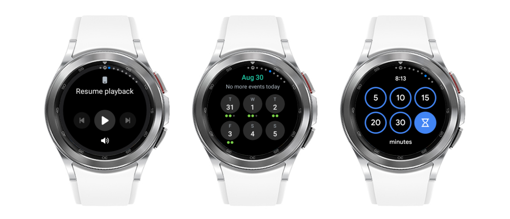
The most obvious thing that Apple could take from Wear OS 3.0 is tiles. I wrote last week that Apple should bring glances back to the watchOS in the form of widgets. Tiles on Wear OS 3.0 are nearly the exact same thing. You can swipe on your watch face from right to left to see small bits of information or tools you can access on the fly. They feel a lot like Apple’s old glances, but they load data quickly and feel very snappy.
Homescreen
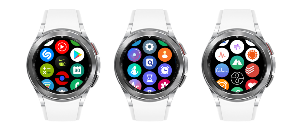
The homescreen on the Galaxy Watch 4 is way better than the one on watchOS. This is another thing I wrote about last week. Apple has left the original watchOS home screen out to dry. It hasn’t changed at all since its introduction. Touch targets are still tiny, there’s no real organization, and it requires muscle memory to find apps. Apple at least added a list view with watchOS 4 but it isn’t customizable and looks kind of ugly. In Wear OS 3.0 on the Galaxy Watch, there’s a simple vertically scrolling grid of icons. They’re positioned in a honeycomb-like grid like the Apple Watch, but they are significantly larger and all the same size. You can easily pick up and move icons around to customize the layout as well.
Text Input
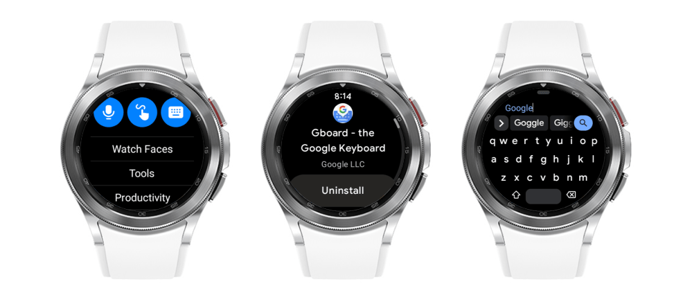
Text input on watchOS was originally only possible through dictation and quick replies. With watchOS 3 Apple added scribble. Scribble has proven to be tremendously useful when you can’t dictate a message, but it can be tedious to type out a long sentence by drawing individual letters on a small screen. Wear OS 3.0 offers several other options. Samsung’s keyboard out of the box has a T9 style layout. But you can download Google’s Gboard from the Play Store to get a full QWERTY keyboard. It offers swipe input so you can quickly swipe across the keyboard to type words rather than individual letters. It’s incredibly efficient, and unsurprisingly, Google’s algorithm for predicting words works really well. Keep in mind that this is on a small circular display, so on a large rectangular-shaped watch like Apple’s, it would be even more useful.
Third-party apps
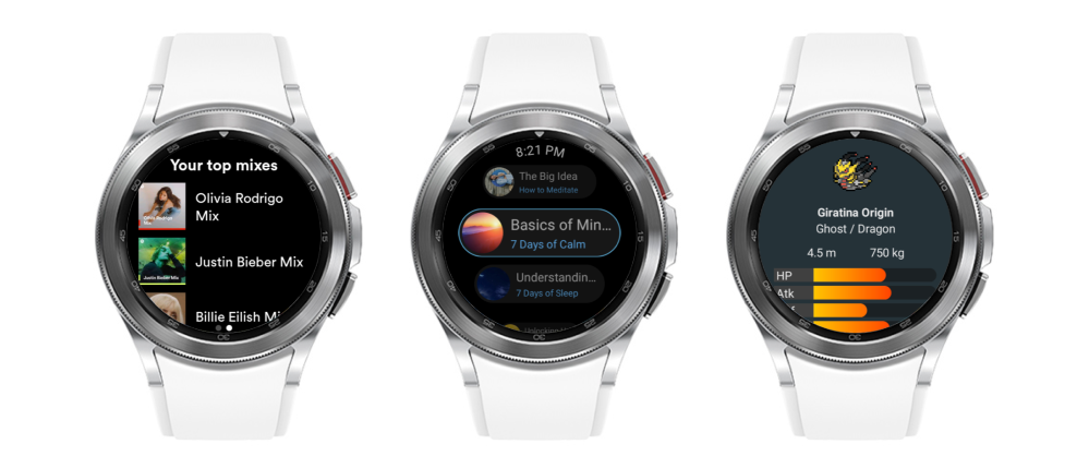
The third-party app offerings are nearly as sparse as they are on watchOS. While you can still find apps from big names like Shazam, Spotify, Citymapper, Nike Run Club, Todoist, and Strava, there simply isn’t a catalog that comes close to apps for Android phones. Previously though, developers would have to build apps for both Wear OS 2.0 and Tizen. Now there’s a unified platform, and that will hopefully spawn many more new wearable experiences. Wear OS didn’t have the user base to justify the resources that are required to develop an entirely new app. Tizen didn’t offer the best tools for actually developing apps. Now, one of the biggest Android manufacturers is teamed up with the operating system developer.
Watch faces
By far the best thing about Wear OS is custom watch faces. Apple has this obsession with control over the way our watch faces look. Make no mistake, just because you swapped out some complications doesn’t mean you’ve truly made a custom face. You just tweaked Apple’s faces in spots they sanctioned. That isn’t to say there’s anything wrong with Apple’s watch faces. In fact, I love the vast majority of them. But despite new ones getting added every year, I still crave new ones constantly. If Apple wants to keep the watch locked down to their first-party faces they should add new ones more often, not just with major software updates.
Watches are at the moment the most personal gadget you can carry with you, and the watch face is sacred real estate. While Google lets developers run wild with Wear OS, Apple could easily offer a curated program that allows designers to come up with beautiful innovative watch faces. Despite the obvious requirements that would come with Apple’s unlikely foray into third-party watch faces, the sheer number of random designs on Wear OS is kind of awesome. Sure, there are plenty of horrendous ones. But many of them are gorgeous and some are just plain fun.
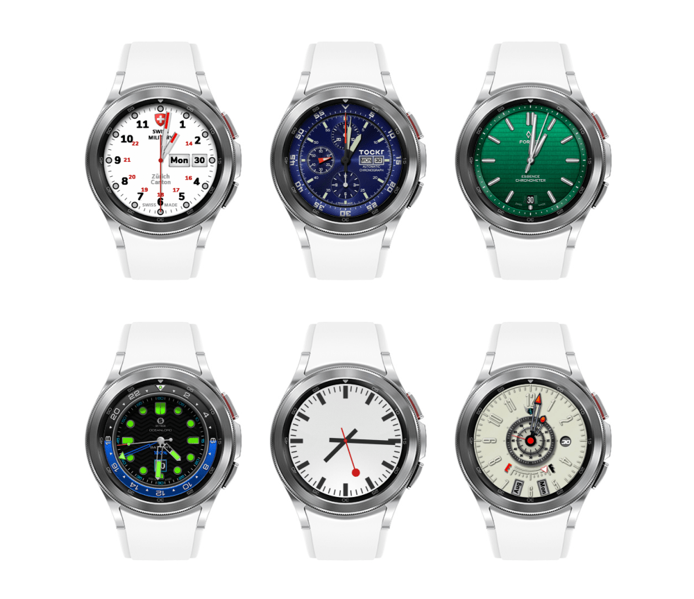
I’ve primarily used an app available on Wear OS called Facer. It’s also available for the Apple Watch, but it’s way more limited. It only offers custom complications and photos on watchOS, whereas on Wear OS it offers complete custom faces. I’ve been able to find stunning realistic watch faces that shine on the Galaxy Watch’s display, like the ones above. I’ve also been able to find really fun faces that show off some of my favorite characters from Nintendo games. There’s even a bounty of Stargate watch faces. The one I’ve been using actually has a moving wheel of symbols!

I’d love for Apple to let designers build analog and digital faces for the watch. I’m totally fine with them curating the collection to their liking. They could even team up with more traditional watchmakers and brands to bring iconic designs to the Apple Watch like they do with Hermes. It’s an obvious source of revenue that the company is choosing to ignore. There are tens of millions of Apple Watch users all over the world, and I am positive that there are many out there who would drop a few bucks on digital Mondaine faces or officially licensed Nintendo faces. The infrastructure is already in place, too. The Watch has an App Store, there’s a file format for faces, and faces are even shareable now.
Missing my Apple Watch
I can’t wear this thing and not miss my Apple Watch. Like I said at the outset, I feel naked without it. I’ve become so accustomed to its functionality and truly love it as a beautifully designed object. watchOS is undoubtedly better than Wear OS. It’s smoother, it works more closely with your phone, and frankly just feels more thoughtful. But that doesn’t mean it’s perfect, and that’s precisely why I wanted to take a look at the latest version of Wear OS. Every product can learn something from another, no matter who makes it. watchOS 7 and watchOS 8 both feel evolutionary not revolutionary. Here’s hoping that Apple is more daring next year with watchOS 9.
Smartwatches should be square
I’ve also come away with a surprising opinion. I love traditional round watches. I also love the Apple Watch’s distinctive rectangular shape. After using a round smartwatch and working within its constraints, I firmly believe a smartwatch should be square or rectangular. A smartwatch should be true to itself. It’s a wrist computer. Computers are better when they maximize screen real estate. Although it’s certainly hard to make a square smartwatch that doesn’t look like an Apple Watch rip-off these days.
What’s on the horizon?
While Samsung certainly makes the most popular watches for Android phones, there’s a whole world of new watches coming from other manufacturers. They’ll likely use “stock” Wear OS 3.0 and we have yet to see what a final version of that looks like. Will it follow One UI? Or will it feel more like Wear OS 2? That’s the biggest question that I have. I much prefer the stock UI of Android on the Pixel when compared to One UI on Samsung phones. I suspect I will feel the same way when we see stock Wear OS 3.0. I’d wager that it will look something like Android 12 with abstract shapes and a focus on color.
Us Apple Watch wearers are anxiously awaiting the next generation watch, which we expect to be called Series 7. It’s rumored to have a flat-edged redesign to feel more like an iPhone 12 or an iPad Pro. The new watches are also expected to have larger displays with some new faces. These watches will come with watchOS 8, which Apple unveiled back in June. It’s not a major update to the platform but comes with several welcome changes. It includes new apps like Find My devices, improvements to existing apps like Photos, and at the moment a single new Portrait watch face. I have high hopes that there are lots of new faces that we don’t know about, much like last year’s surprise collection with the Series 6 announcement.
Conclusion
Samsung and Google have built a great watch. It’s far from perfect, but it’s the closest experience you can get to an Apple Watch with an Android phone. It’s got a nice design, good software, and is likely to receive continuous updates for the foreseeable future. It’s the first smartwatch that I can confidently say could rival the Apple Watch. But in traditional Apple fashion, the Series 7 will surely leap frog the Galaxy Watch 4 only weeks after its announcement.
Author: Parker Ortolani
Source: 9TO5Google


