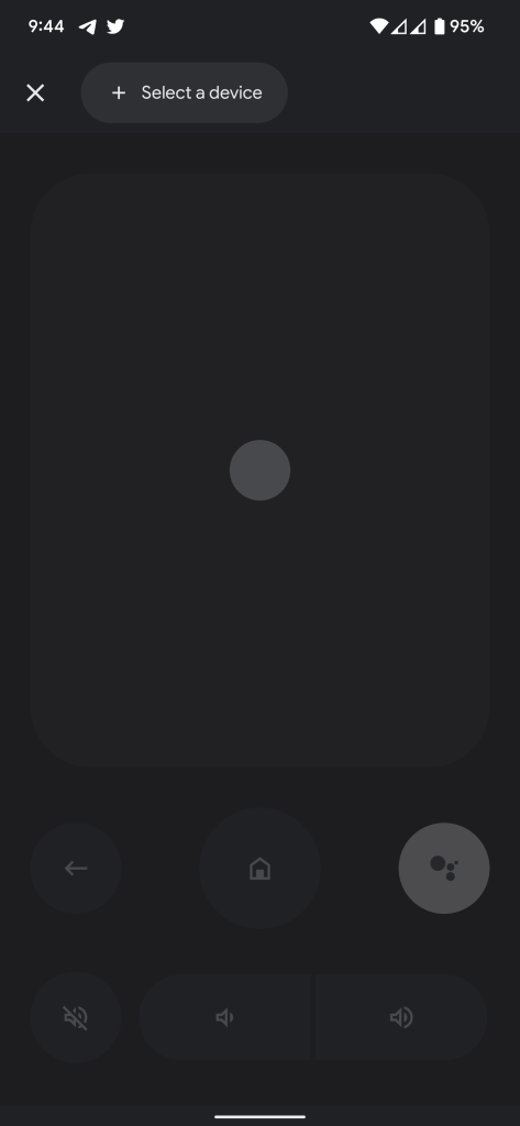
A very long overdue update to the phone-based remote for Android TV and Google TV devices was finally released in the past few months, and Google is already revamping the new app with an updated design.
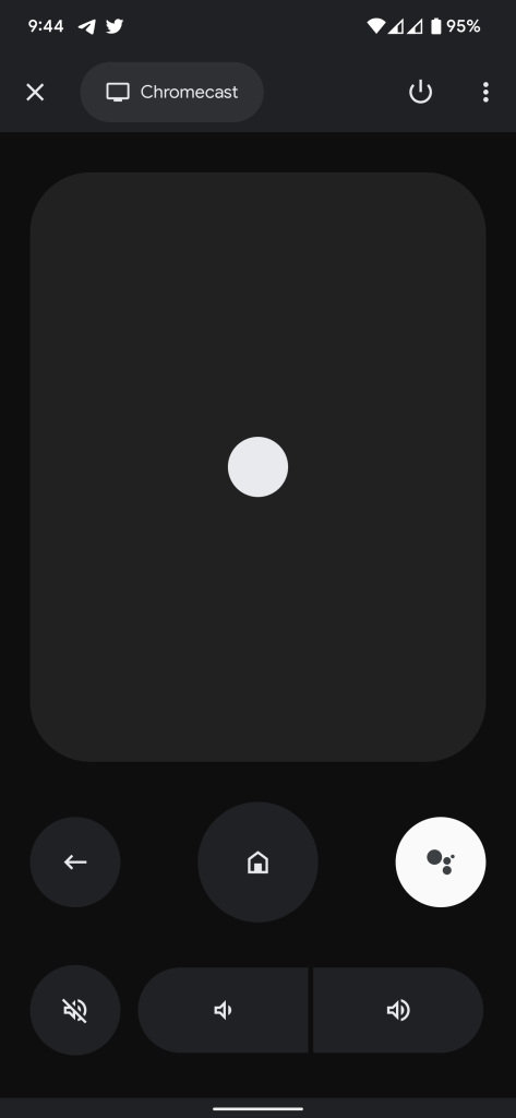
The Google TV app’s remote on Android devices launched with support for gesture and D-Pad navigation controls and support for all modern Android TV devices with a design updated from the ancient UI on the previous app. While we’re big fans of this update, it did feel slightly out of place with Google TV’s interface on the new Chromecast.
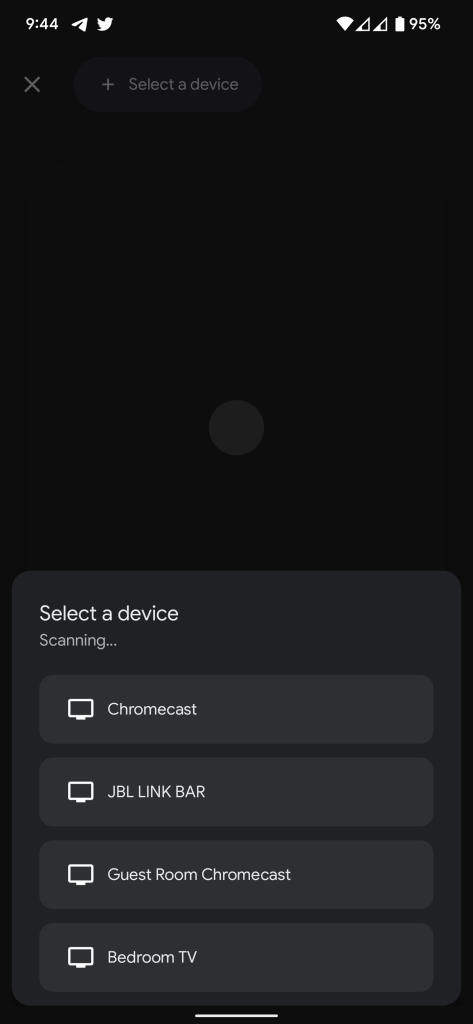
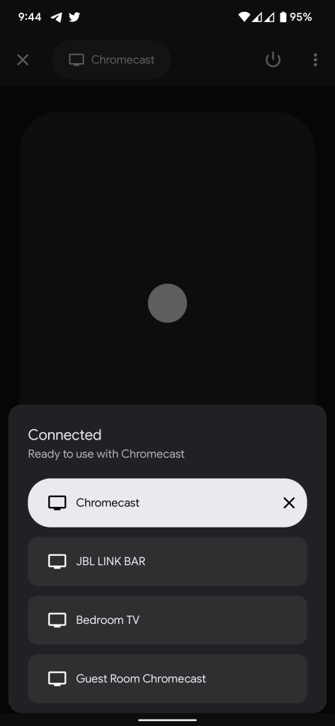
In a new update that is rolling out now, Google is changing the design of its phone-based TV remote. The new design retains the same overall look of the remote, with what appears to be a slightly darker UI. The primary change is the design of the device picker.
The picker moves to the bottom of the screen and adopts larger, rounded buttons for each Android TV OS device on your network. Notably, I’ve only been able to get this new UI to show four devices, so I’ve been unable to use it with the TV in my office. That probably won’t affect most folks, but it’s something Google should certainly address in the future.
This updated design seems to be hitting devices on a server-side rollout that we first heard about last week, but updating to the latest app version via the Play Store is a good idea if you’re not yet seeing the design.
More on Google TV:
- Google Home 2.47.10 adds D-pad controls to Android TV/Google TV remote
- TCL stops selling Google TV lineup over software & performance issues, updates coming soon
- Google TV integrates with over 30 streaming services and apps, here’s the full list
Author: Ben Schoon
Source: 9TO5Google


