Back in August, Google updated Tasks for Android and iOS with tabs that let you quickly jump between lists. The instance of Google Tasks that exists in the web sidebar of Gmail, Docs, and other Workspace apps now looks to be getting a similar redesign, as well as the ability to favorite items.
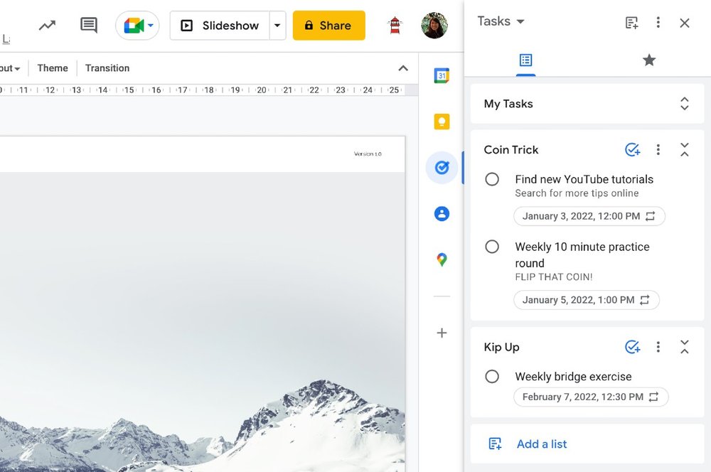
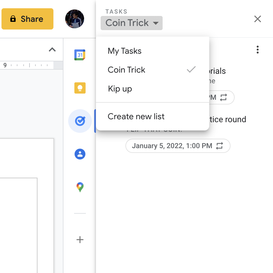
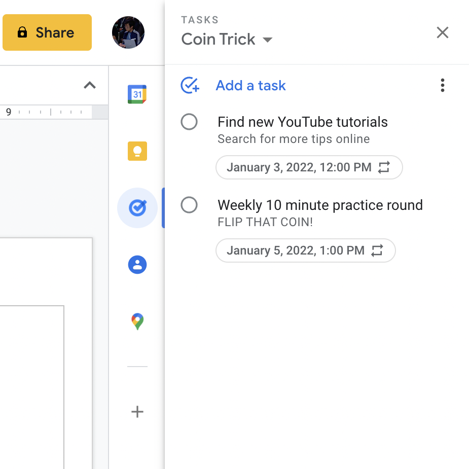
A Google blog post about productivity tips this morning includes a screenshot of a new Google Tasks web sidebar UI. The primary difference is that all your lists are displayed in the main feed instead of users only being able to see one at a time and having to manually switch between lists from the top-left dropdown. For the web, it’s a better overall solution than using tabs.
You have the ability to hide the contents of a list to just focus on those that are currently relevant. Additionally, instead of “Add a task” appearing at the very top of this feed, that button appears next to each list name. You also get a prominent “Add a list” shortcut at the bottom, as well as at the very top.
Meanwhile, moving up in the interface, there’s now a second tab to see just a feed of tasks that you have favorited. This feature has not launched in the mobile apps and could be Google’s way to make sure you don’t have to cycle through each list to find your most important tasks.
As of today, this list redesign for Google Tasks on the web has not yet rolled out on personal and Workspace accounts that we checked. It officially remains unannounced.


Left: Upcoming | Right: Current
More on Google Tasks:
- Google Tasks gets a new icon that matches other Workspace logos [Update: Rolling out]
- Tasks in web sidebar streamlined for quicker, inline editing
- Viewing, creating Google Tasks in Calendar for Android starts rolling out
Author: Abner Li
Source: 9TO5Google


