Earlier this week, Google detailed how Express would soon be replaced by Shopping. This transition is now underway with “Google Express” for Android becoming “Google Shopping” with the latest Play Store update.
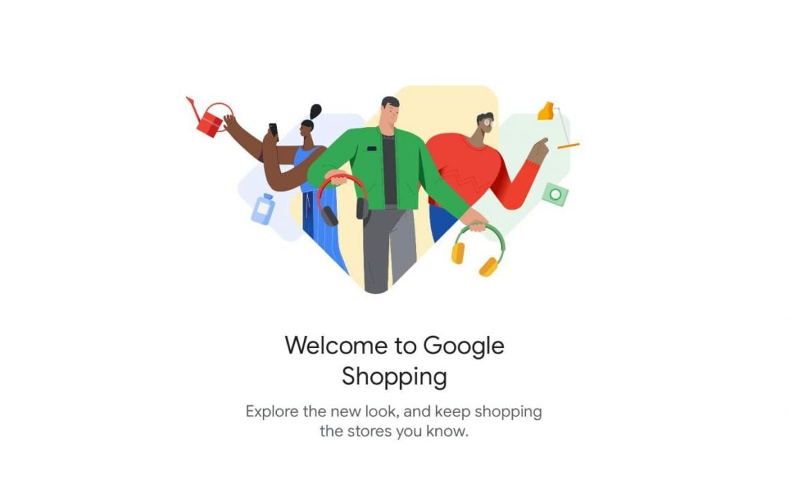
Instead of releasing a new app, the existing Express Android client has been renamed to “Shopping” and gets the price tag icon with version 45. This is less disruptive and allows Google to reach users that already have the app installed. A splash screen welcomes you to the new look and notes how functionality is unchanged after installing the update.
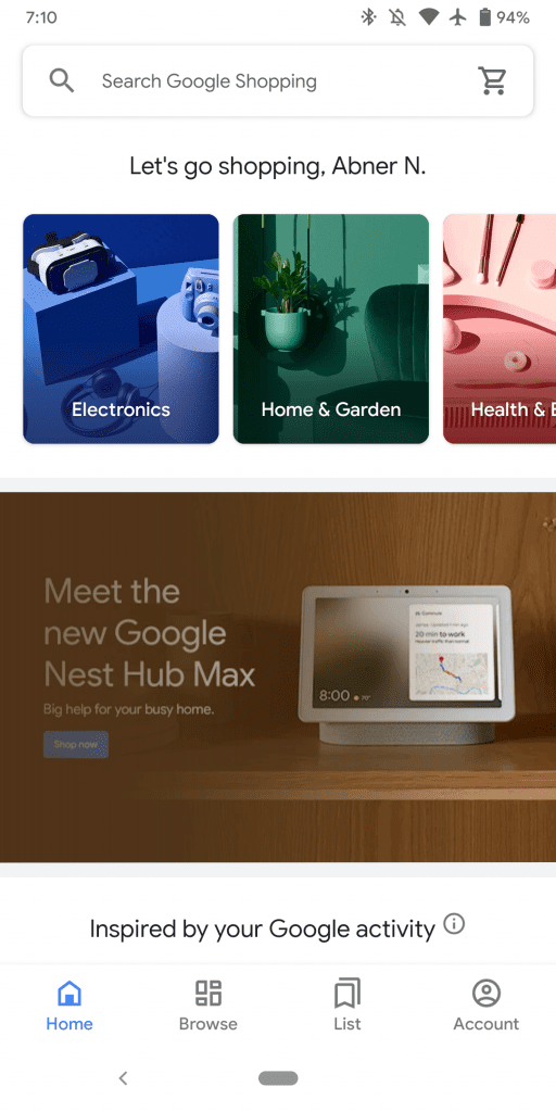
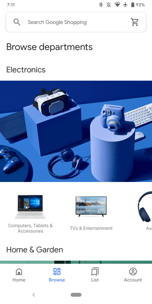
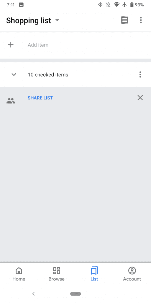
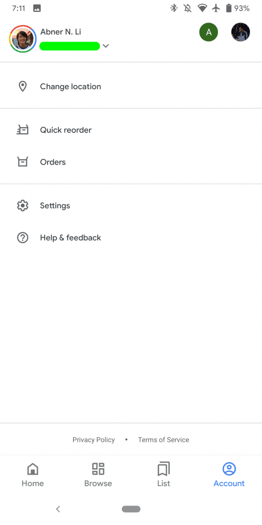
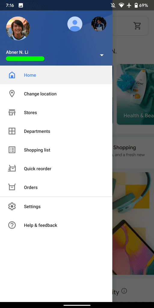
Fully leveraging the Material Theme, Google Shopping switches to a bottom bar. Nine navigation drawer sections have been condensed into four: Home, Browse, List, and Account. The primary features a full-width search bar that briefly displays the service’s full logo before animating out to a “Search Google Shopping” hint. Like before, your cart can be accessed from the top-right corner.
This feed is similar to the online homepage with a carousel of categories at the top with sections like “Inspired by your Google Activity” and “Picks for you” underneath. It makes for an enjoyable product browsing experience.
Elsewhere, the “departments” section is now under “Browse,” while your shopping list is just “List. Account houses “Quick reorder” and “Orders,” as well as settings. This is a straightforward update overall, but unfortunately lacks a dark theme.
Google Shopping for Android is slowly rolling out now via the Play Store, though the listing has yet to reflect the new branding. You can also sideload it via APK Mirror.
Author: Abner Li
Source: 9TO5Google


