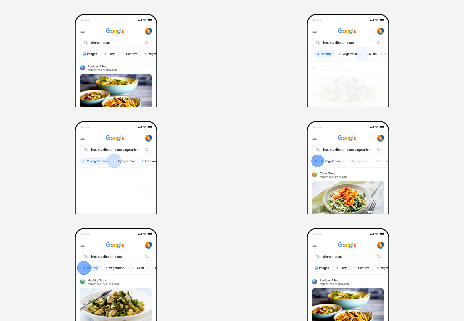
In addition to continuous scrolling on desktop, Google is rolling out new topic filters for mobile Search.
It starts with a redesign of the carousel underneath the Search bar that makes use of pill-shaped buttons that are accompanied by blue icons. Books, Finance, Flights, Images, Maps, News, Shopping, and Videos have matching icons, with Google tending to show one or two of those traditional filters first.
In addition, Google is now surfacing related topics to “help you drill down or discover something new about a specific topic.”
You can add or remove topics, which are designated by a + symbol, to quickly zoom in or backtrack on a search.
Searching “Pixel 7” will return topics like “Reviews” and “Details” though the “Shopping” and “News” filters are still shown first. As you add a topic, the feed of search results quickly updates. Scrolling all the way to the right lets you get an “All filters” list and “Tools” like time and results.

The company says “topics and filters are shown in the order that our systems automatically determine is most helpful for your specific query.”
For example, if you’re searching for “dinner ideas,” you might see topics like “healthy” or “easy.” Tapping on a topic adds it to your query, helping you quickly refine your search results with less typing. Topics are dynamic and will change as you tap, giving you more options and helping you explore new areas. For example, if you tapped on “healthy,” you might see “vegetarian” or “quick” appear next.
These topic filters are rolling out for English users in the US on the Google app for Android and iOS, as well as mobile Search.
More on Google Search:
- Google switching to continuous scrolling for desktop Search results
- Google now lets you search for restaurants by dish as Maps adds ‘fast charge’ EV station filter
- Google Lens added to the google․com homepage
- Google updates mobile Search results with larger favicons and site names
Author: Abner Li
Source: 9TO5Google


