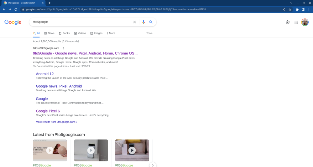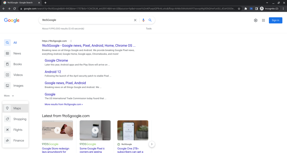
Google has been spotted testing a new redesign for Search that moves alternate search methods like Google Images over to the left-hand side.
When using Google Search on a desktop today, you’ll see alternate options for searching listed below the search bar. Which exact options you see will depend on what it is you’ve searched for – a search for “restaurants” will offer switching to Google Maps, while “Chromebook” would suggest Google Shopping.
In a new redesign, so far only spotted on one of our devices while in Incognito mode, Google Search moves those other search avenues from a row at the top to a column on the left. The most obvious difference is that this makes options like Google Images and Google News far more visible, taking up significantly more screen real estate and using a larger font.
By default, four additional options are visible in the column, still varying depending on what you’ve searched for. Below these, there is a button labeled “More,” which offers the remaining four alternative search options.


Previously, the number of search results and how long it took to find them were listed below the page’s header line. These now appear above the line, alongside the “Tools” button, which has not moved with this redesign. Pressing the Tools button now animates the results counter out of view to reveal the usual controls like controlling how old results can be.
As you’d expect, this experimental Google Search redesign moves your search results closer to the center of the page to compensate for the column of options on the left. In the existing design, there’s padding on the left so that search results line up with the placement of text in the search bar. In the new look, the search bar has also been moved further to the right to still line up with the results.
This isn’t the first time that Google has toyed with the left-hand side of the search results page. A design first seen in 2020 then expanded upon last year put Knowledge Graph section headers into a column on the left, though this design was later scrapped.
Author: Kyle Bradshaw
Source: 9TO5Google


