
Back in April, Google started rolling out a redesign of the Discover feed available to the left of most Android homescreens. After first going live for phones running Android 12, Google is now bringing the “more streamlined” Discover to older devices.
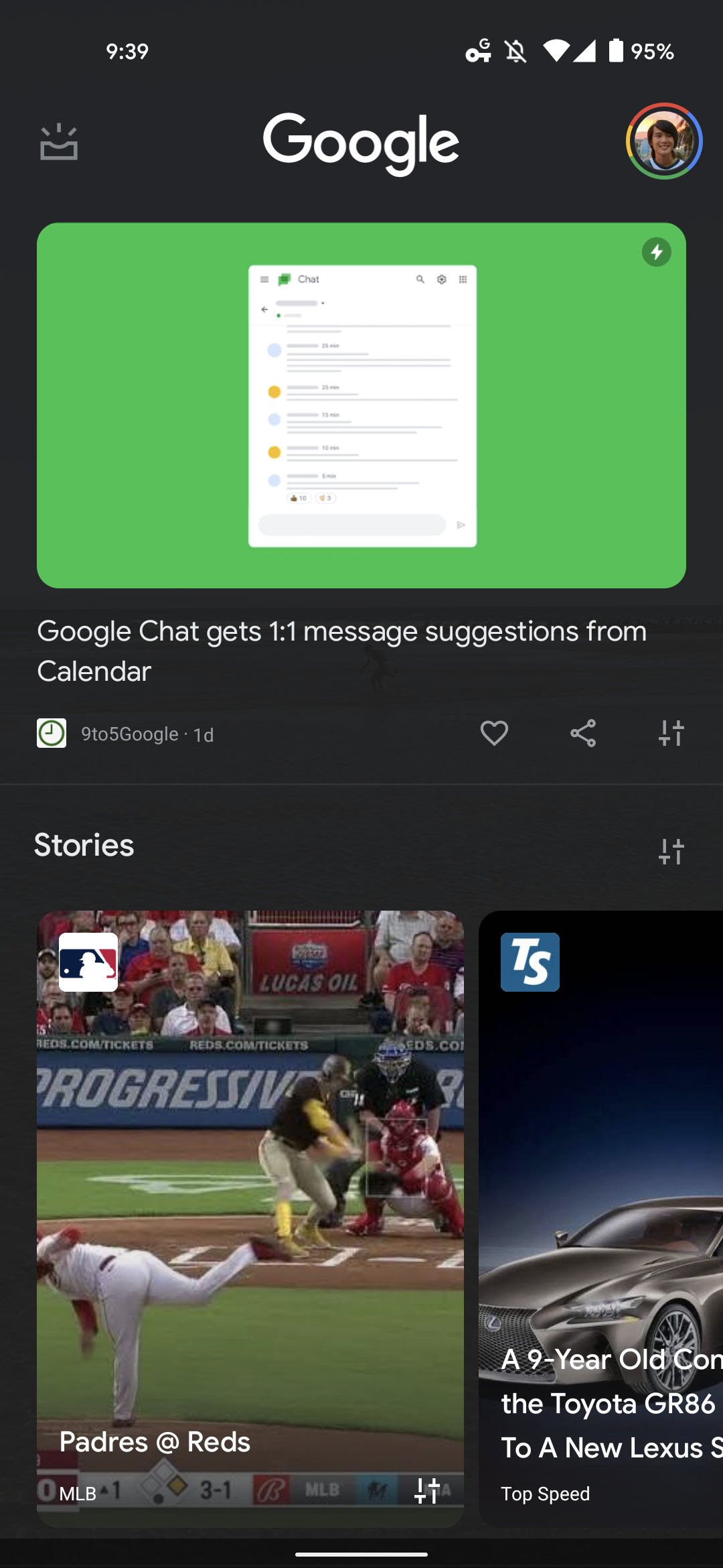
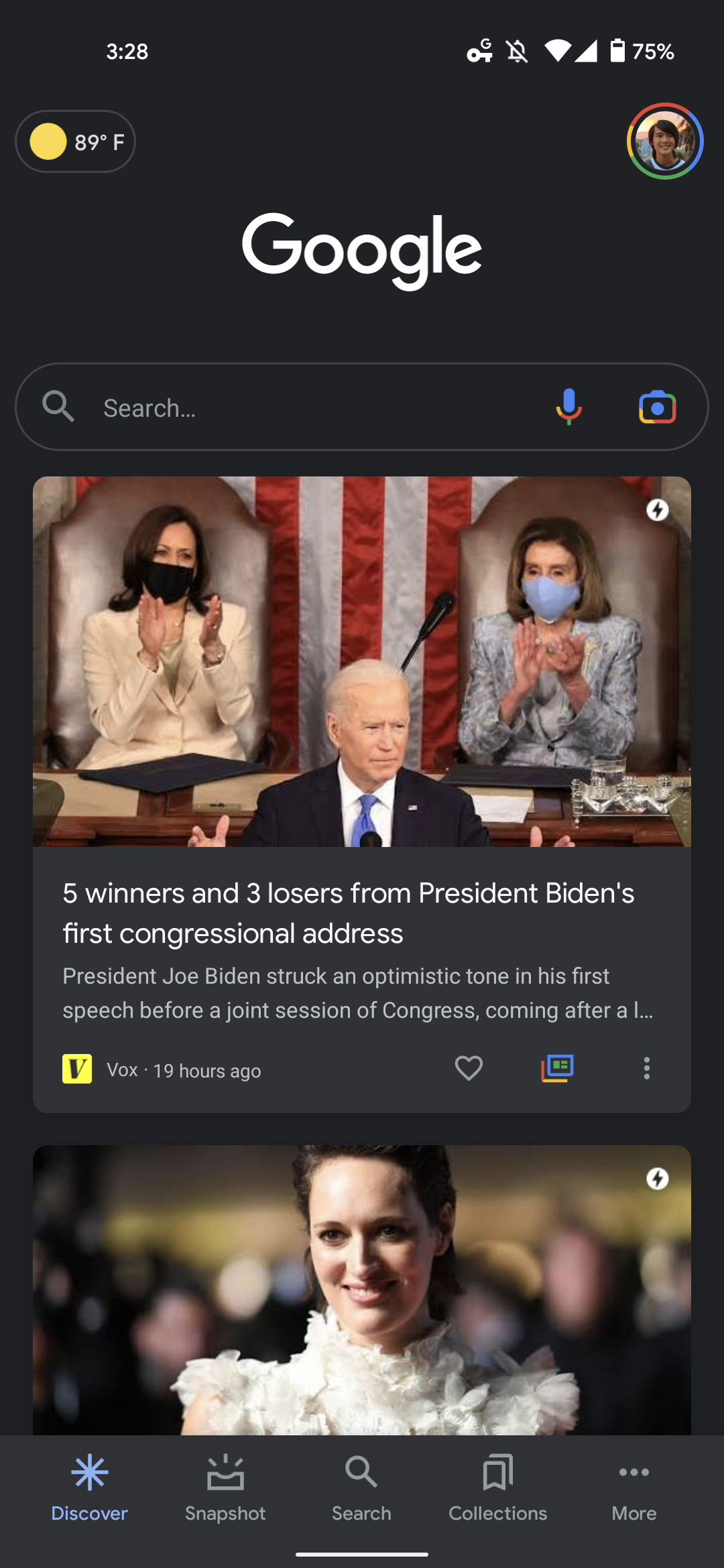
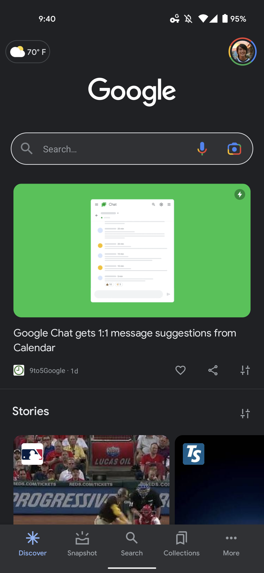
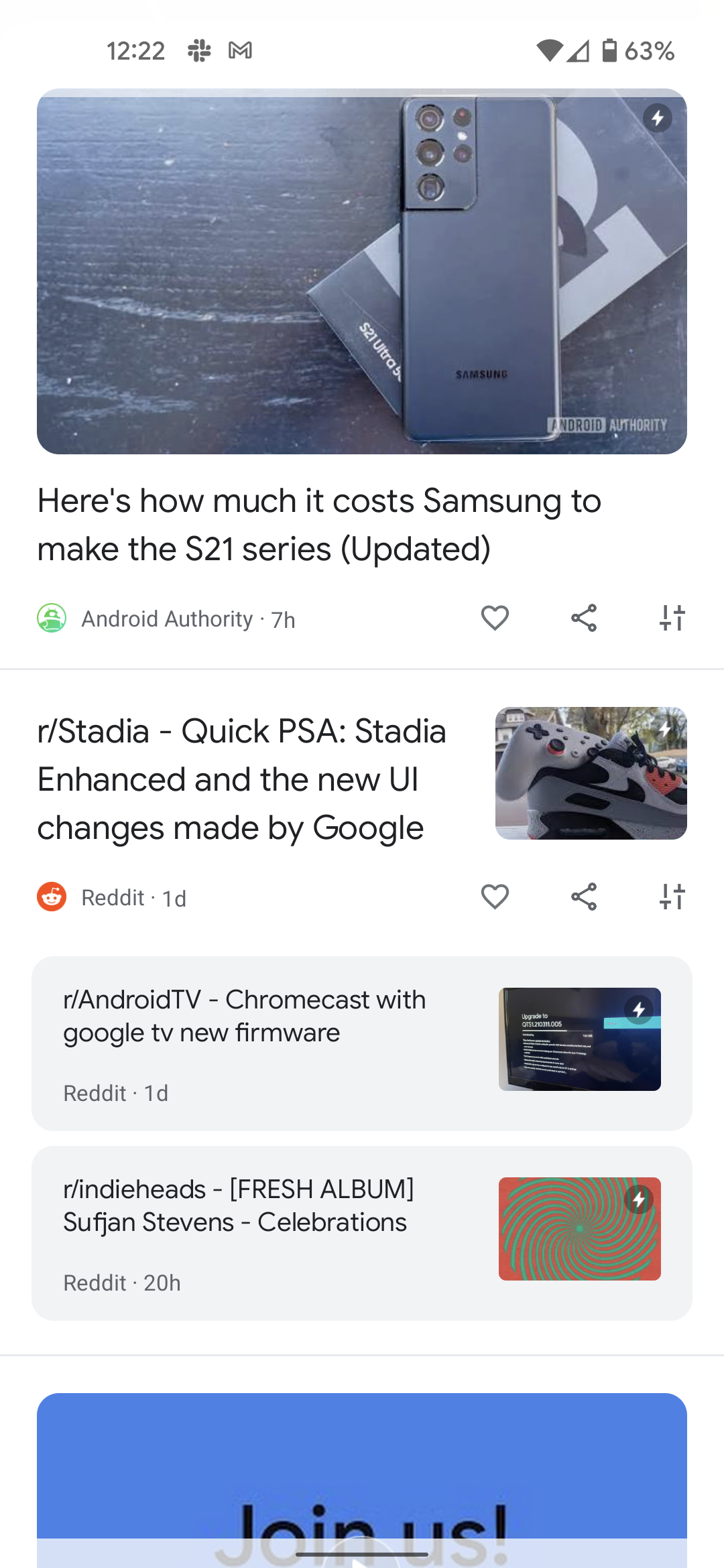
Discover articles are no longer placed in individual cards for a completely flat foreground and background. The lack of layering and shadows make for a somewhat more modern look. It’s technically more efficient in that content can take up the entire screen, but some padding is still applied, so this isn’t a truly edge-to-edge design.
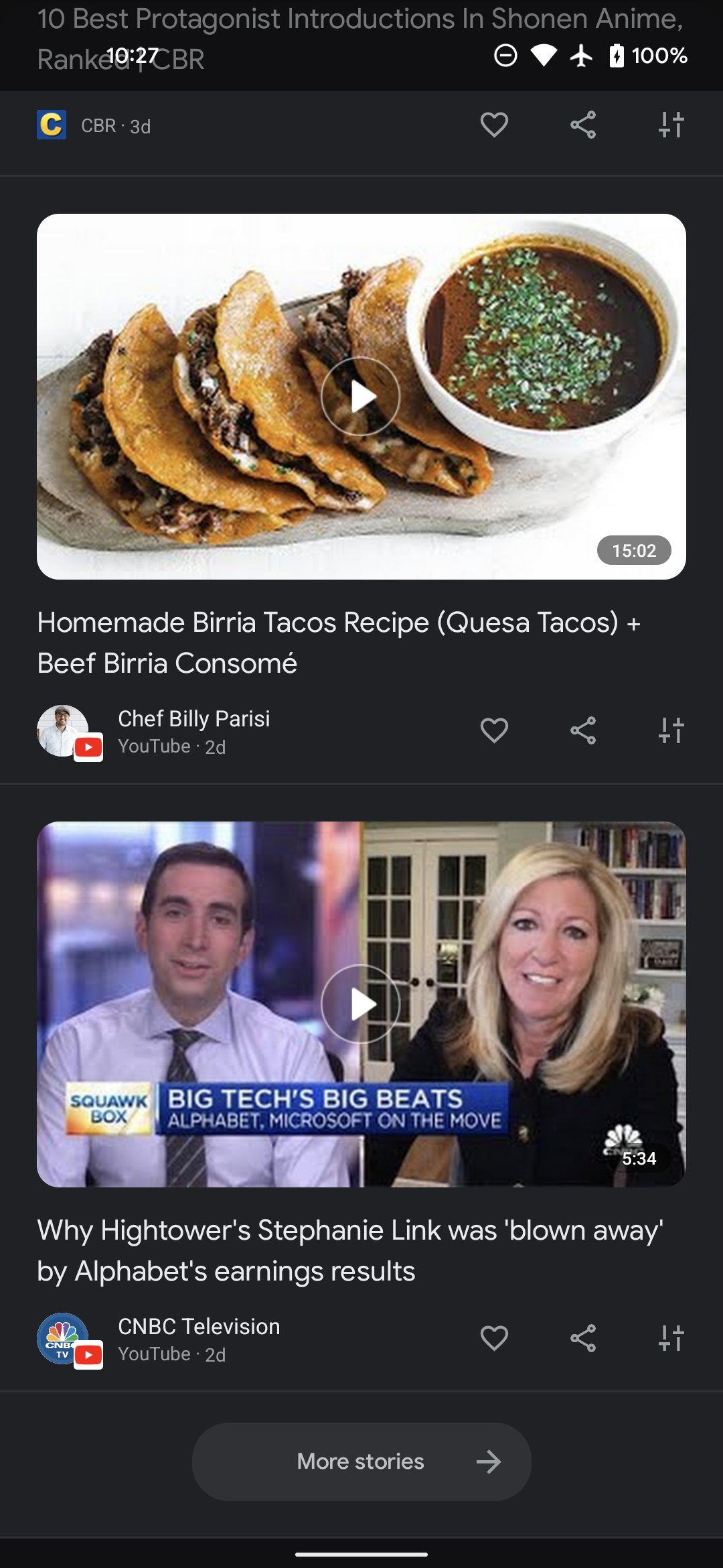
However, the biggest change is that stories are no longer accompanied by the first line of the article. All you get is a cover image, headline, and the publication, followed by when it was published and actions to heart, share, and adjust your feed.
It’s unclear if this will make users more likely to click on content, but it does put greater emphasis on titles and photos for content creators. Meanwhile, this change has been on the iOS Google app for quite some time now.
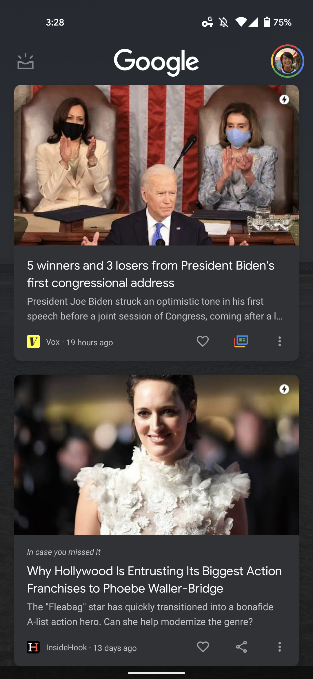
One A/B tested change sees YouTube video cards in this streamlined Google Discover better highlight the responsible creator with their channel avatar appearing next to the YouTube logo. Meanwhile, content from the same site is displayed as a list underneath the main entry.
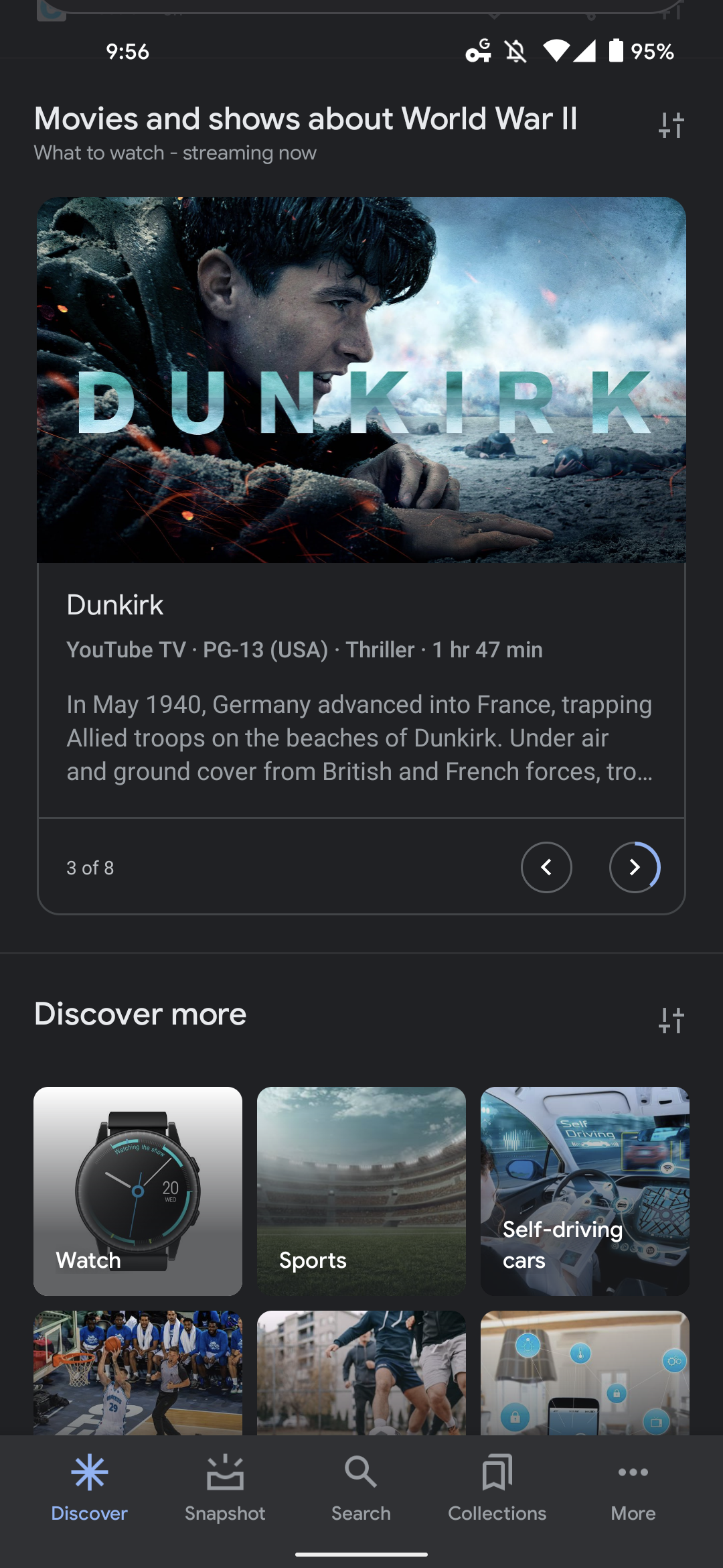
The Stories carousel appears more natural with this redesign, as do “what to watch” suggestions that make use of an auto-advancing slideshow.
Compared to the version that’s been on Android 12 for the past few weeks, the top part of the Pixel Launcher-adjacent feed is slightly different in its use of a left-aligned Google logo — as seen in the cover image above. It’s still centered on today’s wider launch to older devices.
Focus on the stories you care about with a simpler, more streamlined feed
This “new look for Discover” is rolling out with the latest Google app 12.25 beta to devices running Android 11 and lower.
Author: Abner Li
Source: 9TO5Google


