Google is readying a major overhaul of its smartwatch platform and provided an emulator “preview” of the underlying UI changes at I/O 2021. A Wear OS 3.0 redesign of the on-wearable Google Play Store is now beginning to roll out.
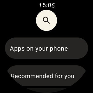
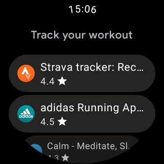
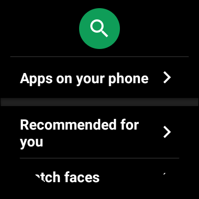
One user has so far reported receiving the new look on their Suunto 7 overnight. Like on the Wear OS 3.0 preview that’s available in the Android Studio Beta emulator, we see how each item in a list is placed inside a pill-shaped card. This starts on the main homescreen, while the search button is placed in a white circle — instead of green today.
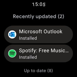
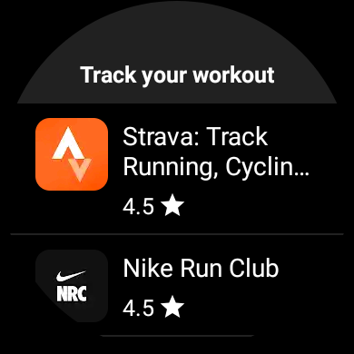
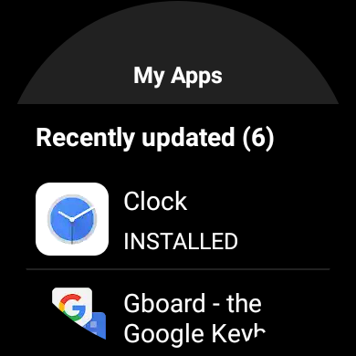
It continues to list apps with an icon at the left and the name followed by a star rating underneath. Lastly, this card-based motif is seen on the My Apps updates page.
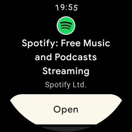
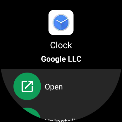
By placing everything in a card, everything does look less cramped, which is important on an especially small screen. Speaking of sizing, we see that app listings are mostly unchanged. The “Open” button, however, is again pill-shaped, as well as light, and spans the entire width of the display.
There’s also ever so slightly more color in this redesign as the cards are light gray instead of white text just being displayed against a black background.
The Wear OS Play Store was last redesigned in late 2019, while Google earlier this year deprecated the legacy Wear OS app model so that the “Apps on your phone” section will not appear for new device setups/pairings.
Besides this visual overhaul and Wear OS 3.0, Google at I/O announced changes to the underlying experience of installing wearable apps. The company wants to improve application discovery and distribution. As we detailed in May:
The most convenient will let you install apps to a watch directly from the phone Play Store as it offers a better browsing experience. This behavior change is somewhat a return to the old approach, but the underlying architecture should still be the modern one. By default, a new app will download on both your phone and wearable. Users, however, will have a dropdown to just select one or the other. Google also touts improved category search and better app merchandising.
Besides today’s one Reddit report, this Wear OS Play Store redesign with Material You elements has yet to appear for other users. If it rolls out before the broader Wear OS 3.0 update, we could be in a situation similar to Gboard being released before I/O.
Author: Abner Li
Source: 9TO5Google


