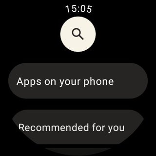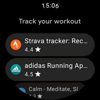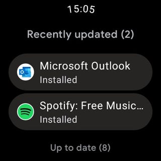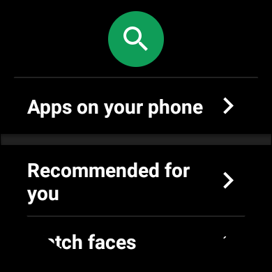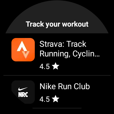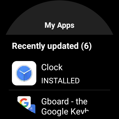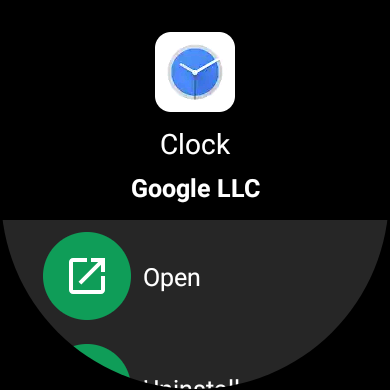
At the start of this month, a revamped Google Play started appearing on Wear OS. Google today officially announced this Material You redesign of the Play Store and that the ability to install Wear OS apps to your from your phone is rolling out.
At a high level, this Material You redesign sees the Play Store place key information in cards to improve readability. This can be seen on the main homescreen and app lists, where everything is placed in pill-shaped containers.
…the new design simplifies the experience of navigating the small surface area of a watch face. Important information is placed in cards, which makes it comfortable to read and make a selection.
A color tweak sees these cards use light gray instead of white text just being displayed against a black background. As we previously observed:
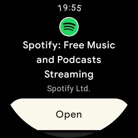
By placing everything in a card, everything does look less cramped, which is important on an especially small screen. Speaking of sizing, we see that app listings are mostly unchanged. The “Open” button, however, is again pill-shaped, as well as light, and spans the entire width of the display.
Meanwhile, the wearable Play Store now allows you to complete an in-app purchase on your Android phone or desktop via a generated URL.
The Play Store on Android phones is also getting some new wearable-adjacent functionality. The biggest addition is the ability to remotely install apps to your watch. On supported applications, the green “Install” button adds a dropdown to specify where you want an install to take place. By default, both destinations/devices are selected.
Google also touts new curated “clusters” and category pages that recommend popular Wear OS apps, as well as watch faces. In search, you can now filter results by “Watch” or “Watch faces.”
This Material You redesign of the Wear OS Play Store is rolling out over the coming weeks to watches running Wear OS 2.x and newer.


Author: Abner Li
Source: 9TO5Google


