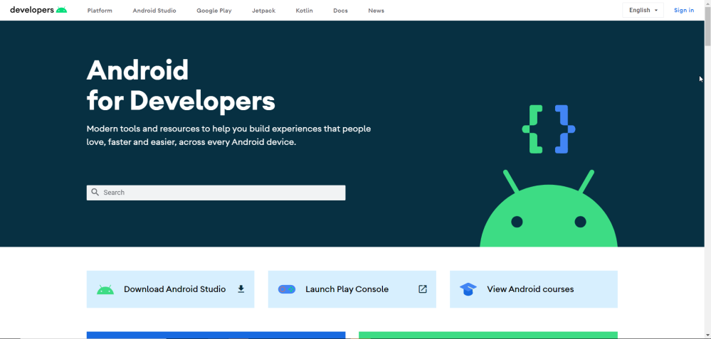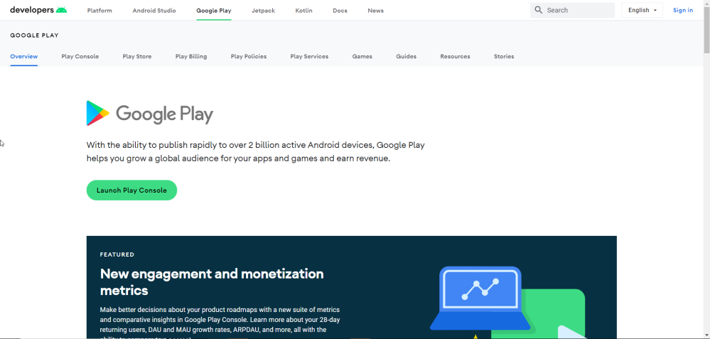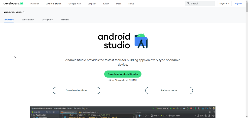
Just a couple of weeks ahead of Google I/O 2021, the company has just redesigned its Android developer website, giving it a fresh coat of paint with new page layouts, colors, and more.
The revamped design of Android’s developer website takes a lot of inspiration from what’s been going on in Google’s various other web apps such as the Google Developer site, Calendar, and Gmail, too. Side by side, the change is clear and also a huge improvement in making the site feel modern. UI elements are rounded in many places, colors look great, and the layout overall feels more worthy of a site that’s designed to help Android developers make better apps.
Does this mean anything for what we can expect at Google I/O? It’s probably just a coincidence, but we have been expecting some changes to Material Design in Android 12 this year. You can check out our previews of that design here.
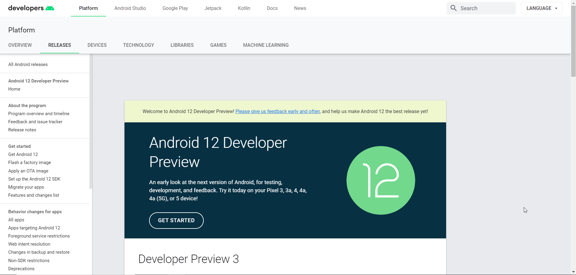
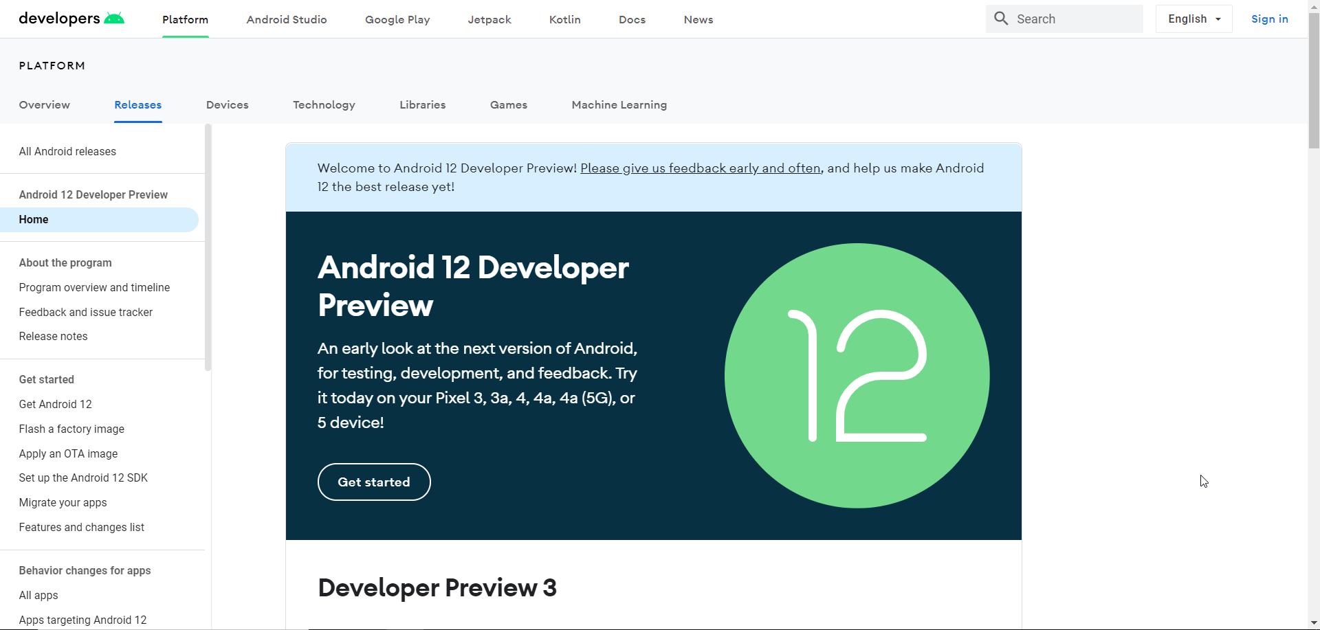
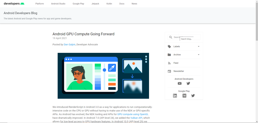
At this point, it appears the redesign is live for everyone while the old design is still in Google Cache. Notably, though, it doesn’t apply to the Android Developer Blog. You can check it out for yourself at developer.android.com.
Dylan Roussel contributed to this article.
More on Android:
- Google Play Store requiring Android apps to detail data use in new ‘safety section’ next year
- Google remembers Android tablets exist, debuts ‘Entertainment Space’ that looks like Google TV
- Imagining what ‘Material NEXT’ could bring for Google’s apps on Android 12 [Gallery]
- Google cracking down on misleading Android app names, graphics in the Play Store
Author: Ben Schoon
Source: 9TO5Google


