Google has finally released its podcasts app on iOS. This is by far the most feature-rich the service has ever been and finally has a shot at being a usable podcasting app.

New Home tab
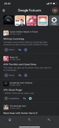
The new app features a new three tab UI. The first home tab features all your subscribed podcasts at the top and below is a list of all the episodes in reverse chronological order.

Search tab
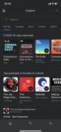
The next tab is for search and here you can see all the podcasts sorted into various categories. The suggestions get recommended based on your listening habits.


Activity tab
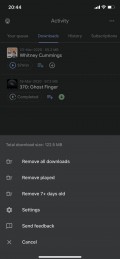
Lastly, there is the Activity tab, where you can see your current queue, downloads, history and manage your subscriptions.

Settings
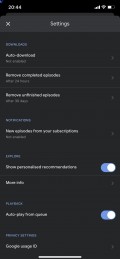
The settings for the app allows you to set your auto-download and auto-delete preferences and notification settings.

Now Playing
The Now Playing screen has also been updated. Here, you now have the option to change your playback speed along with an option to trim silence, which all good podcasting applications need to have. Unfortunately, the feature was buggy in our app, causing the playback to stutter or loop like a broken record. Even when it did work it didn’t seem to trim silences as effectively as other podcasting apps we have used. Eventually, we just turned it off.


Playback settings
The app also has a sleep timer and lets you turn off playback once the current episode ends even if you have other items in queue.
There are things still missing from this app, however, which we would consider necessary for a good podcasting application. First of all, the app needs hyperlink support in show notes. Most podcasts have some external links to things mentioned within the episode, and the Google Podcasts app does not display those links.
Second, there is still no chapter support. More and more podcasts are adopting the chapter format to make it easy to consume long episodes by splitting them into chapters that you can skip to. No support here for that.
Lastly, the app also needs support for custom podcast art. Some podcasts use the album art field to have an image relevant to the current discussion in a particular episode. Google Podcasts just uses the default album art for the podcast and completely ignores any custom art for any individual episodes.
These issues aside, the Google Podcasts app is quite usable otherwise for podcast consumption. The Android app has also been updated to have the same UI as the new iOS app, although the update hadn’t yet rolled out on our Android devices at the time of writing. As and when that happens, both apps will be identical.
We still wouldn’t use this app over something like Pocket Casts on Android, which also has an iOS, Windows and web apps. On iOS, you also have Overcast, Castro and the default Apple Podcasts app, all of which are better than Google’s even though they don’t have an Android counterpart. So although this is a decent effort, it still needs to be a lot better than the competition out there.
Author: Prasad .
Source: GSMArena


