
It’s almost surreal that this product finally exists. The Pixel Watch is finally here as Google’s first self-branded Wear OS smartwatch, nearly a decade into the platform’s existence. Is it any good? Let’s take a look…
Our review of the Google Pixel Watch was first published on October 12, but updated on October 20 following more time with the product.
Hardware |
Getting it out of the way, the Pixel Watch is a gorgeous piece of hardware.
From the “dome” design of the curved glass to the compact size and bands that blend right into the stainless steel chassis, everything comes together for a gorgeous piece of hardware. I think Google nailed the balance of a futuristic smartwatch and a classic timepiece and in a way that seems to fit most styles. The Pixel Watch is certainly on the “fancy” end of the spectrum, especially in its polished silver and gold variants, but paired with the “Active” band, it fits in pretty well as a sports watch too. But at the same time, it fits in just as well with dressy clothing. Our Abner Li says he’s come to prefer the smooth, polished cases over the rougher texture of the black, with the shininess giving a more premium feeling. Meanwhile, the matte black option comes off a bit more sporty, akin to how the Apple Watch has a matte finish on the models aimed at sporty users and the mass market.
And really, Google deserves some credit for striking that balance. It’s something I think only Apple has really pulled off to date, and Google takes it a step further since this looks like an actual watch, not a stylish computer on the wrist. Our Kyle Bradshaw feels Google’s design may earn itself the word “iconic,” as it’s distinctly recognizable just like an Apple Watch.
The 41mm chassis of the Pixel Watch is very much on the smaller side, which I was worried about with my slightly larger wrist. While it does look a little small, I think it manages to be very compact without being too small for people like me.
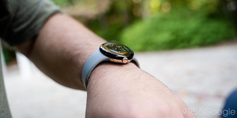
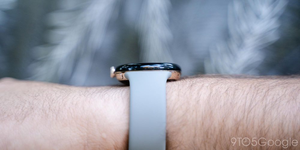
And looking at the thickness, it’s a bit of a mixed bag. Some will feel the Pixel Watch is a bit too thick, but the compact size helps make that a nonissue. I haven’t felt like the thickness of the Pixel Watch, which feels roughly the same as the latest Fitbit smartwatches, was a problem. The curved design also means that areas where a thicker watch would be annoying, such as with a long-sleeve shirt, are mostly negated. I’m just really hoping the choice of Gorilla Glass 5 holds up. This is a design that’s going to make effective screen protectors incredibly difficult (or incredibly ugly), and damage is a “when,” not an “if.”
Perhaps the only major problem I have with the Google Pixel Watch in terms of the hardware is with the stainless steel finish. On the gold model I’ve been testing, the chassis picks up fingerprints and oils incredibly quickly, and it’s hard to keep clean for really any length of time. The matte black model seems far better in this area, and I’m genuinely considering buying that model as a replacement.
Notably, our Abner Li quickly uncovered a potential problem with the hardware. Where the glass meets the metal frame, there’s a strip of some black material that you can pull out/off if you really want to. It’s something you won’t notice until it’s pointed out (our deepest apologies), but then you won’t unsee it. Google tells us this won’t affect the water resistance, though, so it seems to be a harmless manufacturing leftover.
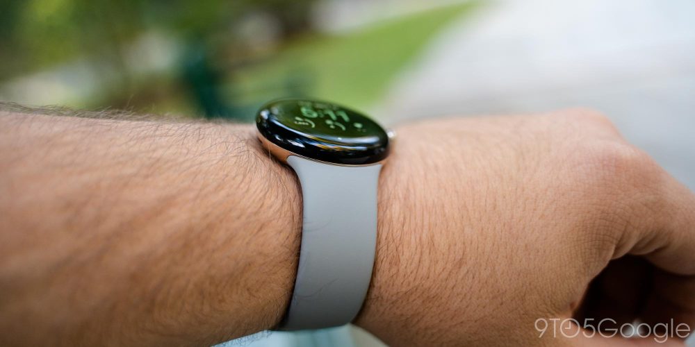
Front and center on the hardware is the circular display of the Pixel Watch, a 1.2-inch AMOLED panel. While on the smaller side, I didn’t feel too constricted with the size outside of having a bit of trouble reading some longer messages and notifications. The UI as a whole is designed well around the size.
The quality of the panel is excellent overall, with a vibrant look and deep blacks that help the UI feel like it’s a part of the hardware, not just being shown on a normal display. UI elements look pretty sharp overall, but you can see a little bit of pixelation in some watch faces. Outdoor viewing is a breeze overall, with the panel being bright enough to stay visible even in direct sunlight.
And on the note of the bezels… it’s been greatly exaggerated.
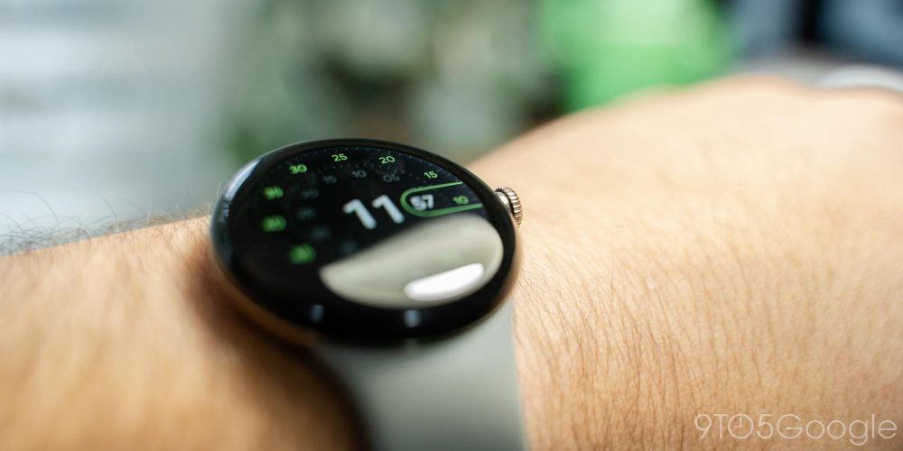
The bezels around the Pixel Watch’s display are not small, that’s true, but they’re not noticeable unless you’re looking for them. Google’s software does a great job of blending the content on the screen into the edge of the display. There was only one time when I visibly noticed the bezels, and that was in direct sunlight. The other is when you interact with the few nonblack backgrounds present on the Pixel Watch, like on the Photos face.
The bezels on the Pixel Watch don’t matter, and I’ll go so far as to say that this product would look worse if the bezels went edge-to-edge. Just like smartphones with curved displays, pushing the display further on the “dome” design of the Pixel Watch would result in annoying reflections and uncomfortable touch gestures.
Update: Almost two weeks in, too, I’m very happy to say I haven’t managed any scratches on the Pixel Watch. That said, I live in constant fear that this thing will slam into a door frame and shatter. Some users have reported quick and painful damage to their watch already.
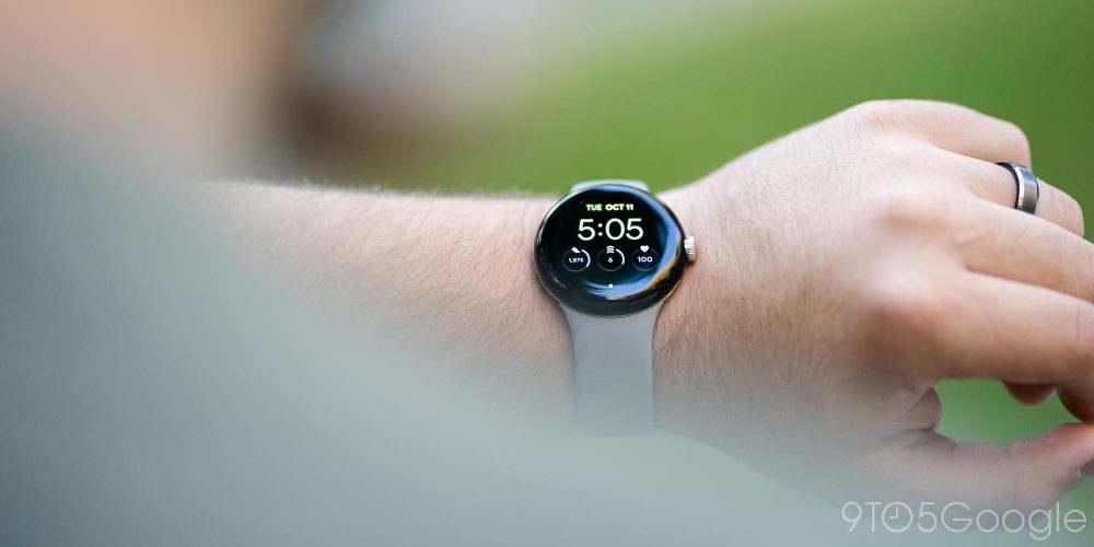
One thing I do wish the Pixel Watch hardware had more of are physical buttons. Technically there are four “buttons” on the watch, but two of those are for swapping out the bands. There are only two buttons that actually have utility with the software experience.
The digital crown is the first of those two, with a rotating design to help you move through UI elements, and a press action that turns on the display, opens the app drawer, or goes back to the watch face, depending on the current state of the watch. A double-click also opens Google Wallet. It feels as intuitive as any other modern smartwatch, though I will say the tactile push of the button and the precise “click” of the haptic motor in conjunction with the crown are absolutely wonderful and really help sell the premium experience you’re paying for.
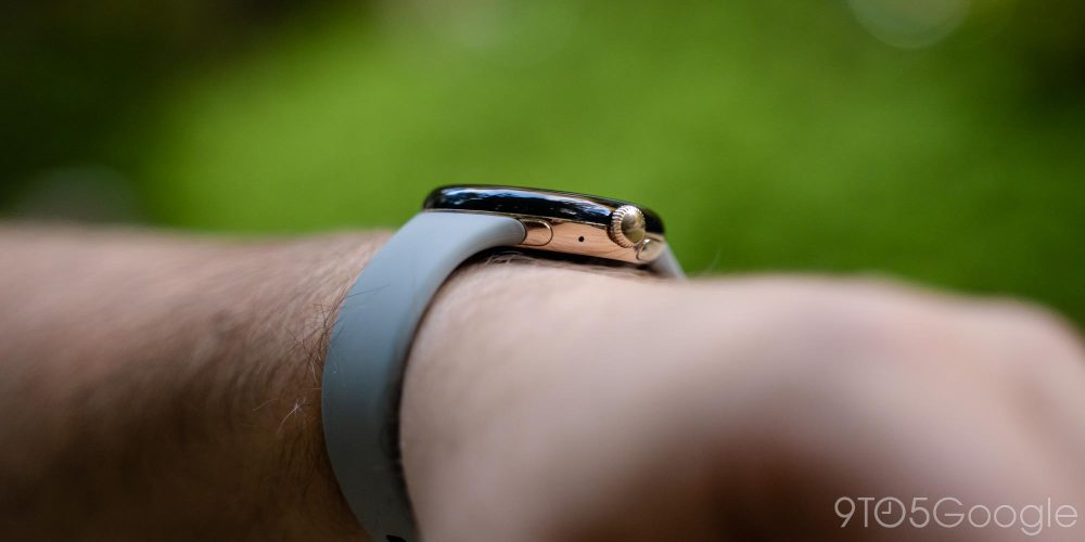
The only other button is hidden from view on the edge of the chassis, making it a little hard to get used to at first. But a day of muscle memory later, it already felt natural, to me at least. Abner disagrees, saying it still feels a bit awkward. The only problem is that it serves limited purpose. A single click opens the multitasking menu, while a double click opens your most recent app. A long press activates Google Assistant. You can’t customize any of these gestures, which is a crying shame. Samsung similarly blocks you from changing some button gestures on its Galaxy Watch based on Wear OS but at least leaves some functions up to the user.
Realistically, it’s probably fine that this button is locked to these functions, as they’re all quite sensible. But I would have loved to see a second button on the hardware to serve as a custom shortcut to an app or function.
As mentioned earlier, one of the things that boosts the “premium” feeling of the Pixel Watch is the haptic motor. The vibrations on this smartwatch are simply delightful.
The haptic motor in the Google Pixel Watch is precise, and it has an impact. There’s a distinct but soft buzz when notifications come through, and a tight click when you rotate the digital crown. When you long-press the crown and pull up the power/emergency menu, there’s a strong “thud.”
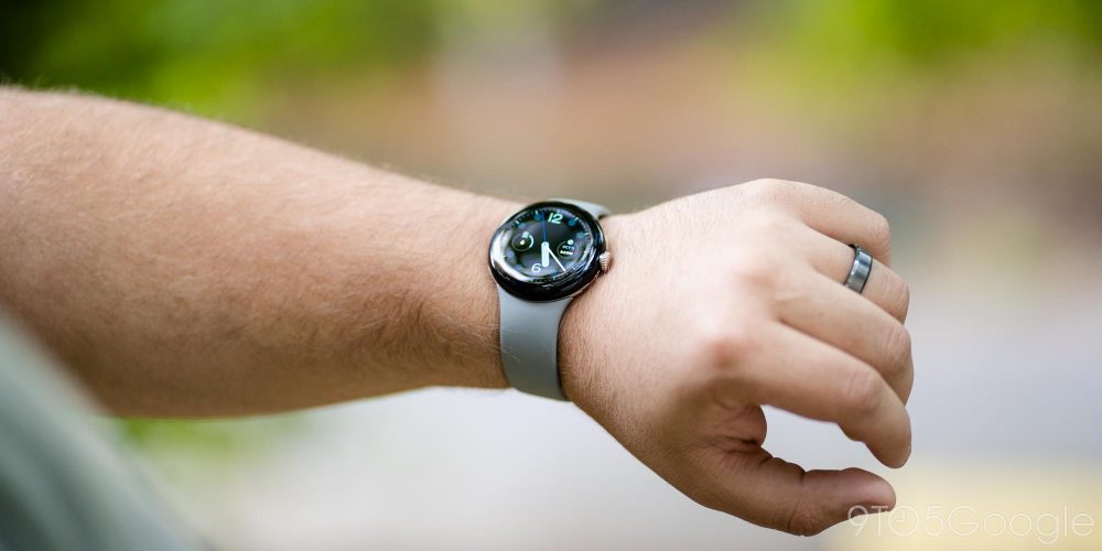
It’s hard to describe the haptics without a clear frame of reference, so it’s really something you need to experience for yourself. But without a doubt, I can say these are the best haptics ever on a Wear OS smartwatch, including Samsung’s Galaxy Watch lineup. That said, you can disable the haptics entirely, or just turn off the crown’s vibration if you choose to do so.
And as a side note, Google boosts the haptics with some charming chimes for notifications that actually convinced me to leave the audible ringer on, something I’ve never wanted to do with any smartwatch.
We’ll have more to say on Google’s Pixel Watch bands in the coming weeks as we have a chance to try out more of them, but let’s touch on the “Active” band that ships by default with your Pixel Watch order.
The simple silicone band is virtually identical to the “Infinity” band design that Fitbit uses on its smartwatches and fitness trackers. It’s a soft rubbery feeling that’s pretty darn comfortable and easy to put on. The “clasp” provides plenty of security, and the attachment points for adjusting the length of the band are frequent enough to where you’ll easily find a comfortable position. Google includes both large and small versions of the band with your order too.
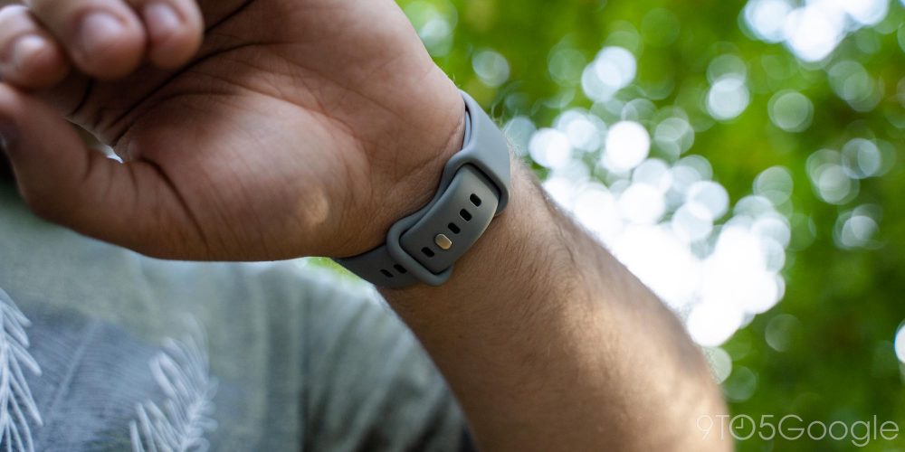
In general use, exercise, and sleep tracking, I’ve found the “Active” band to be very comfortable. It’s thin enough to feel like it’s not there, but I never worried about it falling off. The “Hazel” color is also wonderful.
My main problem stems from past experience with this design. Whether it’s on Fitbit or Samsung products, using this band design that tucks the excess band inside of the loop always leads to skin irritation for me. Generally, it takes around a week or so of constant use for this to happen, but it often leads to me needing to not wear anything on that wrist for a few days to heal. The barely six days I’ve spent wearing the Pixel Watch so far is not nearly enough time to see if this will happen, but I’m pretty confident it will as Google is using virtually the same material as recent Fitbits.
Update: A few more days into my review period, the Active band was indeed starting to irritate my skin, but not quite to the point of causing anything along the lines of a rash. Google pointed out to us that the band is made from a fluoroelastomer material, just like the Apple Watch Sport band. Perhaps this is why I didn’t have issues, but I ended up switching to the much more comfortable Woven band.
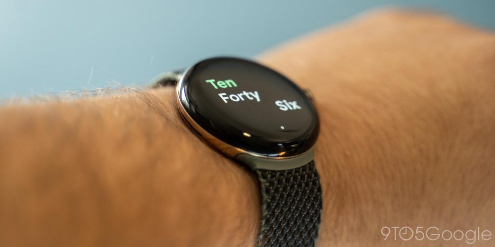
My colleague Kyle Bradshaw stuck it out a little longer on the Active band, but said he was having skin irritation within a week.
What about the connector?
Unlike the vast majority of Android-compatible smartwatches, the Google Pixel Watch introduces a completely unique band connector. It slots into the watch with a twisting motion and releases using a button. It takes a bit of practice to get right, but it is most definitely faster than a traditional pin setup. Straps are harder to connect if the connector is not attached directly to the band, as is the case with the Active band. In our brief usage, putting on the leather bands will be harder. More to come on Google’s additional bands as we get our hands on them.
Notably, too, there are a few pin connectors inside of the band slots. Right now, these serve no purpose, but they could presumably be used for “smart bands” in the future.
But like any brand-new and proprietary system, this is going to prove a headache for buyers for a while.
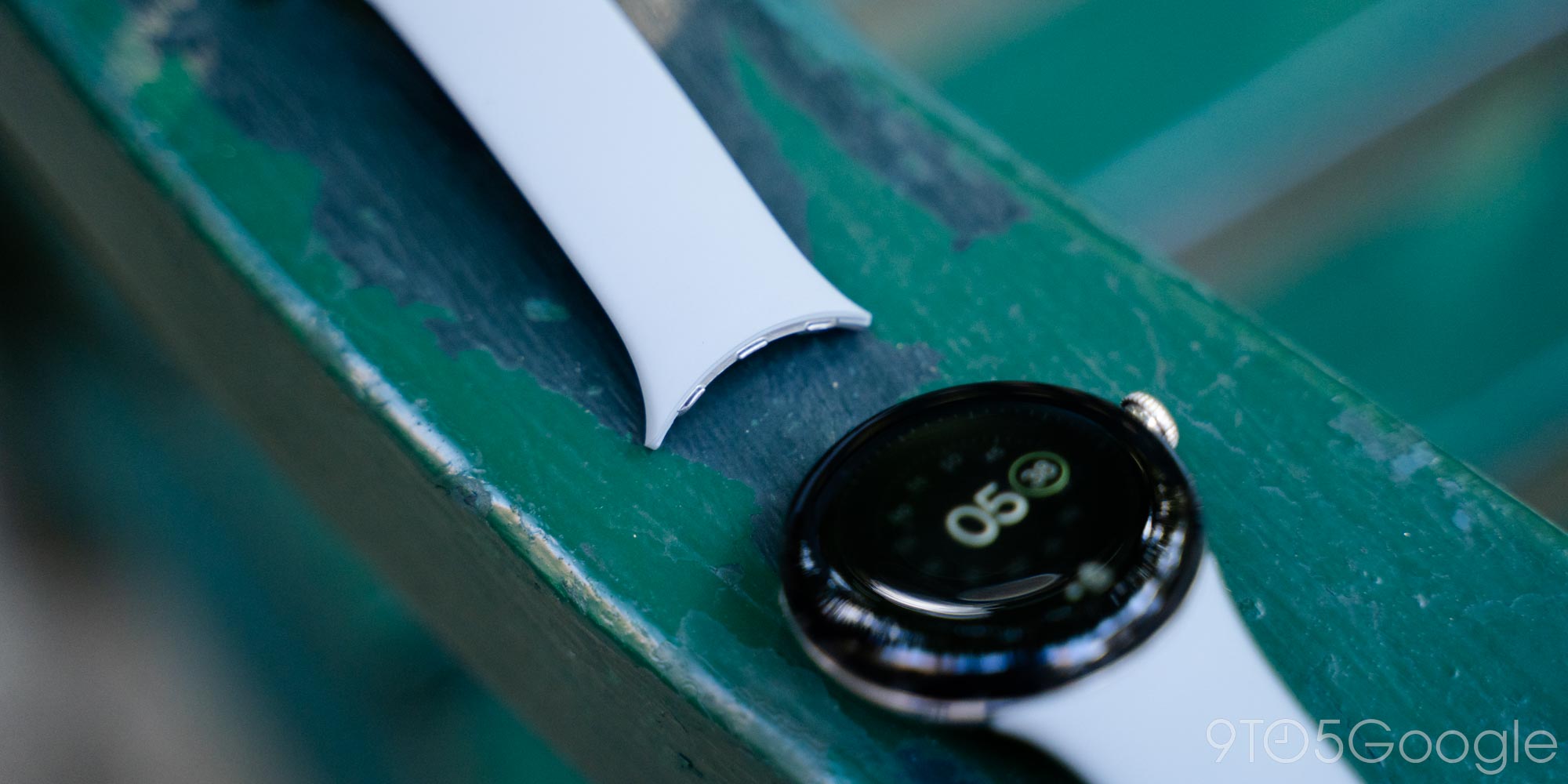
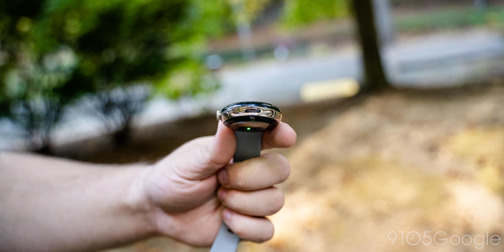
Pixel Watch bands are currently only available from Google — whether through the Google Store or other retailers such as Best Buy — and no other brands have signed on to make their own options. On top of that, Google doesn’t sell an adapter so you can use your own pin bands. At the time of this review, the only way to get additional bands is from Google and its partners, and they come at one heck of a cost. A replacement “Active” band is $50 on its own, but every other option is more expensive. The “Stretch” and “Woven” bands run $60. Leather bands are around $80. And the forthcoming metal bands cost as much as $200.
Making that cost even more frustrating is that you have to pay full price for those bands. If you want a Pixel Watch with a leather band, you’ll have to spend $349 for the watch with its Active band and then an additional $80 for the leather band. Google doesn’t let you swap out the included band or even give you a discount if you bundle them. It makes for a user-hostile purchase when, with something like Samsung’s Galaxy Watch 5, you can use bands from some watches your grandparents used without a problem.
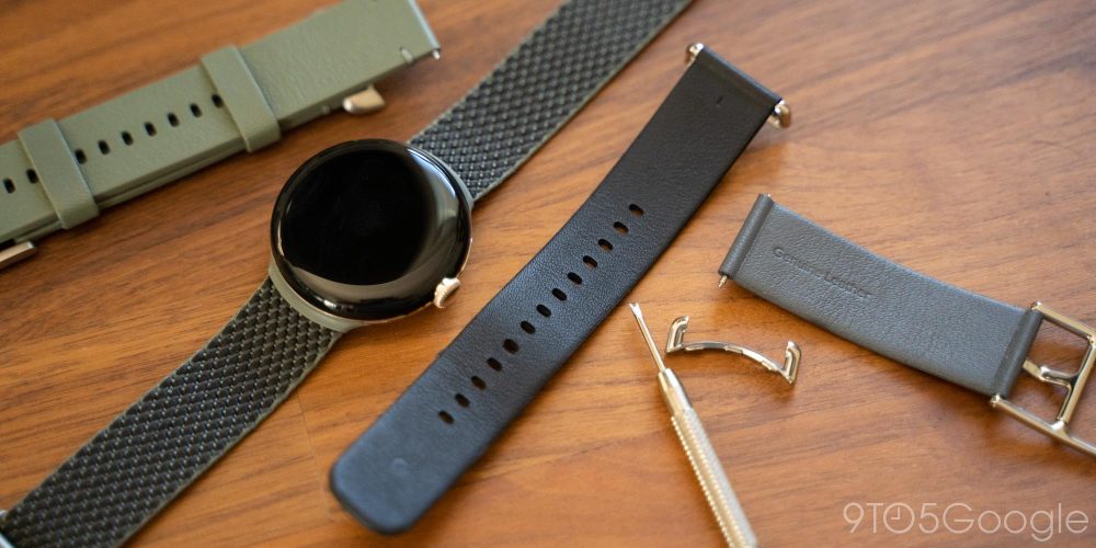
Update: Good news! As it turns out, Google is inadvertently selling a 20mm watch band adapter for the Pixel Watch. Both the “Crafted Leather” and “Two-Tone Leather” bands are attached using completely traditional spring bars, meaning you can use a cheap tool to remove Google’s band and use the adapter for any 20mm band you want. Of course, it costs $80 to do this, but at least the option exists.
This also brings up a long-term concern about the Pixel Watch hardware too.
I fear that Google has locked itself into a single look and feel. The use of a proprietary band connector restricts what Google can do going forward with this design, and it might make future generations, or even just larger sizes, a bit difficult. Of course, that’s under the thought that Google wouldn’t do something as monumentally stupid as to throw away support for proprietary bands that cost as much as $200 a piece after a single generation.
That would be madness.
Software |
It’s taken Google the better part of a decade to make its own take on a Wear OS smartwatch, and it comes at a time when Wear OS is in flux. Wear OS 3 ushers in a new era for the platform that throws away much of the foundation of what was previously in place. There’s no one single “look” for the platform anymore but rather an experience that changes for each manufacturer.
The Pixel Watch is our first look at Google’s take on Wear OS 3 – Wear OS 3.5, to be exact.
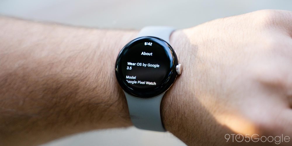
Setup is the first step, with the new “Pixel Watch” app replacing the long-used Wear OS app. Functionality in this app is largely similar to that older app, but you’ll find a fully-custom interface and some tailored designs. It’s an app you’ll mostly not need after initial setup, but it does make some tasks a little easier.
Related: New Wear OS version coming every year
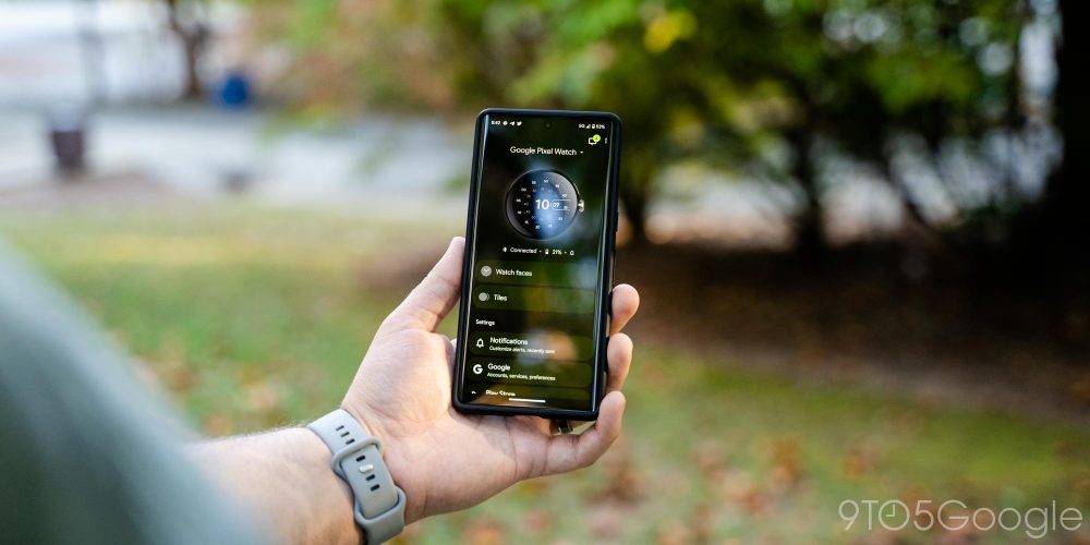
Largely, the foundation of this experience is the same as what Wear OS has been building up to for years. The “homescreen” of the entire platform is the watch face, which you can customize with a long press. Watch faces are pre-installed, just shy of 20 on this device, and you can install third-party options from the Play Store. Each watch face brings a new look to the device, and you can customize what appears on them with “complications,” miniature widgets that can pull data from apps on the smartwatch. You can customize watch faces from the app on your phone, including colors and complications.
Scrolling to either side of the watch face, you’ll find “Tiles,” full-screen “widgets” that are powered by apps on the watch, primarily including Google’s own apps such as Weather, Fitbit, YouTube Music, and others. Some third-party options are there, but it’s primarily Google’s show for now. Still, you’ll find useful functions here, and the library is expected to grow in time. You can customize Tiles as you see fit, either by long-pressing a Tile to move it or through the Pixel Watch app on your phone.
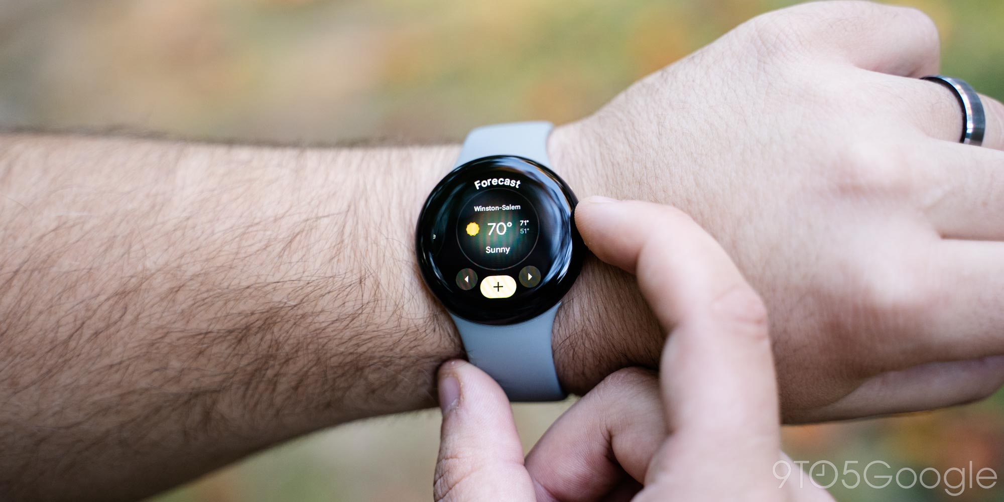
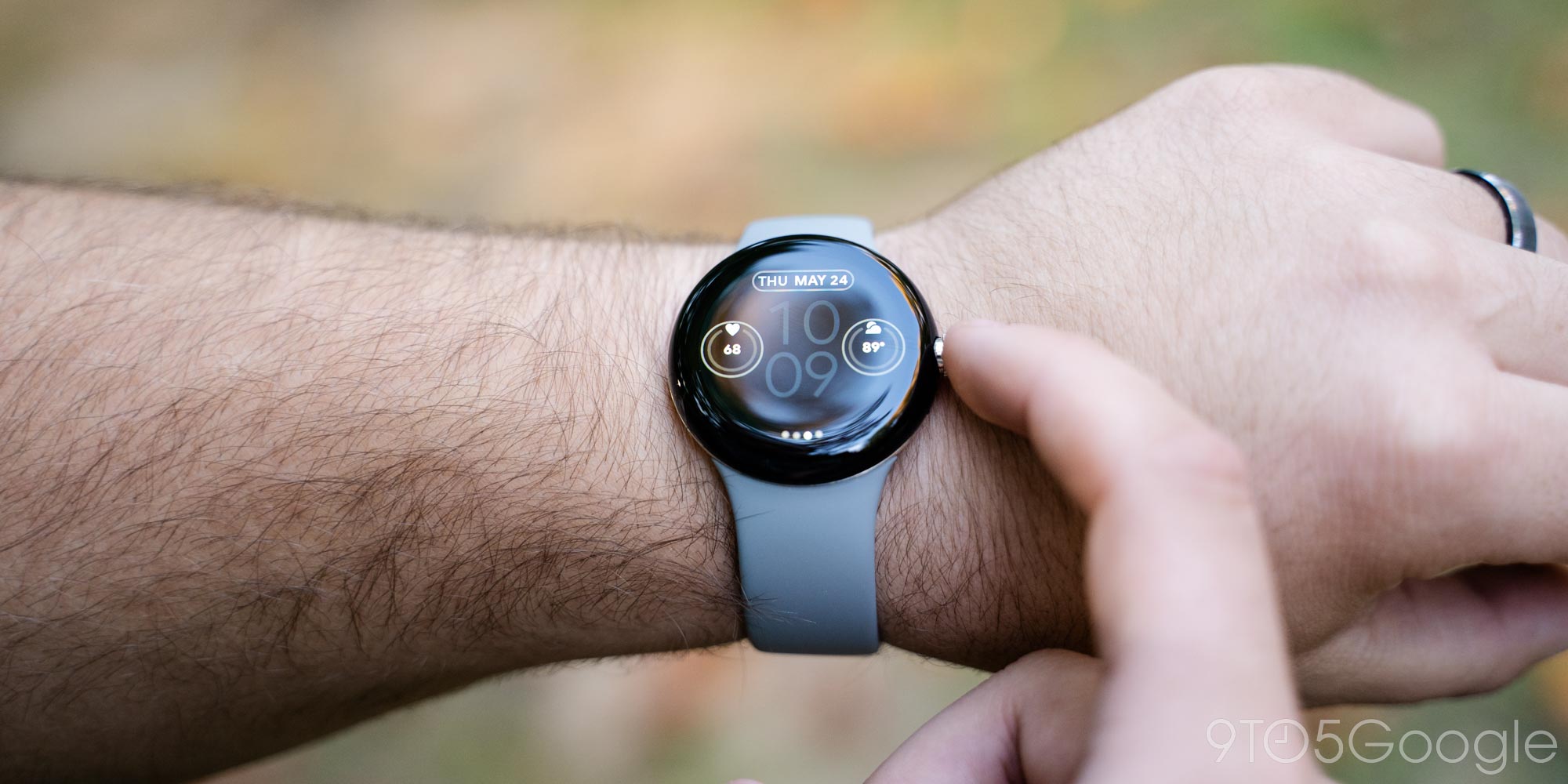
Swiping up from the watch face shows a list of notifications from your paired Android phone. (The Pixel Watch isn’t compatible with iPhone.) By default, it mirrors all notifications (except system notifications) from your phone. You can block specific apps as you see fit. This is a far better approach than Samsung takes, in my experience, as the Galaxy Watch allows notifications only from a select list of apps by default and forces the user to turn on any apps they do want notifications from instead. Potential overload is better than unexplained silence in my book.
Swiping down from the watch face reveals a list of quick settings and shortcuts. This is a list you cannot customize, but it includes pretty sensible shortcuts. The full list includes:
- Battery level + battery saver shortcut
- Settings shortcut
- Ringer (on/off)
- Bedtime mode (disables tilt-to-wake, mutes all notifications except alarms, priority calls)
- Do Not Disturb
- Theater mode (turns off the screen, mutes ringer, disables tilt-to-wake)
- Airplane mode
- Find my phone
- Brightness shortcut
- Touch lock
- Flashlight
- Google Wallet
- Google Home
I very much wish that I could customize this list, at least the order of it. I’d much rather have faster access to Google Home than theater mode or airplane mode!
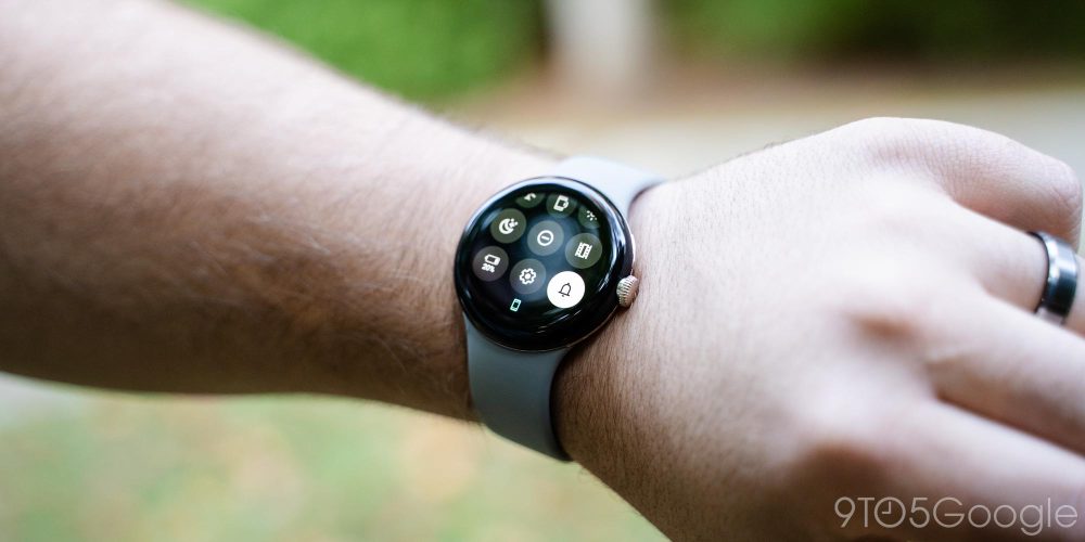
Pressing the crown opens the app drawer, as mentioned, which shows a revamped UI compared to older Wear OS watches. The list of apps looks fine to me, but honestly, I think Google did it better the first time. Older versions of Wear OS had an alphabetical list of apps that curved with the circular display, but this new redesign is just a static list that only shows two apps at once. It’s a waste of screen space and, visually, a worse look. It’s certainly better than the chaotic app drawer on the Apple Watch, but I do wish it offered some customization as Samsung’s take does. At the very least the option to “pin” one or two apps to the top of the app drawer would be quite useful.
One of the biggest upgrades in terms of usability on Wear OS 3 is with multitasking. Where the Wear OS of old forced you to go to the watch face, then the app drawer, then to the apps you want every single time, Wear OS 3 has a “recent apps” menu that shows your latest apps. You can double-click the top button on the Pixel Watch to quickly swap back and forth between apps, or click once to see a list of recently used apps. It’s a huge upgrade to the experience and one that makes me want to use more apps.
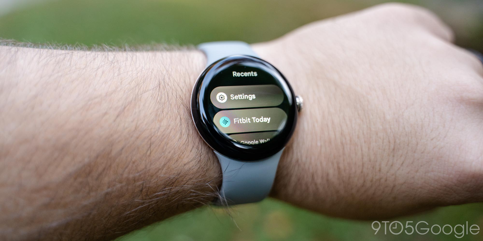
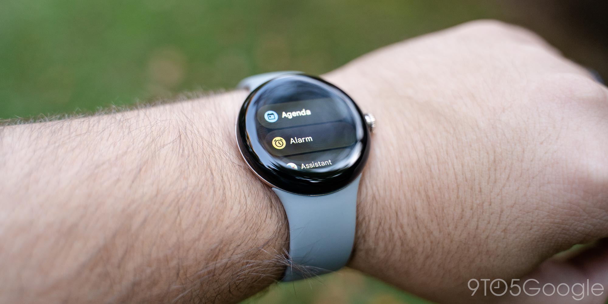
That said, the state of apps on Wear OS is still not quite ideal when compared to Apple. You’ll find major apps like Spotify, YouTube Music, and other media apps. Google Keep, Maps, and Home also fill out the core catalog for most Android users. But there are a few apps I find to be “must-haves.” The Play Store on Wear OS shows apps for specific use cases, like to-do lists, grocery apps, or health/meditation apps. Really, the only app I felt compelled to download outside of what’s included out of the box was UDisc, an app used to track scores while playing disc golf. It’s really handy to be able to keep score without pulling out my phone.
I’ve long felt that a smartwatch should be an extension of your smartphone, not a partial replacement. For most things, your phone is the better option. I don’t want to access Google Photos, or social media, or my full email inbox, or anything remotely along those lines from my wrist.
Personally, I’m fully satisfied with the apps available on Wear OS, but it’s clear that there’s just more available in Apple’s garden, and that might be compelling for you.
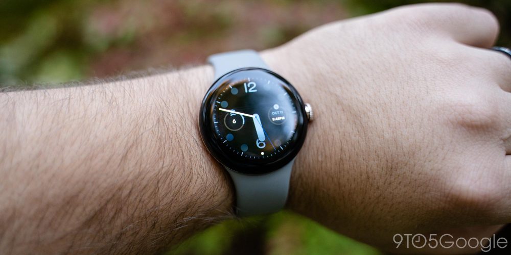
The area where Google’s smartwatch has a distinct advantage over Apple’s is when it comes to watch faces, as Wear OS actually allows third-party developers to create their own designs for users to install. There’s a huge number of watch faces available in the Play Store, and many are free of charge.
But what’s available out of the box?
Google has just shy of 20 watch faces pre-installed on the Pixel Watch. Some are designed around looking like a classic timepiece, whereas others are more unique. We broke down all of the available faces in a previous post.
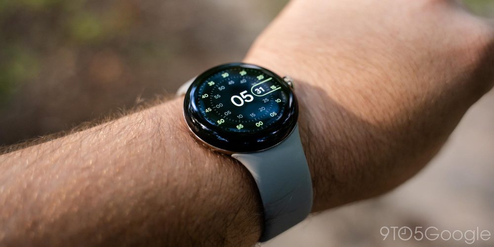
For my time with the Pixel Watch, I stuck mostly with the default “Utility” face. It’s a simple digital clock face with three customizable complications underneath. I used those to show my steps, Active Zone Minutes, and heart rate. “Pacific” was another favorite of mine, with its Google-y take on an analog watch face looking really nice, and complications keeping it useful and stylish. “Concentric” (below) is a super unique watch face too, though I wish it supported at least one complication.
Update: After spending some extended time with the Pixel Watch, I’ve settled on switching back and forth between the Concentric watch face (below) as well as the “Prime” watch face, which expresses the time through words. I love the clean look they provide, despite lacking extra info.
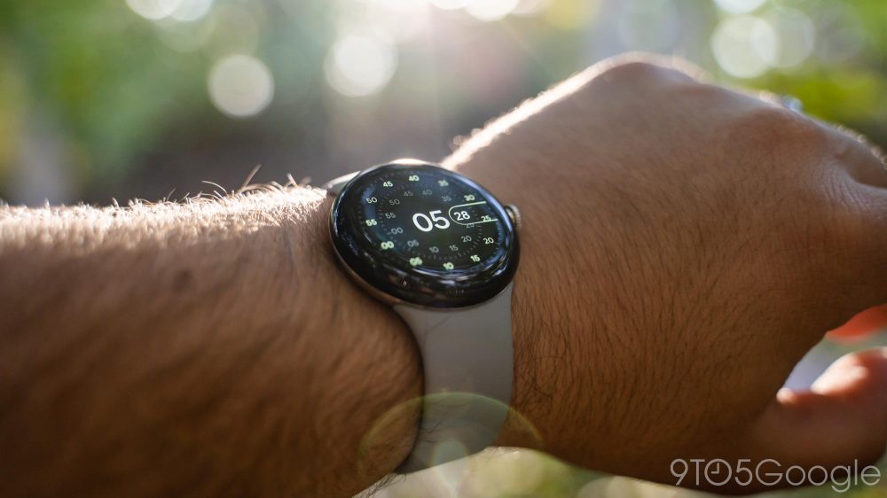
More than anything, I’m just glad Google’s included faces are so clean and useful. They really fit Google’s whole vision with the Pixel, and they’re very enjoyable!
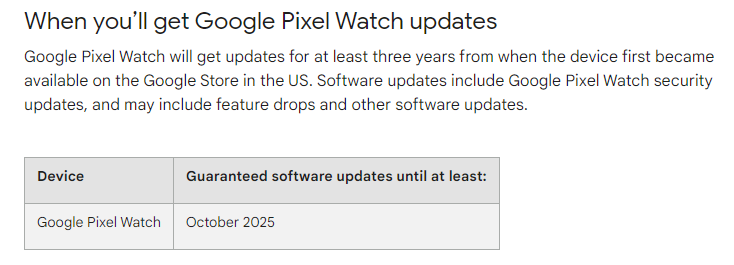
A minor point of controversy over the past week has been with software updates. Google says the Pixel Watch will get updates through at least October 2025, three years from its release date.
For a $350 smartwatch, that sounds a bit light, but it’s really not.
Unless Google makes some drastic changes, this watch will likely live well beyond 2025. Wear OS updates are typically delivered through app updates and server-side changes rather than major system updates. Watches from 2016 have still been getting some of the latest platform features. Heck, this thing ships with Android 11 and a security patch from July 2022. As long as Google pushes security patches semi-regularly, I don’t think there’s anything to worry about.
I’d worry about the battery and hardware of the Pixel Watch degrading far sooner than I would the software becoming irrelevant.
Fitness & Health |
Like Fitbits, the Pixel Watch will track your heart rate continuously to detect your activity levels and collect Active Zone Minutes as well as your steps. The Fitbit app can also use this data to detect smaller workouts, like walks, and count that toward your weekly goals. You can also manually track workouts, but the Pixel Watch lacks the ability to automatically start or stop workouts. Google implies that this functionality might arrive at a later date.
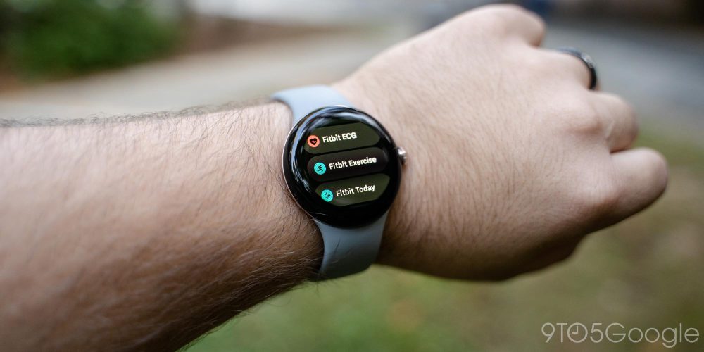
When manually tracking workouts, you’ll use the “Fitbit Exercise” app on the Pixel Watch, one of three Fitbit apps on the smartwatch.
You’ll see your most recent workouts at the top of the interface, with a list of 40 different types of workouts within the app. Starting a workout is pretty easy, and the app shows the data I’d want while tracking a walk, such as steps, time, heart rate, and calories burned. My only big complaint about the workout experience is that you can’t see incoming notifications while using the workout app. That’s probably fine for some more intense workouts, but it’s a bummer when you’re doing something that allows you to look at your watch, as you have to leave the app to see your notifications.

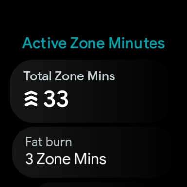
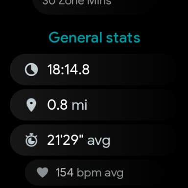
The other two Fitbit apps on the Pixel Watch include one for taking an ECG (electrocardiogram). That app will be able to detect signs of atrial fibrillation, but the Pixel Watch notably lacks support for detecting those signs automatically with Fitbit’s Irregular Heart Rhythm Notifications, which are available on virtually every other Fitbit product. The final app is “Fitbit Today,” which displays your daily stats as well as your live heart rate. This app will also deliver step reminders throughout the day. That’s turned on by default, but can be disabled in the Fitbit app.
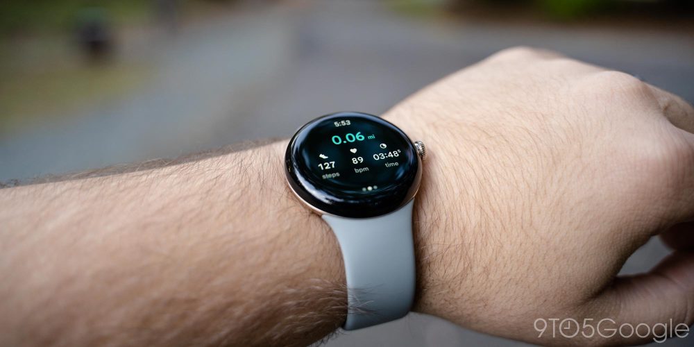
Google has put a lot of weight behind the heart rate sensor on this wearable, claiming that it’s the most accurate yet in a Fitbit product. In direct comparison to the Fitbit Charge 5, I typically found that my heart rate could be different by around 10% on average, but I saw differences up to 20bpm. However, the Pixel Watch did line up almost exactly with a fingertip pulse oximeter I had laying around, which seems to endorse Google’s claim. I found that Active Zone Minutes were on par with my previous Fitbit Charge 5 too.
Here’s the thing about Fitbit on the Pixel Watch. For the basic user who just wants an overall picture of their daily fitness and the ability to track occasional workouts, it’s great. The design is simple and easy to understand, and the Fitbit app is a delight for tracking that data and setting goals. But if you use Fitbit on the Pixel Watch, it’s a compromised experience compared to dedicated trackers such as the Fitbit Versa 4 or Sense 2, as those devices support more stress tracking, more workouts, and, well, just more fitness features overall.
Fitness is the area where Wear OS as a platform has always fallen short, and I was really hoping Fitbit would finally close that gap. For the core offer, I think this experience is rather good, but it’s not quite as good as the smartwatches Google is going up against.
Battery Life |
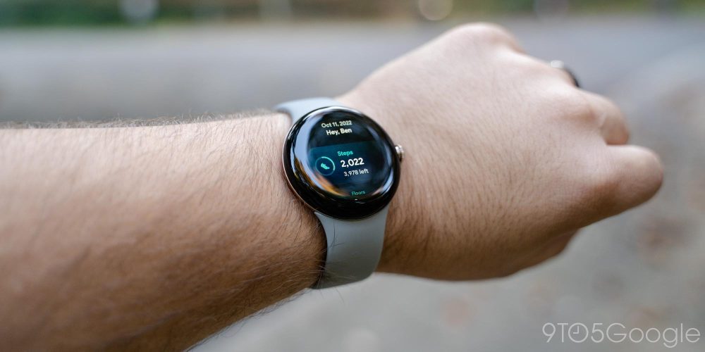
By far the biggest concern around the Pixel Watch ahead of its launch was battery life, and rightly so. The Pixel Watch runs on an older chip and has a mere 294 mAh cell powering the show.
Yet, the battery life on the Google Pixel Watch isn’t nearly as bad as you might have feared.
Google claims that the Pixel Watch can manage around 24 hours on a single charge, and I’ve found that’s roughly accurate.
To get 24 hours on a charge, I needed to disable the always-on display (which is turned off by default), but I didn’t have to change anything else. I get upwards of 700 notifications per day, and I typically use the watch for tracking general activity rather than formal workouts – walks, working around the house, etc. I use the watch for sleep tracking as well, activating “Bedtime Mode” to keep the tilt-to-wake gesture off while I’m sleeping and muting the ringer and haptics.
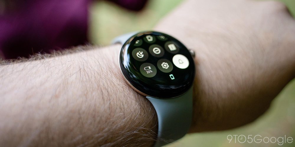
Battery life on smartwatches is something that’s incredibly personalized, it varies drastically from person to person. With the Pixel Watch, battery life will be something that isn’t the same for any two people. For some, it will be unacceptably bad. For others, it might be forgettably fine. For me, at least so far, it’s somewhere in the middle – manageable is the word that comes to mind.
In the very few days I’ve had to test out the Pixel Watch’s battery, my schedule has been a bit out of the ordinary. My first full day started at 9:30 a.m. with a 100% charge and the always-on display disabled. I used the watch throughout the day and for sleep tracking and, due to a travel schedule I regret, slept through noon the following day, waking up with 15% remaining. I dropped the watch on the charger for about 30 minutes while I showered and got ready for the day.
From there, I started my day at 72%. Over the course of the day, I managed to drain the watch down to 24% by 10:45 p.m. with the AOD disabled. Google says you need around 30% for sleep tracking, so I threw the watch on the charger for 20 minutes before bed, getting back up to 71% as I strapped the watch back on for sleep tracking. I woke up the next morning around 8:15 a.m. with roughly 40% left and charged until 9:05 while getting ready for the day, where I started with 99% capacity. By 11:30 p.m. that night, the watch was down to 34%, and 20 minutes of charging got me back up to 74%.
Next, I enabled the always-on display to see what effect it would have on battery life. I started off a day at 8:30 with 100% battery and drained it down to 26% by bedtime around 10 p.m. It’s clear there’s a major impact when AOD is enabled, cutting battery life down to around 18 hours or so based on my use.
Hopefully, you can see the clear trend here.
Google Pixel Watch’s battery life, clearly, is not dreadful. It’s not good, either. The Galaxy Watch 5 (44mm) I wore previously needed none of these boosts. Charging once in the morning was plenty to keep the watch charged up.
The Pixel Watch will last a day and nothing more.
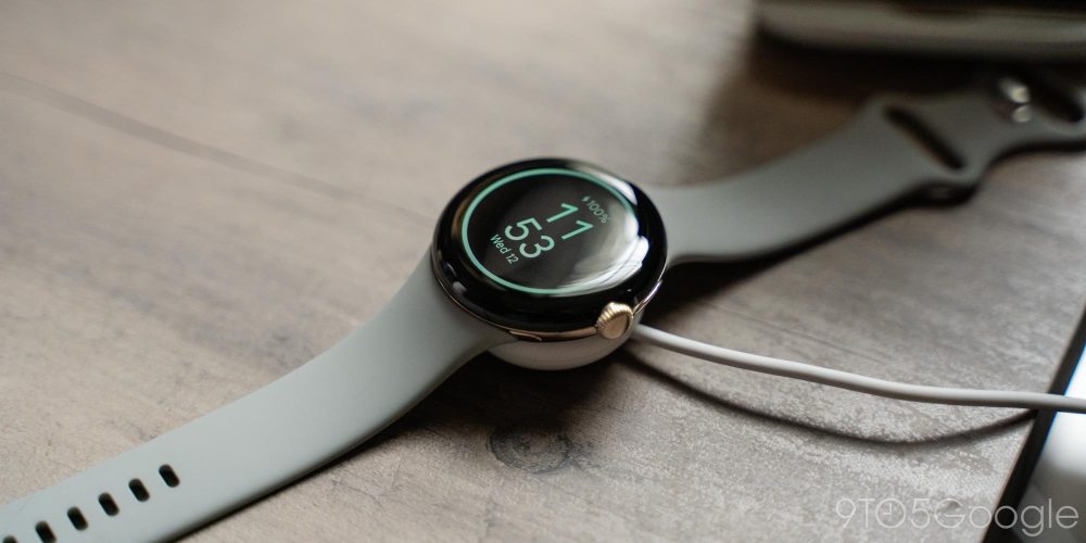
For me, the Pixel Watch battery life is not good. But I can live with it, just barely. Dropping the watch on the charger first thing in the morning for the better part of an hour, then back on the charger briefly before strapping it back on for sleep tracking seems to do the trick for me.
But that’s just not great. It leads to a bit of battery anxiety and surely problems when my normal routine changes. A late night, travel, or even just a day full of additional activity could easily lead to wearing a dead watch. I’d recommend picking up a spare charger, but do keep in mind it connects over USB-C and not USB-A.
Update: After several more days using the Pixel Watch, I’ve actually been pleasantly surprised to notice that battery life seems to be improving slightly. I’m finding that I have more and more battery left when I drop the watch on the charger. Perhaps as the watch is learning my habits, Android is “settling in” and optimizing as such.
This doesn’t change the core fact – the Pixel Watch has bad battery life, but I’m really finding that it’s battery life I can absolutely live with. If my experience sounds terrible to you, just get a Galaxy Watch 5 instead.
I really hope that future optimization leads to better endurance. Stay tuned, we’ll have more battery testing as we have a bit more time with the Pixel Watch, but to me, it’s not nearly as bad as I expected.
Final Thoughts |
The quote that’s kept coming back to me through the leaks and even now as I’ve spent the better part of two weeks with Google’s first smartwatch is MJ’s line from Spider-Man: No Way Home: “Expect disappointment, and you’ll never be disappointed.” I went into the testing process with the Pixel Watch with low expectations, and frankly, I’m not unhappy with this smartwatch.
I’m not disappointed.
The battery life is bad, but it’s manageable. The Fitbit integration is a little lacking, but it’s enough for me. And really, that’s how most aspects of the Pixel Watch are. They’re not quite ideal, but they’re good enough if you don’t have sky-high expectations. This is the first generation of Google’s smartwatch, and things are sure to get better.
So far, my verdict is this: The Pixel Watch is an excellent first attempt at a smartwatch, but it’s not the best smartwatch you can buy for your Android phone. On the whole, the Galaxy Watch 5 is a more polished option at a much better value with its $279 starting price.
If you do want the Pixel Watch, wait for your chance at a discount or, if you pre-ordered a Pixel 7, use the credit Google gave you to get the watch for $149. It’s well worth a lower price, but $349 feels like a bit of stretch given the current state of the product and, more so, its competition.
Update: As it stands after two weeks of use, the Pixel Watch will be staying on my wrist, and I even dropped the money to buy a black one, too. After over a year dual-wielding a Fitbit Inspire 2 and then a Charge 5 alongside a proper smartwatch, I’m so happy to finally have one product that does it all, and I can’t wait to see what Google does with the future of the Pixel Watch.
You can buy the Pixel Watch today from the Google Store, Best Buy, Amazon, and other major retailers.
Where to buy the Pixel Watch
- Google Store
- Best Buy
- Amazon
- Verizon
Abner Li and Kyle Bradshaw contributed to this review.

Author: Ben Schoon
Source: 9TO5Google


