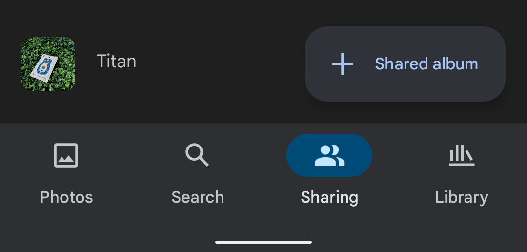
Outside of Workspace apps, Google Camera, Clock, Contacts, and Phone have already been updated with the company’s new design language. Google Photos is the latest app to get Material You, though it’s a work in progress.
The most prominent change is the taller bottom bar that allows for a pill-shaped selection indicator. That particular highlight — and others — are blue, with Google Photos not yet leveraging Dynamic Color. This is similar to the current Google Phone Material You revamp but will presumably change in the future for Pixel owners.
Elsewhere, the app bar is now flat and blends into the background, while buttons for “Favorites,” “Utilities”, “Archive,” and “Trash” in the Library tab lose their outline for an elevated and filled look. That change also applies to album covers that now feature more rounded corners.


That increased curvature also applies to the tools carousel in the image/video editor. Lastly, in “Search,” the top field is now pill-shaped.
Version 5.59 is rolling out now via the Play Store with the Google Photos Material You redesign. The update is not yet widely available. This new look joins the delightful “Your memories” homescreen widget introduced in August for all Android versions.


More about Material You:
- Google Keep is next in line for a Material You update, coming later this month
- Here’s an early look at YouTube Music’s upcoming Material You widget [Gallery]
- Google Translate for Android prepares for Material You as its first major redesign in years [Gallery]
- Google Phone rolls out Material You redesign in beta
Dylan Roussel contributed to this article
Author: Abner Li
Source: 9TO5Google


