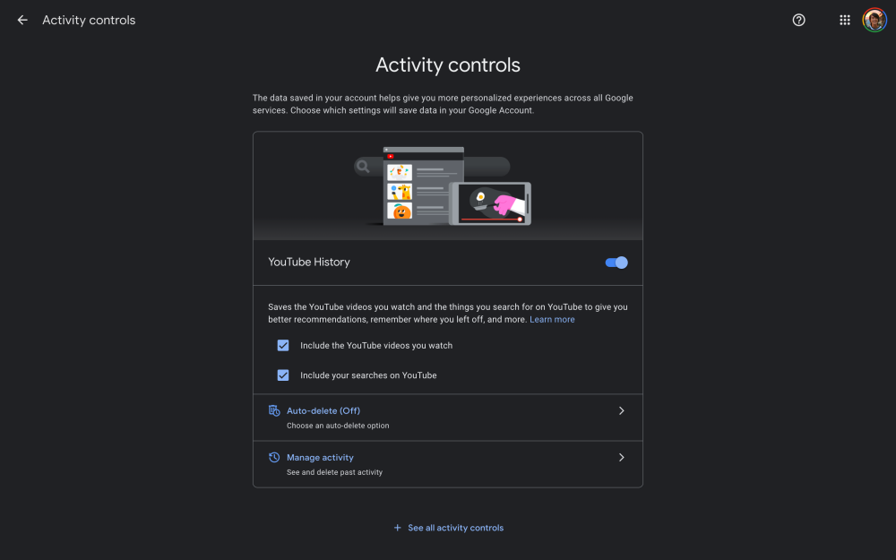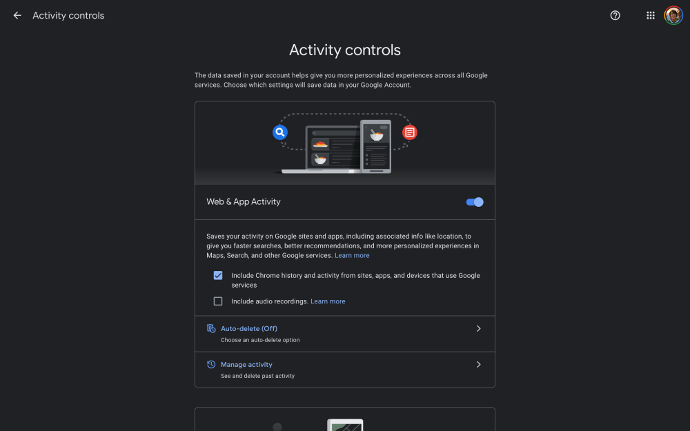
While prolific among first-party Android and iOS apps, night modes on Google websites are few and far between. The Google My Activity page is now the latest to feature a dark theme.
Google granularly records how you interact with its apps and services. Launched in 2016, “My Activity” lets you “see and delete your activity using the controls on this page.”
The activity you keep helps Google make services more useful for you, like helping you rediscover the things you’ve searched for, read, and watched.
Organized as a reverse-chronological timeline in either “Bundle” or “Item view,” it makes for a very long list that’s somewhat mitigated by date/product filters. There’s also a search capability, while tapping an entry provides even more detail about an interaction. At the very top of this page, Google lists three settings to turn on/off with each featuring additional options: Web & App Activity, Location, and YouTube History.
Given that it’s a long list for users to spend some time scrolling through, the page is an ideal candidate to receive a dark theme. My Activity leverages Google’s typical dark gray background with graphics and logos adjusted accordingly. This night mode gets applied automatically and follows your system setting on both Android and iOS, as well as desktop platforms, like macOS and Windows. It was rolled out in recent weeks. However, users report requiring a page refresh before it takes effect.
Google has yet to update the My Account page, which serves a similar purpose and is visually identical. This dark theme joins one for Google Keep, Support, and — to a limited extent — the dark “theme” available in Gmail and Chrome’s New Tab Page. Meanwhile, desktop Google Search has been A/B testing one since late last year.
Night mode adoption is much better over at YouTube with the main site, Music (by default), and TV featuring such options.
Author: Abner Li
Source: 9TO5Google


