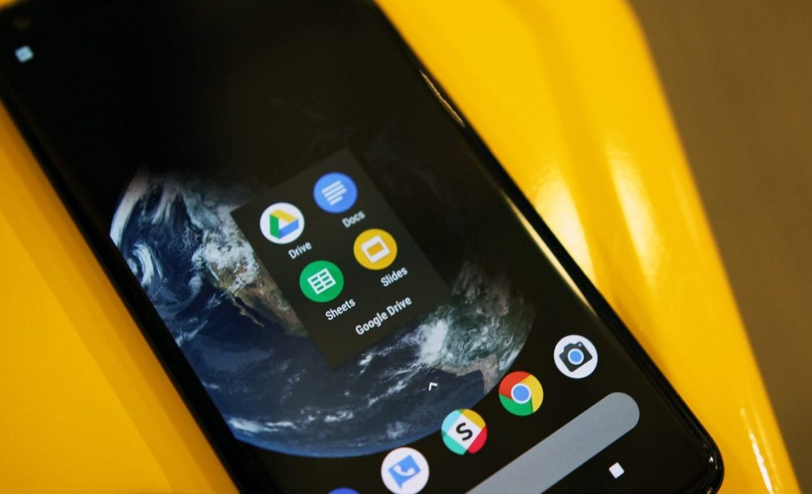
Google Drive on the web was one of the very first services to get the Material Theme treatment in 2018, with the Android and iOS clients following this April. The homepages for Google Docs, Sheets, and Slides were updated in February, with a similar Google Material Theme revamp now available for the Android apps.
Like other Material Theme redesigns, app bars now lack color — blue for Docs, green for Sheets, or yellow for Slides. Accent theming does remain in the grid view alongside file names.
Google’s four-colored logo with Docs in Google Sans is centered instead. Search is right next to it with a folder icon to “Open from” Drive or device storage.
While Drive for Android still retains a navigation drawer, Google moved key functionality to the bottom bar. In Docs, Sheets, and Slides, that nav element goes mostly unchanged with Recent, Shared with me, Starred, Offline files, Trash, Notifications, Settings, and shortcut to open Google Drive.
The bottom-right corner features the multi-colored FAB with a tap revealing new Material Theme icons for “New document” and “Choose template,” which are also present in app shortcuts. The overflow menu next to a document opens a sheet with rounded corners.
In files, the app bar is similarly white and also merges with the system status bar for a very clean look. There is a splattering of new icons here, but it’s mostly unchanged. Even on the web, the Material Theme editor is only a facelift that does not greatly impact underlying functionality.
Overall, the Google Material Theme for Docs, Sheets, and Slides brings some needed consistency across different platforms. It first appeared in early June, and now appears to be rolling out with version 1.19.312.02.40 of Google Docs, Sheets , and Slides. These three updates should now be widely available via the Play Store.
Author:
Source: 9TO5Google
Tags:


