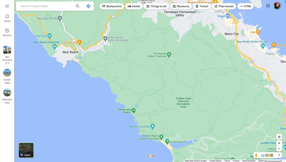
Compared to Maps for Android and iOS, Google makes relatively few visual updates to the Maps website. Google Maps is now testing a sidebar on the web that provides convenient access to recently viewed places.
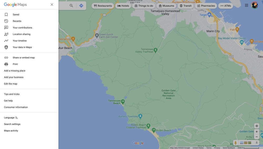
For some, Google Maps on the web now sports a navigation rail on the left edge that features a hamburger button that opens the same drawer as before and two tabs that open your list of “Saved” places and “Recents.”
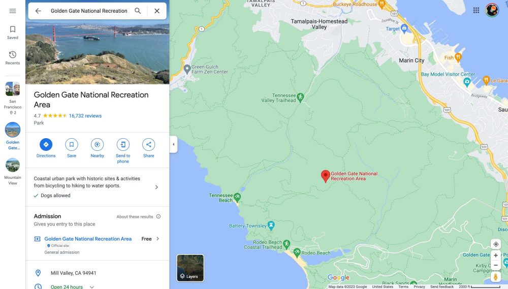
What’s even more convenient is how recently viewed places — including locations and cities — will also appear in the sidebar. It allows you to quickly go back to a place without having to search and sift through previous results.
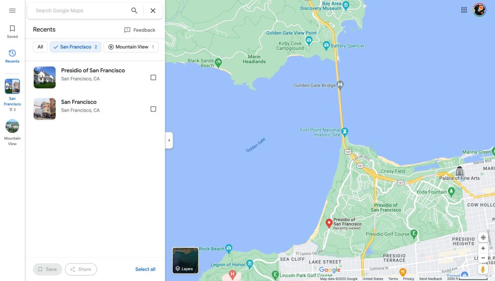
Individual locations immediately open and take you to the full listing. However, Google Maps will group together places in the same city, and clicking one opens up a side panel list. There’s an almost chat head-like manner to this approach, allowing quick multitasking/switching between places.


This is a very good use of the extra screen real estate afforded by the web on laptops/desktops. The sidebar is better than having multiple tabs with Google Maps open. It would be a great addition to the mobile apps on Android tablets and iPads.
At the moment, this Google Maps sidebar is not widely rolled out and only appears on one of our signed-in accounts. The change makes location planning on the web meaningfully better than on mobile, and it’s rather exciting to see new large-screen UI ideas from Google.
More on Google Maps:
- Comment: Is Immersive View how you want to use Google Maps?
- Google’s Travel website to stop creating trip summaries
- You can finally open Google Maps on your phone while Android Auto is running
- Google Maps adds background blurring when viewing photos
Author: Abner Li
Source: 9TO5Google


