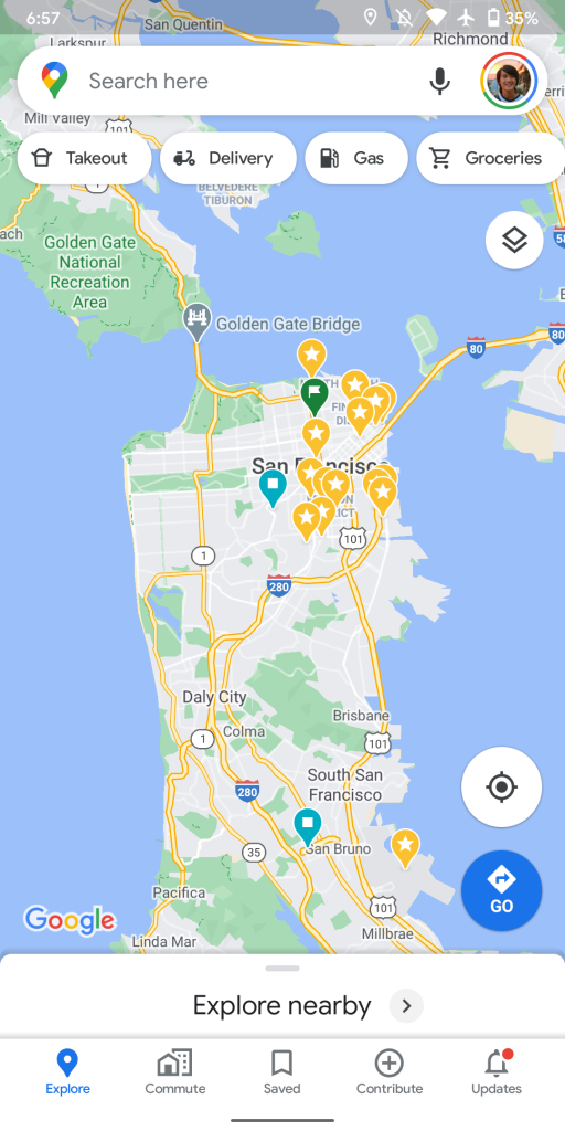
Google gave Maps on mobile a big revamp earlier this year. Like all other first-party apps, the design is always being tweaked and Google Maps for Android now features a pill-shaped search field.
The search field at the top of Google Maps for Android has long been a rectangle with rounded corners. With February’s bottom bar-focused revamp, the hamburger menu for the navigation drawer was removed.
Google Maps now has a pill-shaped search bar that features the four-color pin icon at the left. There’s a “Search here” hint and a gray microphone icon, while your rounded profile avatar fits rights in at the edge.
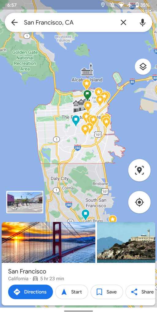
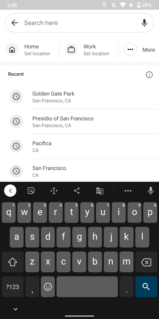
This pill is present in the full search interface, though without the corner branding. Google has not updated the two (or more) fields for directions. Otherwise, it fits with the multitude of similarly-shaped buttons and rounded sheets throughout the current UI.
The rounded Google Maps search field first rolled out to iOS. It’s appeared on and off for Android users in recent weeks, but is seeing a wider rollout on the stable and beta channels this evening. It’s clear that this is not an A/B test, and hopefully maps.google.com also gets updated.
More about Google Maps:
- Google Maps for Apple Watch is now available on the App Store
- Android 11 Pixel Feature Drop brings AR location sharing in Google Maps Live View
- Maps readying app-wide dark mode on Android [APK Insight]
- Google Maps ETAs prioritizing recent traffic patterns as DeepMind AI improves predictions
- You can now pay for parking directly in Google Maps, starting in Austin
Author: Abner Li
Source: 9TO5Google


