With travel currently feeling more like a necessity rather than something you do for fun, you’re probably not using Google Maps as much as you did previously. However, it looks like the Google Maps app on Android is testing a UI refresh for the route option section.
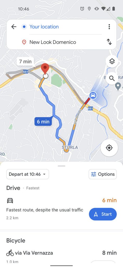
Should you fire up Google Maps and want directions to or from a location, you may be lucky enough to see a new route option UI. The change doesn’t appear to be widely available but was spotted by the team over at XDA, with the map view being less obscured by portions of the traditional UI.
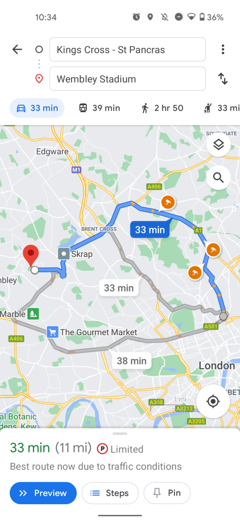
You can see from the images below that there are some tweaks to the start and destination input top bar, which now floats above the wider map view. Transportation options look to have moved too – no longer are they attached to the route option portion at the top of your Google Maps window:
-

New route option UI -

Current route option UI
Each transportation mode — from bicycle to taxi — is now found in a scrollable list within the bottom half of your display. This might make it easier to reach on larger displays, but it’s a big change that, at least on first inspection, feels a little convoluted. There is also a new “Options” button from within this bottom bar that will likely allow you to change route stipulations and toll roads, etc.
This new route option UI is not exactly widely rolled out and is likely only being tested with certain Google Maps users out there. It certainly looks a lot cleaner, but the current implementation isn’t exactly difficult to use or understand. Let us know down in the comments section below what you think of this potential change.
- Google Maps Street View gets split screen UI on Android
- [Update: Now rolled out] Google Maps adding more details to streets, starting in 4 cities
- Google Maps on Android Automotive gets better at planning EV charging stops
Author: Damien Wilde
Source: 9TO5Google


