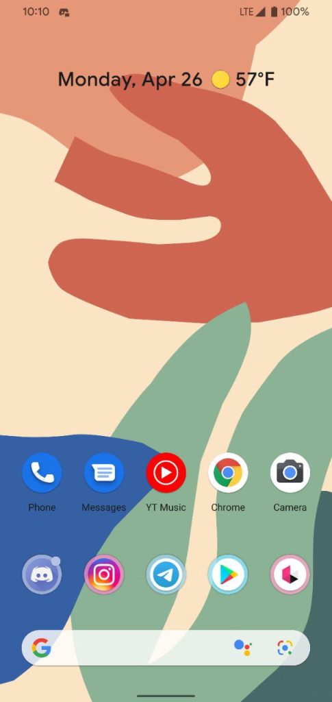
Google Lens has begun to appear in the Pixel Launcher’s search bar side-by-side with the Google Assistant, in a new test.
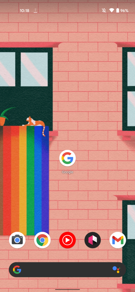
For the last few years, the Google Search bar on the Pixel Launcher has had a fairly consistent design, offering the ability to quickly search or activate the Google Assistant. This search bar’s “G” has also served as a fun additional surface for artwork and animations related to a particular day’s Google Doodle.
As spotted today by one of our readers, Google is testing a new design tweak for the Pixel Launcher search bar, adding the (older) Lens logo to the right of the button used to launch the Assistant. As you would expect, tapping this button launches directly into the Google Lens app, just like the similar Lens button in the Google Search app’s main search bar.
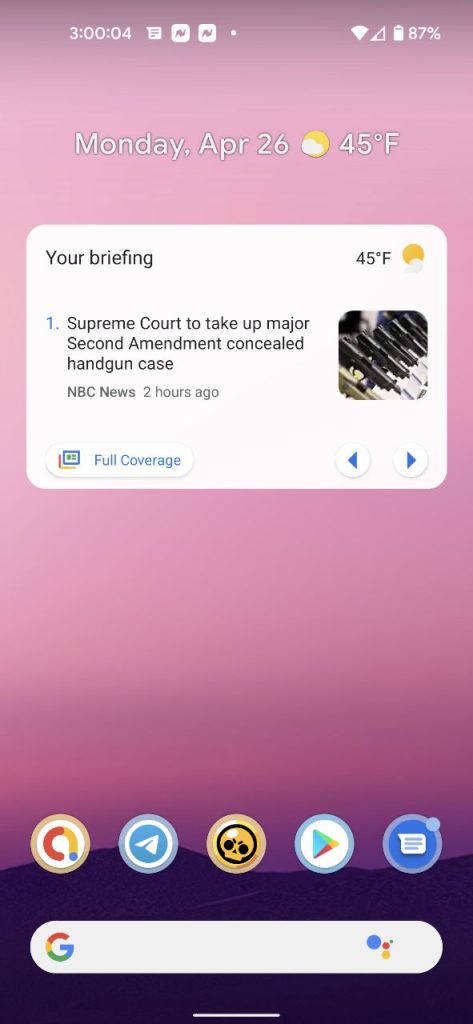
Ahead of the redesign’s launch, some had been noticing that the Assistant button in the search bar was seemingly not in the correct spot, appearing too far to the left, as seen below.
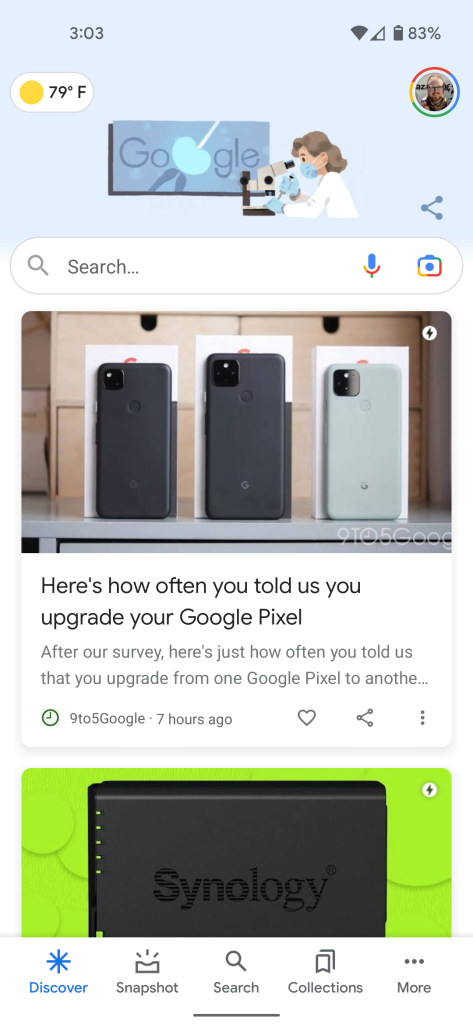
So far, we’ve only confirmed the new design to appear on a device running the Android 12 Developer Preview, but it’s possible it could be arriving for all Pixel devices soon. One argument in favor of it being an Android 12 feature is that the Google app is already testing a redesigned header for the Pixel Launcher’s Discover feed, exclusive to Android 12.
This is just one more step in Google’s process of integrating Lens deeper into Android, particularly on Pixels. Most recently, a Lens-powered “Translate” option has begun to appear both in Android 11’s screenshot UI and Android 12’s Recent Apps view.
Is this new design tweak for the Pixel Launcher available on your device? If so, let us know down in the comments which device you’re on, and whether or not you’ve upgraded to the Android 12 Developer Preview.
Thanks Dee and Michael!
Author: Kyle Bradshaw
Source: 9TO5Google


