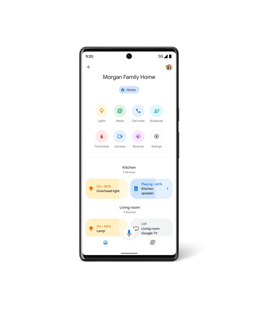
After updating the primary tab with interactive device toggles inspired by Android 11, the Google Home app wants to redesign the “Feed” to be more useful.
The Google Home app consists of two main tabs. There’s the “Home View” with a list of all your devices laid out in a grid that Google just updated to allow for quicker actions. Next to it is the “Home Feed” tab that’s meant to show alerts from your smart devices.
These “Priority events” include Home & Away changes and other updates, like the recent one to Speak Group functionality. Underneath that is a “Recent events” section, while a few promotional “Discover” cards round everything out.
Google this month will redesign the Home Feed to “help you better understand what’s happening in and around your home.”
The update automatically sorts your home’s recent and most important events in an updated clutter free layout. Grouped events will help you understand what happened around the same time instead of scrolling through a list of repetitive events.
There looks to be much less scrolling with a new card design that immediately identifies the type of alert at the left. Each notification includes the name, time, and what room the device originates in. Camera cards are accompanied by images, while each has an overflow menu. Lastly, there’s a “History” shortcut at the top-left of the feed to see everything.
This should be available in the coming weeks, while version 2.49 with the Home View redesign is not yet widely rolled out for Android via Google Play.
More on Google Home:
- Home Essentials: SimpliSafe fills the security need Nest abandoned, for a cost
- Google Home app getting centralized Privacy settings
- Google Home rolling out redesigned device grid for fast volume, brightness adjustments
Author: Abner Li
Source: 9TO5Google


