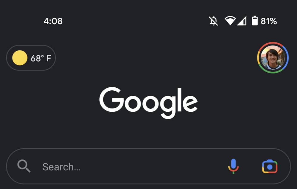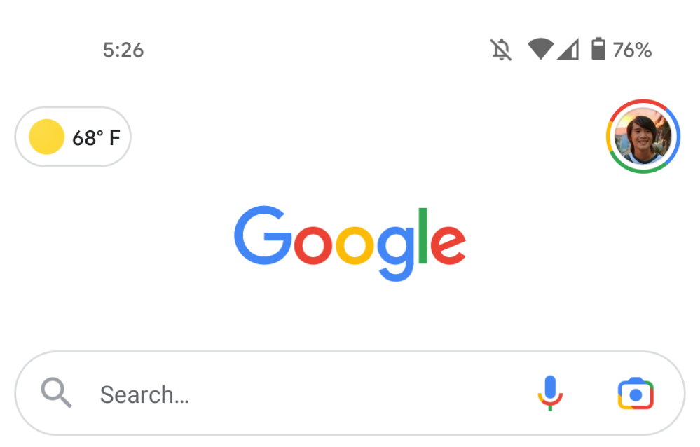
Since it was announced in 2017, Google’s visual search tool has seen two (live) logos. Google Lens is now getting a third logo that better reflects how it’s a camera for looking up things in the real world.
The new Google Lens logo is rectangular and shaped like a dedicated, single-purpose camera. Blue, which encompasses the center lens, top-left corner, and viewfinder/flash, is the most dominant color. Red is next and yellow follows with only a smidgen of green (again).
In January, the updated icon was an “experiment to see if we can better communicate that tapping that button will open the camera.” The last two versions were just rounded, minimalist squares that weren’t as explicit.
This new Lens logo is now live in the Google app on Android for beta users — force stop from App info if it doesn’t appear on your device yet. The homescreen icon, which is a separate app in the Play Store, and Google Photos have yet to be updated, along with the Assistant, camera apps, and Image Search integrations.
This design harkens back to the version that was used for the onstage unveiling of Lens at I/O 2017, and the Pixel 2’s retail packaging. Google also briefly trailed another ‘G’ icon last year in Photos before deciding on this one.


More about Google Lens:
- Google’s Lens AR lead departs to become chief product officer at Robinhood
- Lens for Android gets built-in gallery to quickly pull up screenshots
- Google Lens for Android rolling out offline translate capability
- Google Lens passes 500 million installs on the Play Store
Author: Abner Li
Source: 9TO5Google


