Lens closed out last year with a Pixel Camera-inspired redesign and more shortcuts in other apps to launch the visual search tool. Google is now testing a new Lens icon that better communicates its functionality.
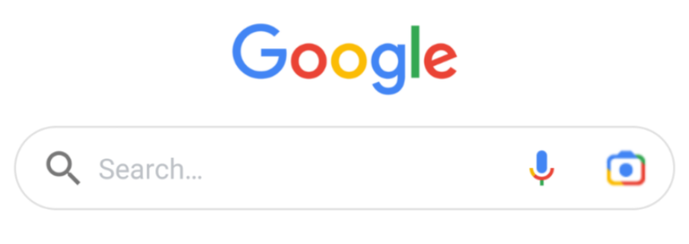
As spotted by Android Police, the new Lens icon was spotted at the top of Google app in the search field. This placement, which appears next to the microphone icon, was introduced to Android in October. The shortcut has been on iOS for quite sometime now.
Instead of a rounded square, this logo is rectangular and shaped like a DSLR. Still comprised of four colors, blue is the most dominant one taking the lens, top-left corner, and viewfinder. Green remains the least prominent at the top-right position.
This change is not widely rolled out today, and Google’s Rajan Patel said it was just an “experiment to see if we can better communicate that tapping that button will open the camera. Seems to be doing well!”

Google is looking to increase the usage of Lens. Today, it’s available in Assistant, Photos, camera apps, Search (Images), and Chrome when holding down on a picture. Its placement in the Google app is already prominent, but the company wants to increase the tool’s obviousness.
Lens has officially had two icons in its life. That said, when it was announced on stage in 2017, the company had a rectangular version that’s not too different from what’s being tested today. In fact, that variant also appeared on the Pixel 2 and 2 XL’s retail packaging — the first phones with Lens.
In software, the icon has always been a rounded square. In 2019, Google made it less blocky with rounded corners and visual separation to look more like a viewfinder than a square camera. The company also briefly trailed another icon last year.


Author: Abner Li
Source: 9TO5Google


