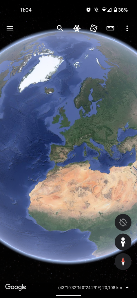
The past few years has seen a shift to dark themes on many of the most popular mobile applications all working directly with on-device system themes, the latest being that of Google Earth.
Dark themes have become a big deal in part due to the ability to toggle the mode officially in Android 10 onwards. The downside is that not every developer is quick to add the option for those that prefer not to have their eyes seared with bright UI elements and backgrounds.
Google hasn’t been the fastest to give all of their first-party apps access to a darkened UI, but finally, the firm has officially announced that Google Earth has a dark theme. The option is available across mobile and desktop too, meaning you can head to earth.google.com and not be met with bright white side menus and UI elements.
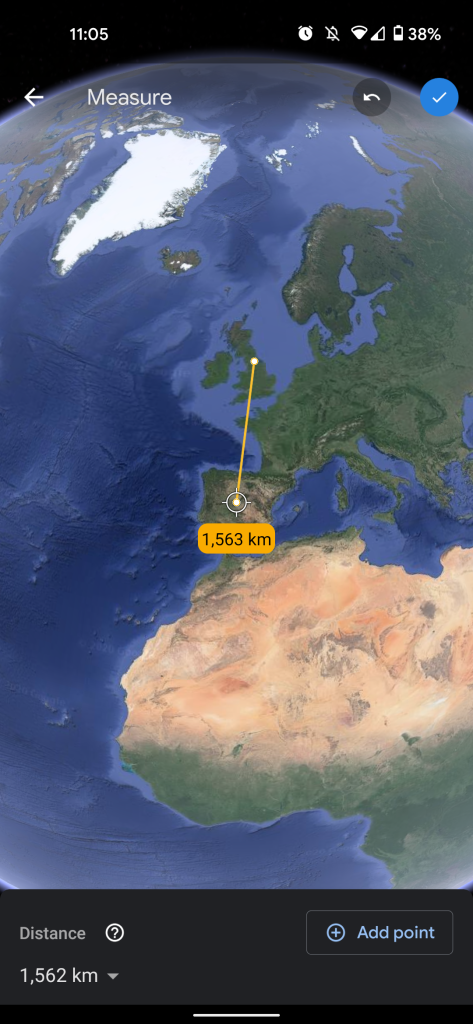
Google Earth is happy to announce two new features that will add more functionality and usability to the web and mobile offerings through a better understanding of your locational accuracy and the ability to switch between light and dark modes.
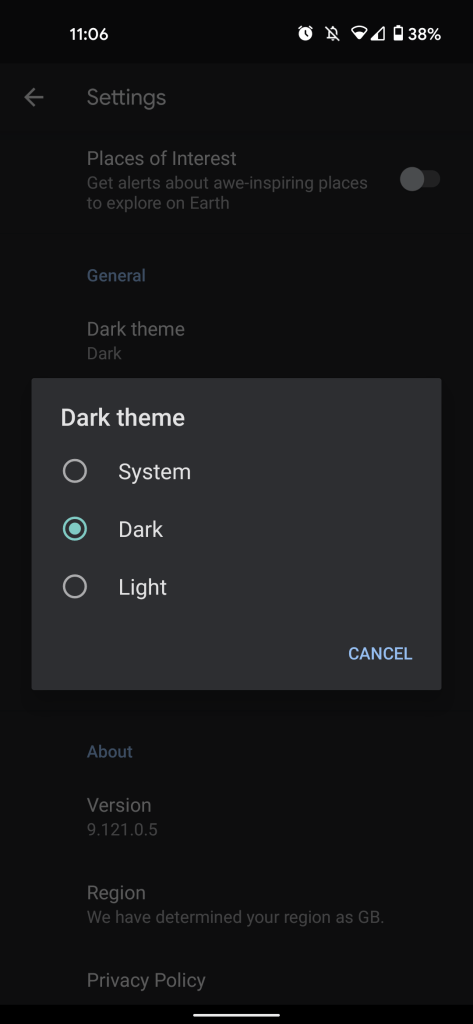
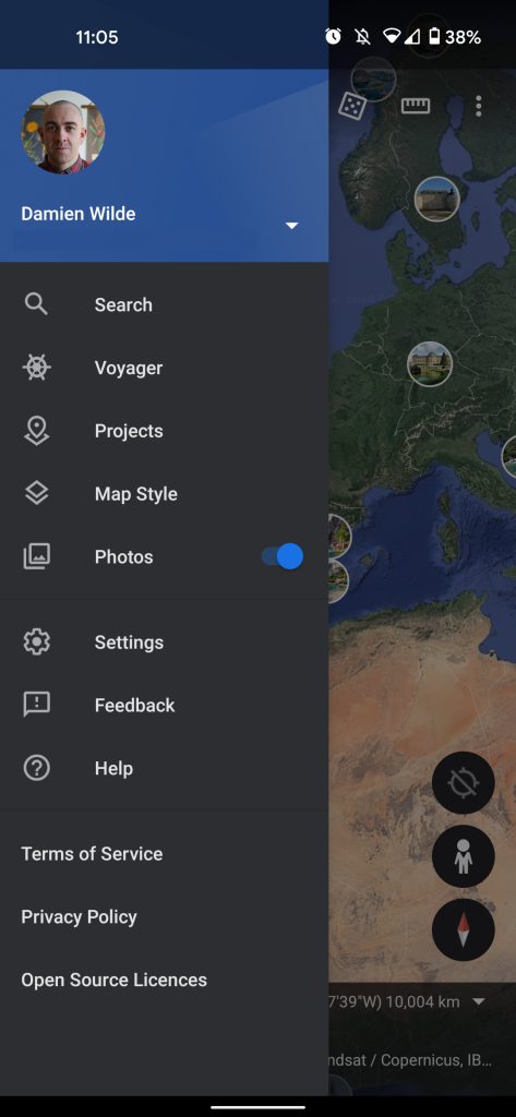
On mobile, you’ll need to activate the mode by heading into Settings > General > Dark theme. There is an option to choose to have the Google Earth respect your device System theme, but in our testing so far it doesn’t seem to work as expected — hence needing to activate manually. We’re not sure if this is just a mini-bug that will be squashed as trying to activate this way didn’t work when first updating.
At least with this new Google Earth dark theme option, you can virtually traverse the planet until the small hours without blinding yourself.
- These are the best smartwatches for Android [Late 2020]
- You can now search Google Assistant settings on Android as Routines UI tests tweaks
- Google Messages for Web picks up in-line emoji reactions, months after Android
Author: Damien Wilde
Source: 9TO5Google


