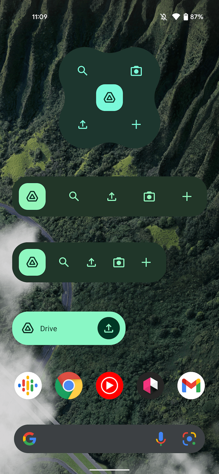
Last week, Google announced that Material You is actively rolling out to the key Workspace apps on Android, including Drive. The Google Drive redesign also brings along new widgets including a quirky and large X-shaped one.
Google Drive’s redesign is fairly straightforward with a tall bottom bar that makes use of pill-shaped indicators to highlight the current tab you’re viewing. Since the application is list and text-heavy, the larger size helps better distinguish the navigation element.
Meanwhile, there’s a pill-shaped search field up top, rounded square FAB in the bottom-right corner, and Dynamic Color for tab indicators and the light background.
Google Drive also introduces Material You widgets. The main update is to “Drive quick actions,” where you can search, take a picture for OCR, upload, and create a new doc. The smallest 3×1 size is just a shortcut to open the app and upload with a lighter Dynamic Color palette leveraged. Going one or two increments wider shows all the available actions and switches to a darker shade.


Going to at least 2×3 shows the bulbous X-shaped widget where buttons are placed in the corners around a rounded square in that the app. We’ve previously seen this widget design for Keep and it makes sense why other action-heavy Workspace apps are adopting.
Material You in Google Drive is rolling out now via the Play Store with version 2.21.330.x, but 2.21.357.x is required to get all four widget sizes/variants.
More Material You:
- Google Photos rolling out Material You redesign, but without Dynamic Color
- Google Keep is next in line for a Material You update, coming later this month
- Here’s an early look at YouTube Music’s upcoming Material You widget [Gallery]
- Google Translate for Android prepares for Material You as its first major redesign in years [Gallery]
Thanks Jondan!
Author: Abner Li
Source: 9TO5Google


