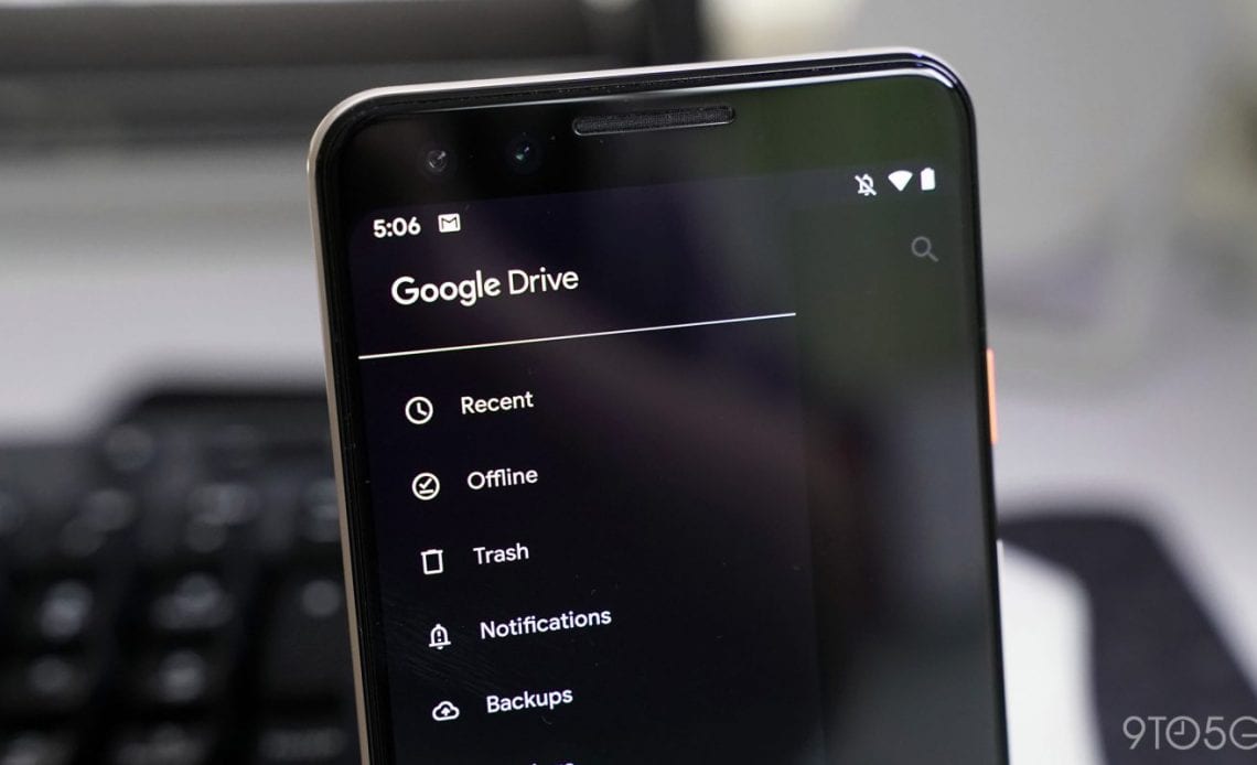
Google Drive for Android’s dark theme began appearing for some users with the Material Theme redesign in April. Thanks to a new theme setting, it’s now more widely available for users not running Android 10.
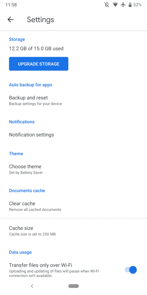
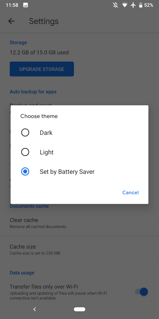
In Settings, there is a new “Choose theme” menu that presents the three standard options for Android apps: Dark, Light, and Set by Battery Saver. It’s set to the latter by default, but users now have the ability to manually enable the darker look.
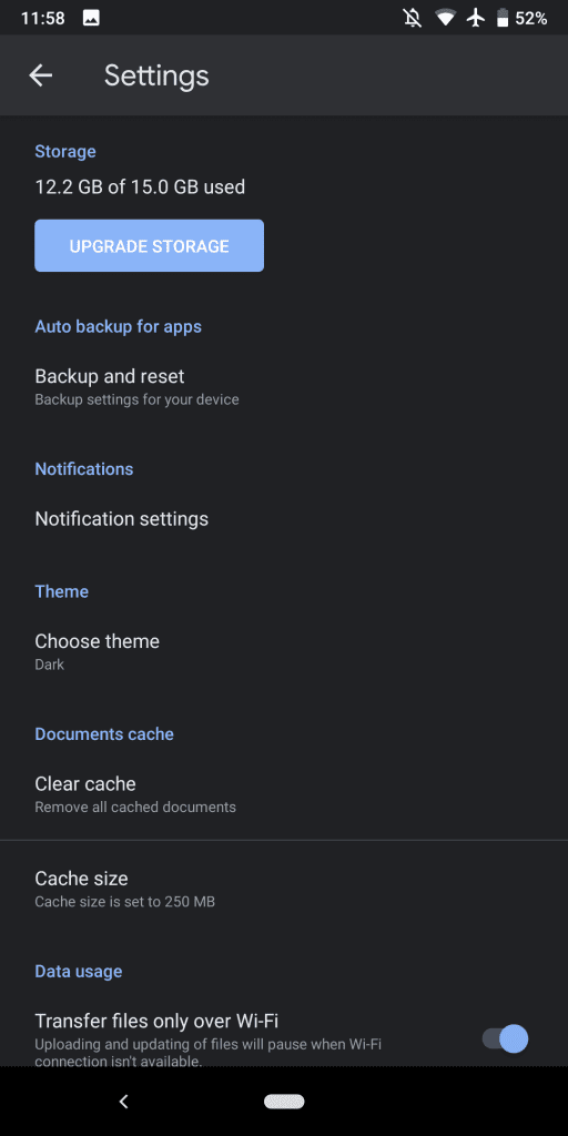
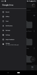
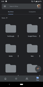
The Google Drive dark theme is quite straightforward and switches the stark white background to a deep gray. Lighter shades are used for the search field, while the bottom bar retains its transparency. A softer blue accent color is also used throughout, with icons for file types getting the same lighter treatment. The “Home” feed is still quite bright due to document previews.
The standalone Android clients for Google Docs, Sheets, and Slides have yet to be updated with a dark theme at this point, and only gained their Material Theme revamps last month. Hopefully, a darker look is in the works and that it won’t take four months.
Google Drive’s dark theme setting has been slowly rolling out over the past several weeks. It should be widely available with version 2.19.332.01.40 or later, and comes following Android 10’s launch on Pixel devices yesterday.
Author:
Source: 9TO5Google


