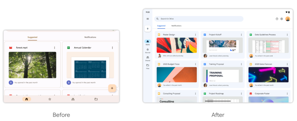
To help those getting work done with an Android tablet, Google is rolling out a large-screen redesign of Google Drive, complete with a navigation rail.
Announced on the official Workspace Updates blog, those with workspace accounts enrolled for “Rapid Release” should soon see a new look for Google Drive on Android tablets. Most notably, the redesign ditches the bottom navigation bar in favor of a side-mounted navigation rail.
In addition to the usual tabs (such as Home, Starred, Shared, and Files), the rail now also contains the “plus” FAB for creating new files/folders, as well as a button to expand/collapse the drawer. As part of the change, the top search bar no longer uses the full width of the screen, while buttons for help, settings, and your profile have been added to the top-right corner. Below that search bar, the tabs for things like “Suggested” files and “Notifications” now take up much less space.
Broadly speaking, this new design for Google Drive seems well-optimized for making the most of the additional screen real estate of an Android tablet. As shown in Google’s provided side-by-side example, more individual files and controls can be seen on-screen while remaining relatively uncluttered.

For those not enrolled for Rapid Release, this tablet-ready design of Google Drive should arrive to more Android users starting on April 3.
The redesign arrives on the heels of Google Drive, Docs, Sheets, and Slides web apps all getting a new coat of paint by way of Material You. Between an increased emphasis on larger screens and the recent series of Material You upgrades, Google has been pouring a significant amount of design work into its man Workspace apps, a trend we hope will continue.
Author: Kyle Bradshaw
Source: 9TO5Google


