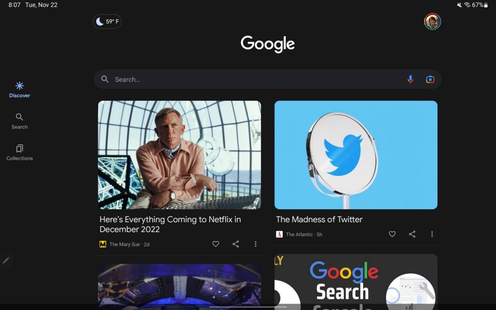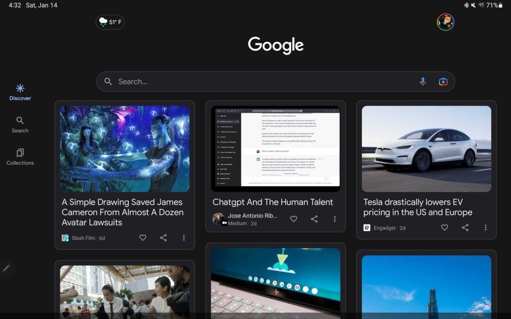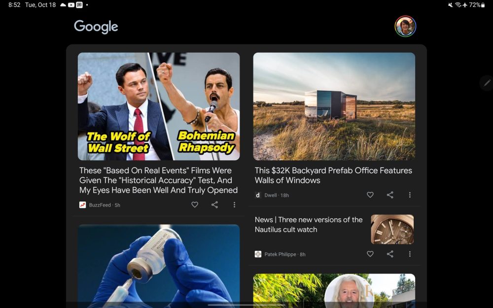
Google has been optimizing its first-party apps with large-screen optimizations since I/O 2022 and that’s expected to culminate with the Pixel Tablet. The latest update is a three-column UI for Google Discover on tablets.
We’ve already shown how Google is updating Assistant and Discover for the Pixel Tablet. The latter change is already rolling out to existing tablets, including Samsung’s Tab S8 with Google app 14.2.7.26 (current beta).
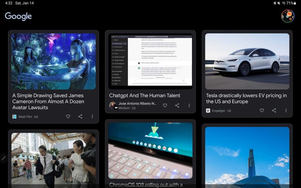
Instead of just two columns of articles, Google Discover now has a third that makes the feed go edge-to-edge. The fullscreen effect is particularly prominent to the left of your homescreen with a black background, while the Google logo and your profile avatar are moved to the top corners.
Meanwhile, the navigation rail in the Google app looks much better without the empty space. We’re still waiting for that side element to switch to the Material You style.


As part of this three-column change, Google now places all articles in cards with faint outlines, while cover images get smaller. The width is identical, but height differs from row-to-row. This is also the case in portrait orientation, though you stick to two columns.
On the Pixel Tablet, Google is expected to add rows of media suggestions that are “From your apps,” like Google TV, as part of a leanback experience and a color background.
More Google tablet apps:
- Here’s what it’ll be like to use the Google Pixel Tablet [Video]
- Android 13 QPR2 is changing how the taskbar works
- Pixel Tablet readies new designs for Google Assistant and Discover [Gallery]
- Google Pixel Tablet and speaker dock prototypes leak on Facebook Marketplace [Gallery]
Add 9to5Google to your Google News feed.
google-news
Author: Abner Li
Source: 9TO5Google


