Alongside web articles, YouTube videos, and Web Stories, advertising frequently appears in the Google feed available to the left of most Android homescreens. Google Discover is now getting a new ads slideshow format that automatically moves you to the next image.
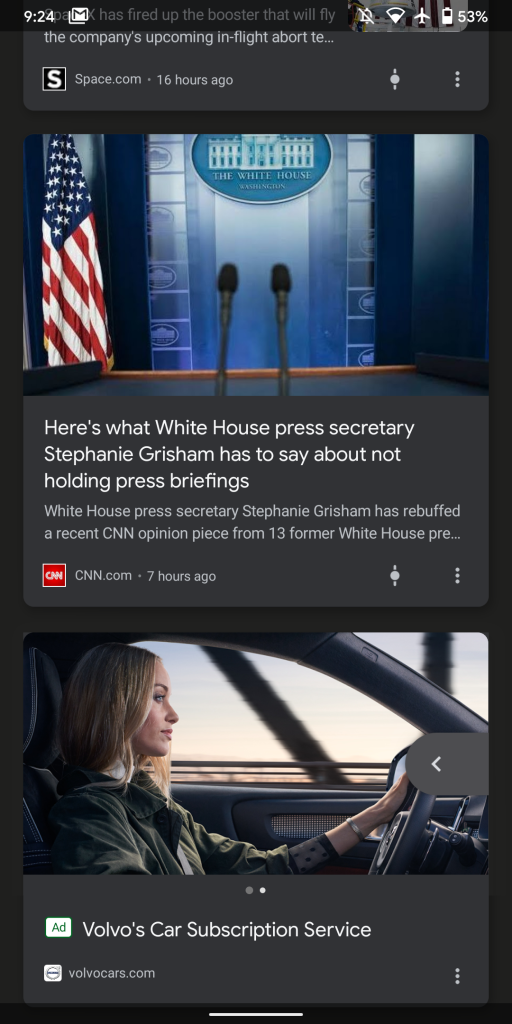
This Google app feed today is home to a number of Discovery ad formats, with the most basic being a landscape cover image followed by a caption. One variant of this leverages a portrait picture that makes for a very tall (and noticeable) card.
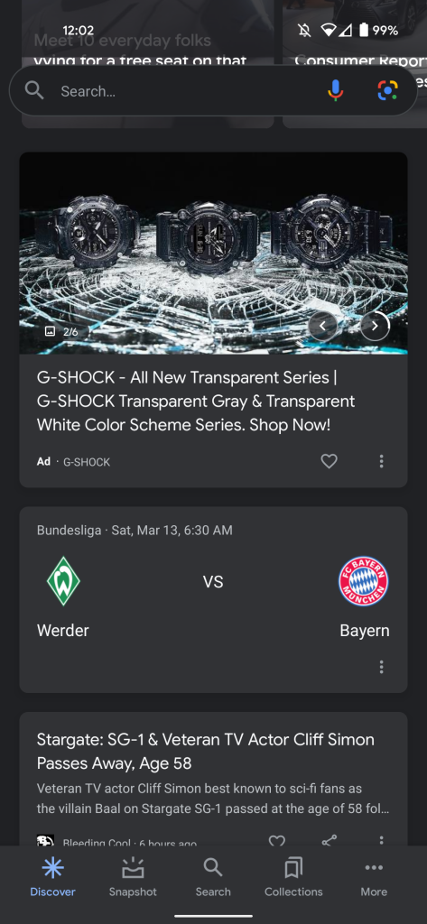
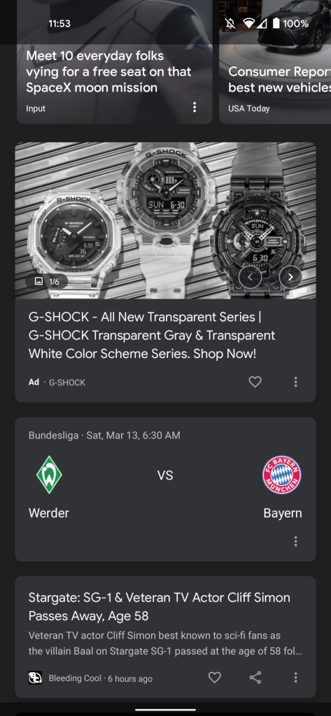
There are also carousels that show multiple images and require you to swipe through photos. However, this format does not work particularly when viewed on the homescreen, as it’s easy to accidentally swipe out of Discover. It’s also not immediately obvious that there are multiple images.
Google’s solution to that looks to be a new carousel type where images automatically advance after a few seconds and do so until completion. There’s a story-like aspect to this ads slideshow approach in Google Discover, with users able to manually tap in the bottom-right corner to move through as a count is shown in the other corner.
More about Google Discover:
- Discover starts surfacing YouTube content in ‘Short videos’ carousel
- Google surfacing lightweight HTML5 games in Discover, Chrome around the world
- Google Discover tests marking each article with hashtags
- Google Discover feed gains ‘What to watch’ and beauty, apparel recommendations
Author: Abner Li
Source: 9TO5Google


