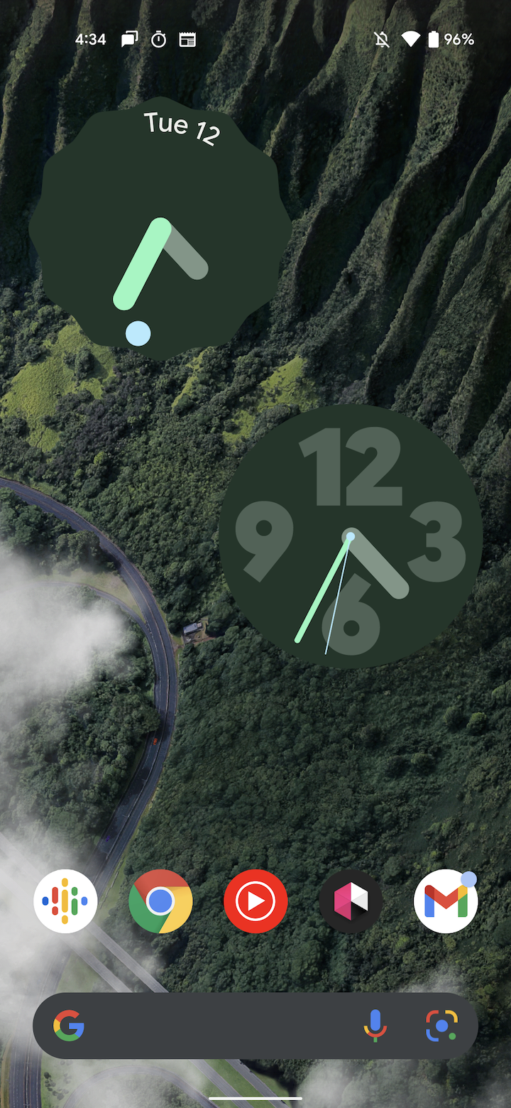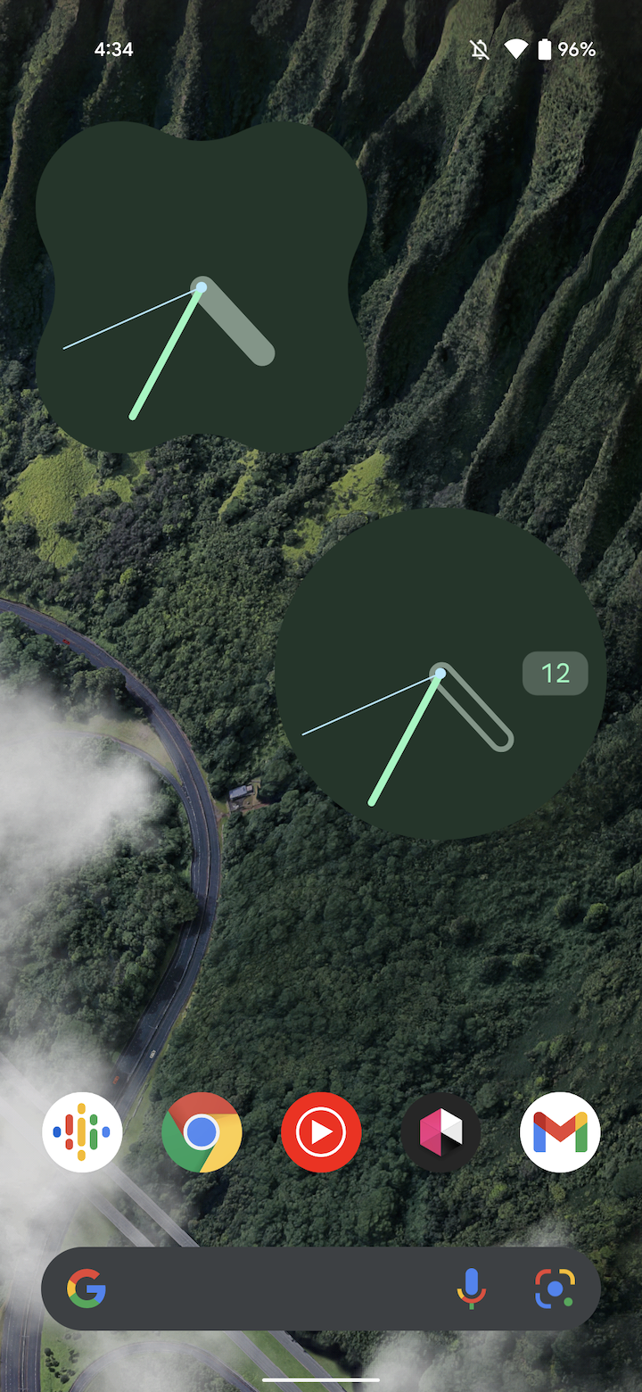
With Android 12 Beta 5 last month, Google introduced Material You clock widgets. An update to Google Clock is rolling out today with a brand new widget and a grand total of five clock styles to choose from.
After placing a widget, you’ll be able to select from different “clock styles.” For example, “Analog” offers:
- Scallop: Like the original, it retains a scalloped perimeter, but with the weekday and date now appearing (and rotating) opposite the seconds dot
- Numeral: There are 12/3/6/9 markers that are somewhat reminiscent of the Nike Apple Watch face, but commonly found in mechanical watches (Explorer)
- Day: A date window at the 3 o’clock position, while the hour hand is just an outline
- Clover: X-shaped widget already used for Quick Capture/Actions by Keep and Drive
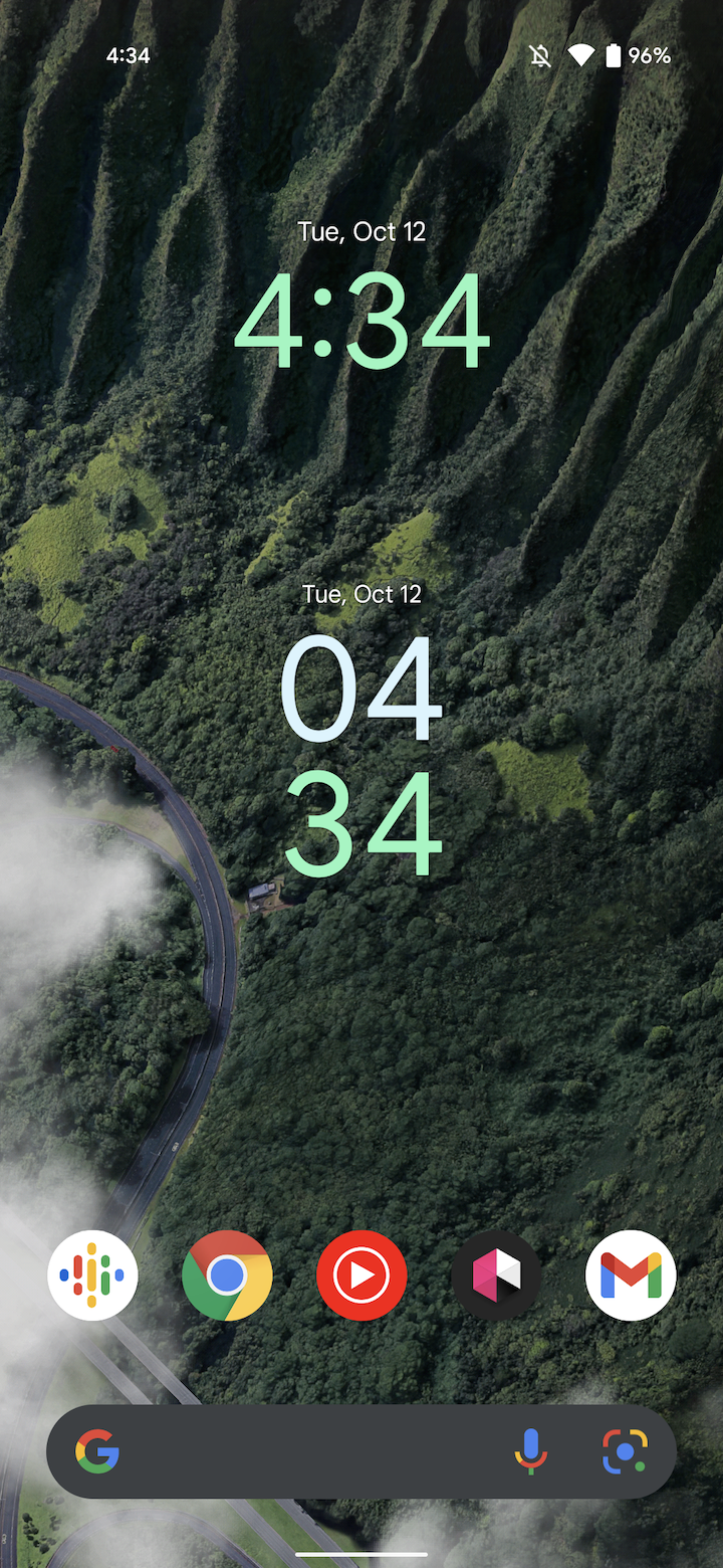
Similarly, Digital, Stacked, and World now offer a “Transparent” style (versus “Solid”) where there is no hued background so users can see their wallpaper. Long-pressing on a widget reveals a pencil icon in the bottom-right corner to quickly edit the style.


“Stopwatch” is now Google Clock’s fifth widget. It takes after YouTube Music’s most recent addition with the ability to start/stop in the bottom-left, while you can quickly start a new lap or restart. It’s pretty useful and lets you skip the notification.
Clock 7.0 – with a Material You redesign – first appeared with Android 12 Beta 5. Version 7.1 of Google Clock is rolling out now via the Play Store with these additional Material You widgets, though it’s not widely available yet.
More Material You:
- Material You shows Google finally has a company-wide vision that spans Pixel 6 to Workspace
- Clock for Wear OS looks to be getting a Material You redesign [Gallery]
- Google starts rolling out Play Store Material You redesign, but it only scratches the surface
- Material You rolling out to Google Messages [Update: Wide Dynamic Color availability]
Author: Abner Li
Source: 9TO5Google


