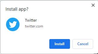
In Chrome, both on desktop and mobile, Progressive Web Apps are becoming more common among certain websites. The current look on Chrome for desktop is very basic and doesn’t provide much information for users prompted to install a website’s PWA. That looks to be changing in the future with Chrome for desktop testing a new dialog box for PWAs.
Over the past few years, experimentation has progressed with how PWAs are installed on devices. If a site wants you to install its Progressive Web App, you’ll see a dialog box appear somewhere on your screen. Chrome for Android has been making adjustments over the past year or so, making it easier for the user to understand exactly what is being installed.
Currently, PWAs on Chrome for desktop look rather fundamental. No information is really given other than the name of the app and an icon to the left. Fortunately, it looks like a change is in the works.
Chrome Canary has a hidden feature that will change how the dialog box is portrayed when displaying a PWA installation request (via Techdows). In Canary, PWAs will appear with not only the icon of the app and the name itself but a full description of what the app is.

For instance, Twitter’s PWA dialog box states the purpose of the Twitter web app, giving a reasonable description of what Twitter is. Below that, users are given two options – install or cancel. This is definitely an improved look into PWAs on desktop going forward.
The core function of Chrome’s PWAs doesn’t seem to have changed. The dialog box is the only adjustment seen so far. As far as when we’re likely to see this implementation of the new dialog box, we’re uncertain. It’s likely the new dialog box style will be in the works for a while longer.

More on Google Chrome:
- Google Chrome set to expand translate options to include selected text, more languages
- Your laptop’s battery life may get a boost as Google Chrome looks to tone down background pages
- How to manage payment methods in your Google Account
Author: Andrew Romero
Source: 9TO5Google


