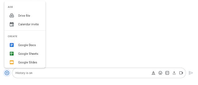
Google is making a text box/compose field tweak to the Chat mobile and web apps that sees the Workspace communication service look more like the consumer Messages client for SMS/RCS.
For the longest time, the Chat text box was a simple field with a row of buttons underneath to access various tools. Those Workspace integrations are now hidden by default with a pill-shaped field that’s flanked by a ‘plus’ icon in a circle and shortcuts for emoji and gallery, as well as the send button.
Tapping the first button brings up a sheet that offers access to: Photos (again), Camera, GIF, Meet link, Calendar invite, Drive, and Format. The text label accompanying each line is helpful and allows Google to add more integrations without being overwhelming. Meanwhile, the web version gets icons and better organization.
While you’re having a conversation in Google Chat, you can now more easily take actions in other Google Workspace products. Simply hover over the + icon to the start of the text box to quickly see and access the menu of options. These options vary by context, and can include Drive, Docs, Sheets, Slides, Photos, and Calendar.


That said, this design is nearly identical to Google Messages on Android. The uniformity is interesting and could be helpful for those that use both Google services. This new Chat text box will be available for all Google Workspace users in the coming weeks. It will first launch on Android and the web before coming to iOS in “early 2022.”

More on Google Chat:
- Chat in Gmail rolling out instant & link-free 1:1 Meet calls, similar to classic Hangouts
- Google Chat adding ‘mark as unread’ for DMs and Spaces
- Chat gets built-in GIF search on the web to replace bot lookup
- Google Chat PWA rolling out straightforward dark theme
Author: Abner Li
Source: 9TO5Google


