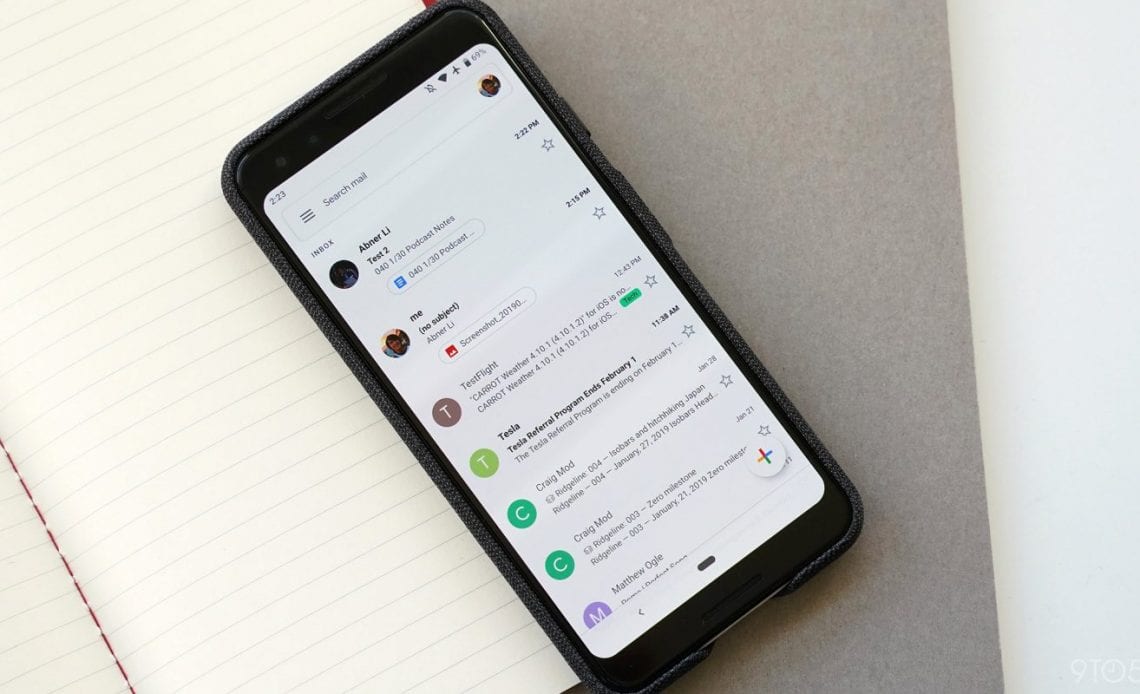
With its Material Theme update last year, Gmail for iOS added a very convenient gesture for switching accounts. After appearing on other Android apps over the past month, swipe-to-switch is now available in Gmail for Android.
Version 2019.08.18 (via ) of the Gmail Android client this evening lets users swipe on their Google Account avatar in the top-right corner of most screens. Swiping up or down works, with the profile icon featuring a fill-in animation while the rest of your default inbox loads.
Incredibly convenient, this UI element helps make the always-present avatar that identifies what account you’re using even more useful. A similar, but horizontal swiping action was available in the old navigation drawer account switcher, but the Material Theme equivalent is much more prevalent.
On Android, swipe-to-switch oddly first appeared in Google Maps and then Google Drive, while Google Contacts followed yesterday. The two latter appearances in productivity services makes more sense than the mapping/navigation client. With most users today having more than one email account, it fits naturally in Gmail.
This is the only change currently live in Gmail 2019.08.18, though a dark theme has been in-development for the past several releases. A partial darkened look appeared back in June, with strings in today’s update showing that work is still underway. It will presumably apply to the inbox view, but applying a dark mode in the body of emails is not that straightforward.
<string name=”prefs_general_theme_title”>Theme</string>
<string name=”view_cv_in_light_theme”>View in light theme</string>
Gmail for Android’s switch gesture is rolling out now via the Play Store with version 2019.08.18. It’s also available for sideloading from APK Mirror.
Author:
Source: 9TO5Google
Tags:


