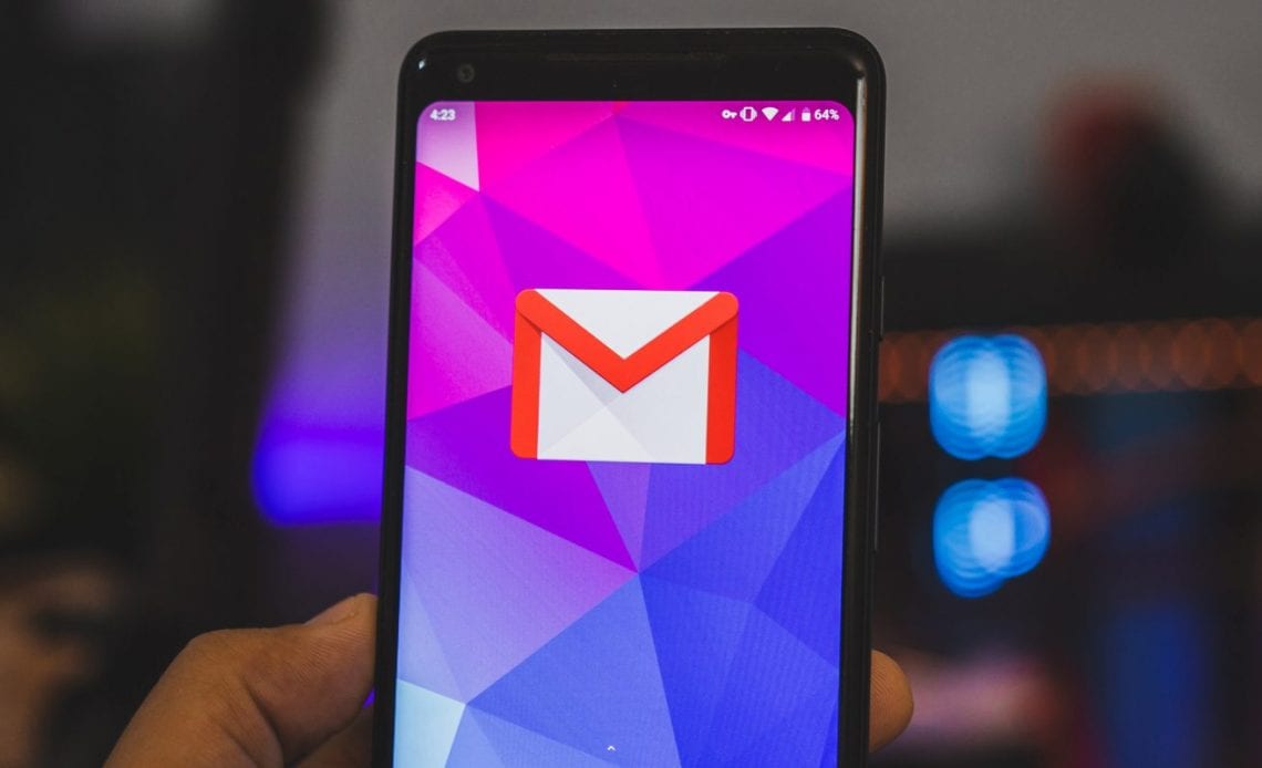
Following Android 10’s public launch last week, many users have been waiting for all of Google’s apps to offer darker looks. After a brief tease on Android.com, a dark theme is now rolling out to Gmail for Android today via a sever-side update.
Like other Google apps in recent months, there are three options in Gmail: Light, Dark, and System default. The dark theme is quite straightforward with the email client adopting a dark gray for the background and navigation drawer.
In that latter part of the UI, a red accent color is still leveraged to note what inbox you’re viewing. Other elements like the search bar use a lighter shade of gray to provide a better visual distinction.
Avatars, labels, and other colors in the inbox view have been appropriately tweaked to be less bright and more muted. A similar treatment is applied for all icons and buttons throughout the Android app.
Gmail’s dark theme also extends to the compose screen and messages. While the body of an email leverages white text, signatures can be harder to see.
Version 2019.08.18.267044774 of Gmail is required with that release now widely available via the Play Store today. However, the new “Theme” menu at the top of General settings is rolling out via a seperate server-side update.
More dark themes:
Author:
Source: 9TO5Google
Tags:


