
I hate to admit it, but I might have a new favorite phone. Samsung’s Galaxy Z Flip 4 is the latest version of the company’s smaller foldable and with this generation, the company has addressed most of our problems with the previous model. It’s delivered longer battery life, increased durability and a slightly more useful external display. With the same $1,000 starting price as before, the Z Flip 4 costs about the same as an iPhone 13 Pro and a Galaxy S22+, but can fold into a square that you can hide in your palm. It’s a supremely fun phone to use, thanks to the different modes you can set it up in. The Z Flip 4 isn’t perfect, but by improving its battery life, Samsung’s finally made a foldable phone that’s ready for the mainstream.
Design
One of the best things about the Flips is that you can fold them in half and easily stuff them in pockets, small bags or other tight spaces. As someone whose desk is chronically cluttered, I struggle to find a spot to place my gigantic Pixel 6 Pro, which, if not placed carefully on an even surface, would suicidally slide off a table and plunge to its death.
Pros
- It folds in half!
- Improved battery life
- Useful hands-free applications
Cons
- Low light photos could be better
- Lingering concerns over long-term durability
Thanks to its new matte finish, Flip 4 is not as slippery as its predecessor or the Pixel, so I was less afraid of putting it on top of keys or packs of snacks, for example. I’ve only dropped it once since I’ve had it, and so far, the case has survived without a scratch. And because the Flip is so small, I also had a much easier time finding somewhere to place it. On one occasion when I wore something with a particularly tight pocket, the Flip 4 still fit easily, though it was a bit uncomfortable. It still felt better than the iPhone 12 and Pixel 6 Pro that I regularly use, though, both of which peek out the top and make bending forward feel like I’d break the phone.
I’ve also been far less careful with my review unit of the Flip 4 than with prior foldables, tossing it into bags packed with keys and other hefty phones. I panicked for a second when I realized what I had done, because I still needed the phone to be in pristine condition for a photoshoot, but phew, the Gorilla Glass Victus+ covering on the Flip’s inside and outside has kept it scratch-free.
Many of the other changes the company made this year are less impactful. The smaller hinge, shinier edges and slightly sleeker lines make the new model look a little cleaner, and the external cameras protrude slightly more than before, but beyond those minuscule differences, it’s hard to tell the Flip 3 and 4 apart.
The easiest way for me to identify the Flip 4 is by its color. My sample is in Samsung’s “Bora Purple” hue, which is a nice lavender shade, but I prefer the blue version. When open, the two Flips are even harder to tell apart — the latest model is just a hair shorter.
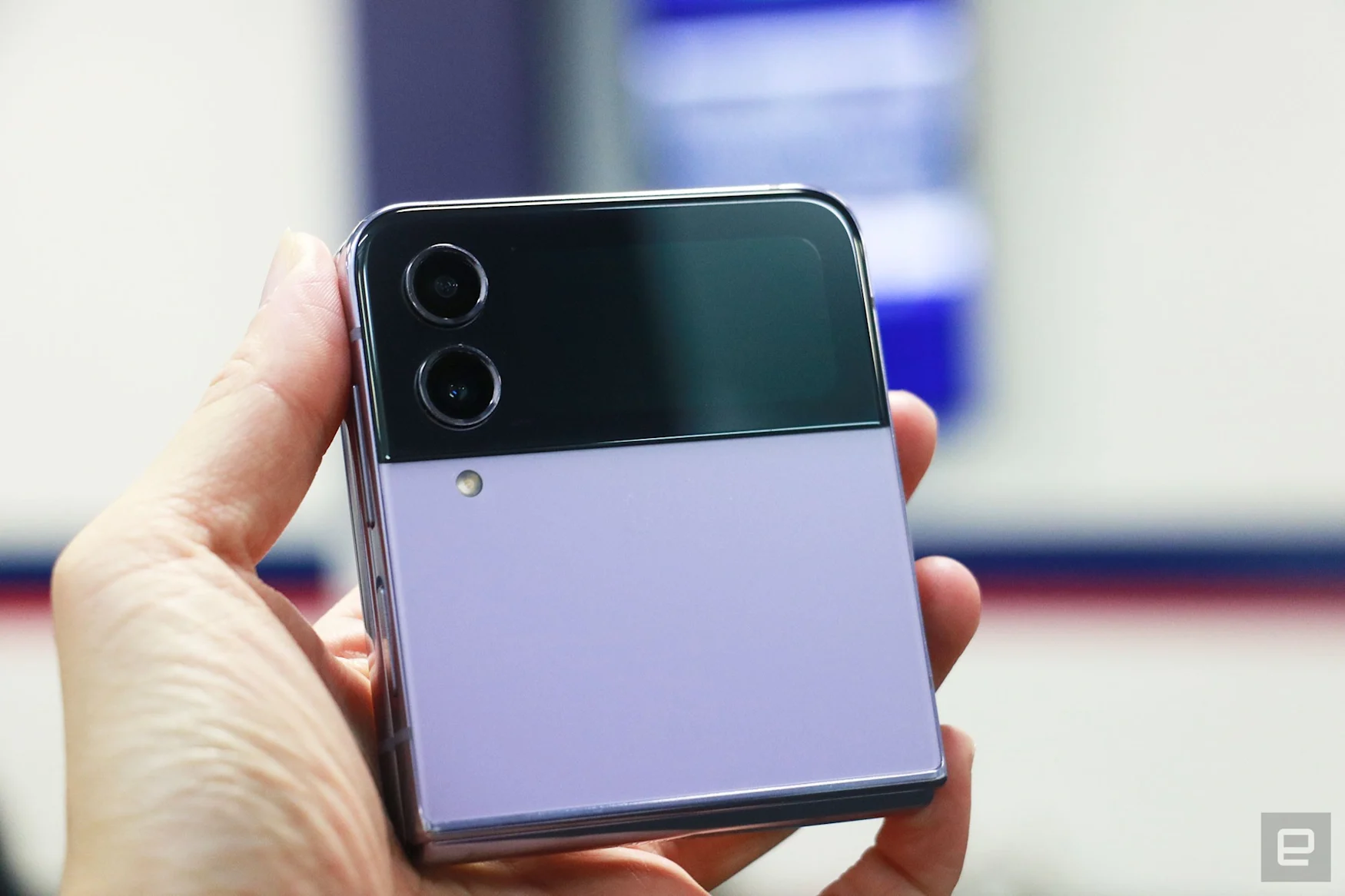
Both their hinges feel similarly sturdy, and I could still, with a lot of careful maneuvering, open and close the Flip with one hand. I even created a spot on my home screen for my thumb to push into the panel for leverage when shutting the device, and so far I haven’t felt like I might break the display.
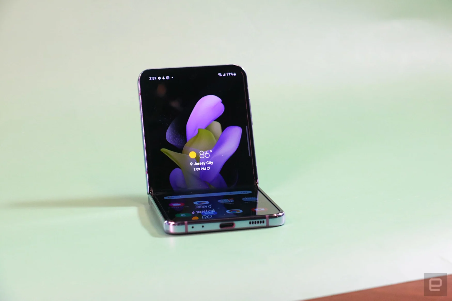
The Flip 4 still has a crease running across its display, but this time it seems shallower. It might just be because it’s new and over time it may get more prominent. But those hoping for a more minimal crease may be disappointed — it’s definitely still there and noticeable.
If you’re a fan of sensory experiences like I am, you might like to know that stroking this crease as you scroll long articles or Reddit posts still feels oddly satisfying. Running your finger up and down this depression feels like trying to massage a knot out of your back (except you don’t want to use nearly as much pressure). It’s not going to get in the way of your using the Flip, but if you’re into tendons it’ll just spice up the experience.
It’s hard to compare the Flip 4 to other phones because it’s the only viable one of its kind retailing in America. Still, it’s worth noting that at 187 grams (or 6.59 ounces), the Flip 4’s lighter than other $1,000 phones like the S22 Plus and the iPhone 13 Pro. It’s just 13 grams heavier than the iPhone 13.
Displays and audio
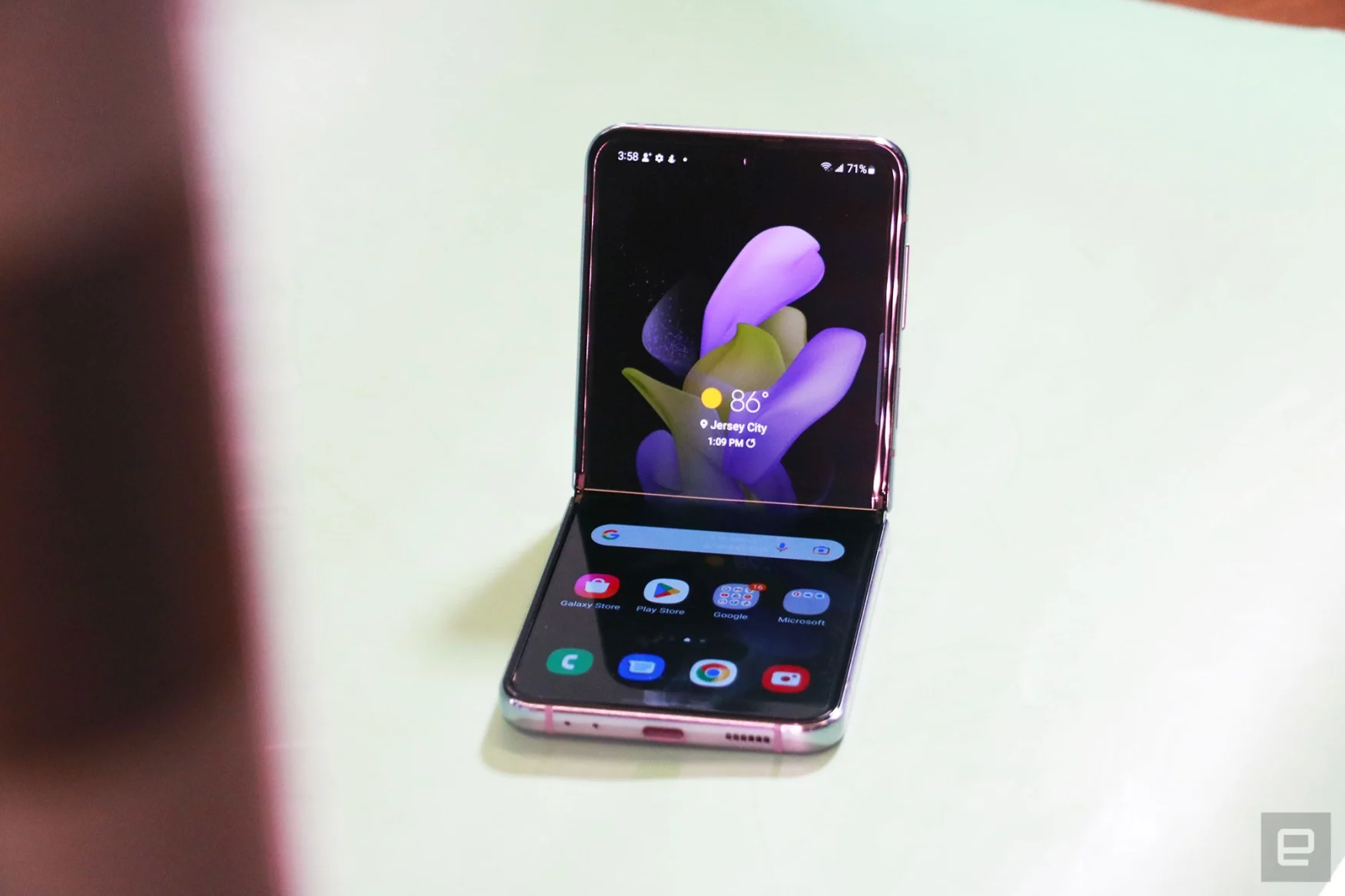
The Flip 4 is also hard to categorize because of its unique screen. Though it measures 6.7 inches diagonally, its aspect ratio of 22:9 makes it slightly longer and narrower than most phones. I didn’t mind this — in fact, I found it easier to reach across the Flip’s display to hit buttons on the other side than on my iPhone or Pixel.
As usual with any Samsung mobile device, the Flip 4’s 1080p panel delivered rich colors and crisp details, and I love the 120Hz refresh rate for scrolling through my favorite subreddits. There is a slight issue with viewing angles when you fold the phone slightly, though. If you’re looking at it straight on, everything seems fine.
But sometimes from an angle, I’ve seen some discoloration along the crease. This isn’t a huge deal, since I’m rarely looking at the screen that way and it doesn’t really impact visibility.
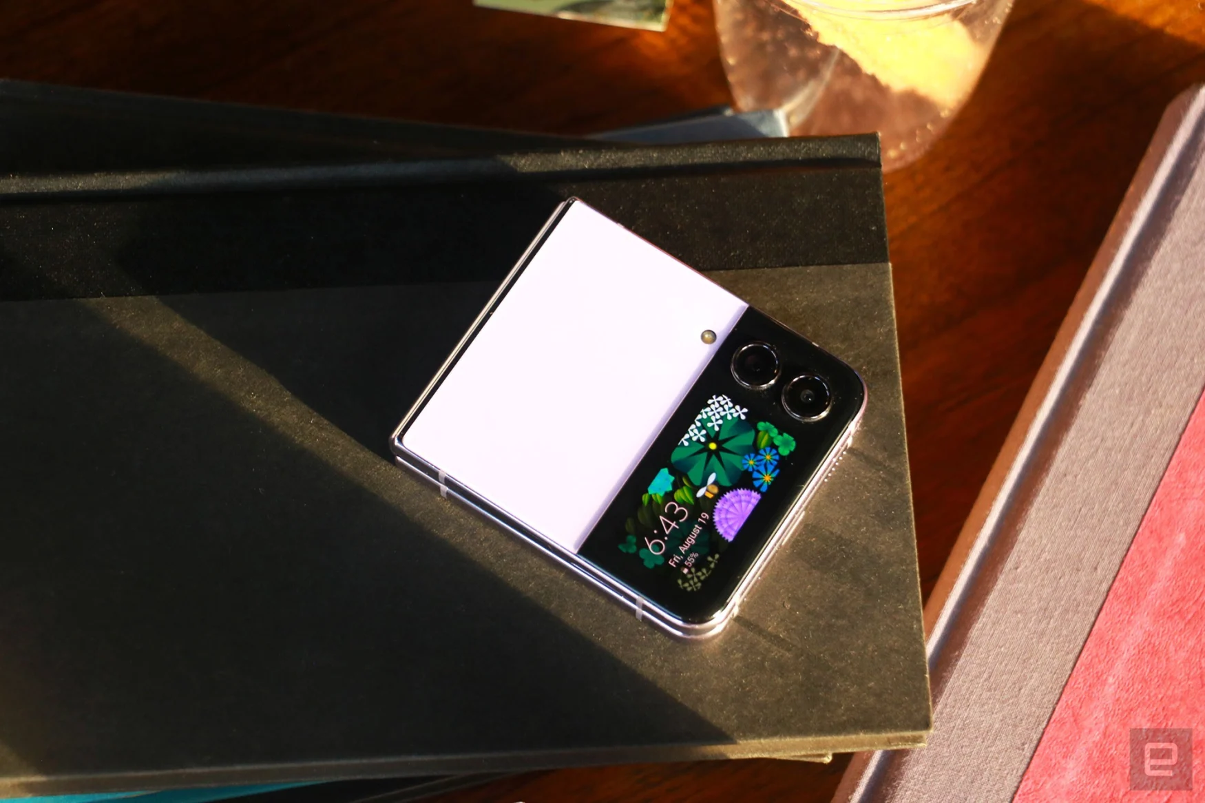
I also spent less time reading things on the 1.9-inch cover display, but when I did use it to reply to messages or set alarms, it was easy to read. I love the colorful clock faces Samsung provides, which make the Flip 4 more eye-catching.
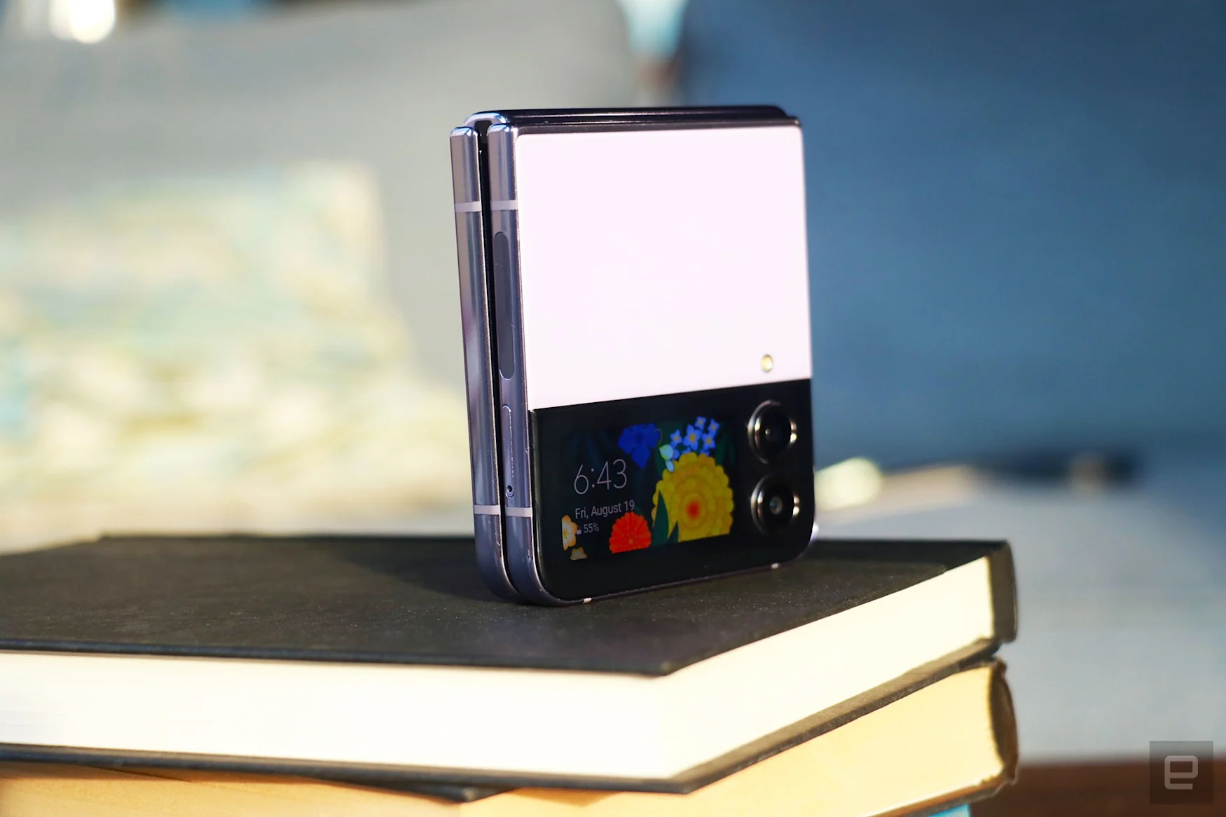
Using the cover display to play music from Spotify is convenient, and by default hitting play on this widget will start the last song you listened to. In general, the Flip 4’s speakers were loud enough to provide background sound while I worked, though I wish there were stronger bass for tracks like Taste by Tyga and INVU by Taeyeon. The music also sounded slightly different when the Flip was open versus when closed, with audio seeming a little canned in the latter mode.
In use when folded: Flex Mode and cameras
The Flip 4 is perfectly capable as a regular, non-bendy phone, but when it’s closed or half-folded, it’s truly unique. In those formats, it’s basically either a camera with its own built-in kickstand (perfect for the selfie-obsessed like myself) or as a less-disruptive pager-like device. I’ve loved using the Flip 4 to record an embarrassing number of yoga routine videos or document my outfits for the week. I’ve even attempted some of the trendy dance moves young people seem to do so much on TikTok. (Though, I will never share those clips.)
There are two ways to shoot with the Flip 4 when it’s flexed: With the external cameras and the cover display as a viewfinder, or with the internal camera while framing your shot with the top half of the main screen.
When I try to use the cameras on the outside to shoot selfies, it’s hard to find a flattering angle because the outside screen is so small I can never see my entire face in it unless I’m too far away to make adjustments. Even with the phone completely closed, using the cover display as a viewfinder is not worth the effort — I always ended up with awkward, unflattering angles. The internal camera is more reliable, but it doesn’t have the wide angle lens and generally produces less vibrant shots.
Despite the limitations, I’ve been enamored with taking pictures on the Flip 4. It’s worth shouting out the open palm gesture that Samsung has supported for years that makes hands-free triggering of the camera much easier. And I have to be honest — I mean specifically shooting selfies and content for social media featuring me (and my friends). The Flip 4 is also useful for my video calls with my parents in Singapore, eliminating the need for a phone stand. None of this is new to this year’s Flip, by the way. I just wanted to remind you how much fun and function you can get out of a regular-sized phone that folds.
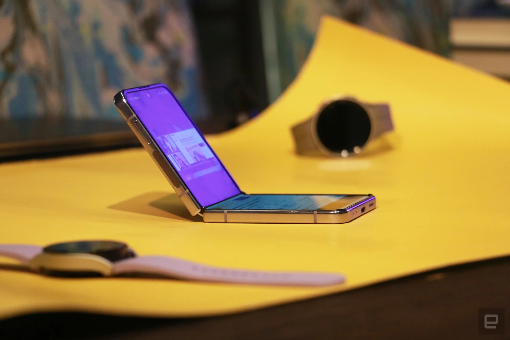
Samsung also offers an interface called Flex Mode that kicks in on compatible apps when the system detects the phone is open at about 170 degrees or less. In these situations, apps like Camera and Gallery turn the lower half of the screen into a touchpad that lets you swipe through pictures while displaying the content you’re viewing on top. YouTube, for example, will display the video on the top half, flanked by two horizontal black bars, while the title, views, details and comments sit in the bottom portion.
It’s mostly intuitive and useful but, man, I have such a love-hate relationship with Flex mode. I vividly remember thinking that using the Flip with one hand while leaning back on my couch would be easier if Samsung added its Flex Mode panel to more apps so I could easily scroll through long posts or articles. I was wrong.
On the Flip 4, Samsung introduced a Touchpad feature to its Flex Mode panel, which you can force enable for most apps even if their developers didn’t design a specific layout. You’d use this like it were a laptop trackpad on the bottom of your screen: move your finger around to control a cursor, tap to click links and other elements and drag two fingers up or down to scroll. You can’t pinch to zoom, but honestly that’s not a laptop-like gesture I need here.
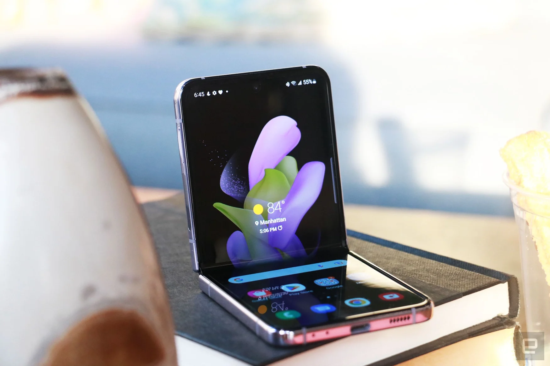
In theory, a lot of this makes sense. When you’re using one hand and holding the Flip slightly folded, reaching for elements on the top of the screen with your thumb can be tricky. The trackpad makes it easier to click things at the edge of the panel. But two-finger scrolling in one-handed use simply does not work, unless you somehow can balance the Flip with just three fingers and have the dexterity to use your remaining digits to swipe on the screen.
Those of us without Olympian-level finger gymnastic skills will probably need to leave Flex Mode to scroll. Trouble is, there is no easy way to summon this panel. Worse, it reappears if you straighten and refold the screen, or if you jump to another app and return. I’ve lost track of the number of times I’ve hit the X to dismiss Flex Mode, only to absentmindedly open Telegram to reply to a friend, and be presented with the black box again.
To make things worse, the X icon to dismiss the Flex Mode box is right up against the crease, making it incredibly hard to hit. I usually have to tap it about five times to get it to register. Honestly the only thing the new trackpad is good for is dragging the cursor to the X to close itself.
To be clear, this panel only appears if you’ve gone into the experimental Labs area in Advanced Settings to enable it for specific apps. Most people are unlikely to encounter it by default, and the Flex Mode layouts for customized apps like Gallery and Camera are fine.
Cover display is slightly more useful
Samsung is also caught in a difficult situation when it comes to the external screen. This window is the same size as last year, and the company’s added a new widget so you can do more without opening the phone, like control your smart home appliances. The existing options were a media player, calendar, schedule, weather, alarms, timer, quick dial and health, which is really a glorified step counter. To make the cover display a bit more useful, Samsung also added the ability to quickly reply to messages using emoji, dictation or a selection of preset responses like “No thanks” or “On my way.” It’s basically what you get from a six-year-old Fitbit or smartwatch. The Apple Watch offers an onscreen keyboard for replies now, too, even if it’s hilariously and uselessly tiny. Still, I’m glad Samsung at least offers some options here, making the cover display at least slightly more functional.
The minimal functionality of the Flip 4 when it’s closed is a good way to partially unplug from distractions while still remaining reachable — kind of like using a pager (remember those?). Samsung’s new customizable clock face designs are adorable and make the device more attractive. I also appreciate being able to surreptitiously set a timer or snap a selfie when the Flip is small enough to hide in my palm — people are less aware of me taking my 900th selfie of the day when I’m using a tiny square instead of holding out a metal-and-glass slab of a phone.
Without increasing the size of the cover display, the company can’t really do much more. And I’m not sure I want Samsung to go bigger. A larger second screen would tax the battery, which is something the Flip 4 can barely spare. I’d much rather the company gave the next Flip better cameras.
Cameras
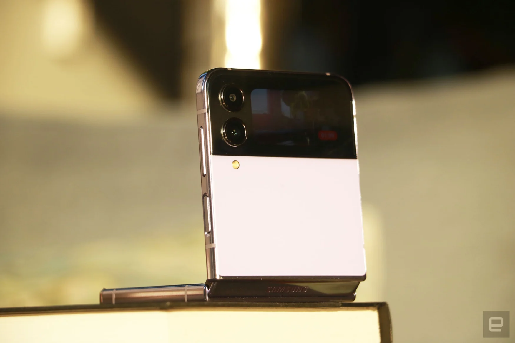
That’s not to say the Flip 4’s cameras are bad. They’re actually surprisingly capable — especially the pair of 12-megapixel sensors on the outside. With larger 1.8-micron pixels than the Flip 3, the primary and ultrawide cameras both delivered impressively colorful and sharp pictures that rivaled the Pixel 6 Pro and iPhone 13 Pro in bright light.
Like the Galaxy S22 Ultra, the Flip 4’s pictures were warmer and more saturated than the Pixel’s, but less red than the iPhone’s. All three handsets produced similarly sharp pictures of buildings at sunset, though Samsung’s images were occasionally a little soft. But they weren’t anything egregious — the bark on a tree I shot against the sun wasn’t as crisp on the Flip for example. But I wouldn’t have noticed if I wasn’t pixel peeping looking for the differences.
As usual, Google has the upper hand at night, with windows on the Empire State Building looking tack sharp, but slightly blurrier on the Flip 4. I also prefer Google’s approach to Portrait mode. The Pixel 6 Pro is better at identifying outlines of subjects and applying a blur to everything else. Samsung’s system is still hit or miss and can look artificial.
The iPhone and Pixel both offer better quality than the Flip on zoomed-in photos, especially in low light. While Apple and Google were able to retain generally clean lines in the faraway Manhattan buildings in a nightscape, Samsung’s picture was a muddy, blotchy mess.
Gallery: Galaxy Z Flip 4 camera samples | 31 Photos
Gallery: Galaxy Z Flip 4 camera samples | 31 Photos
Selfies I took in low light with the Flip 4 were similarly splotchy, but the Pixel and iPhone didn’t do much better in those situations anyway. I was pleasantly surprised by how sharp and warm the photos I captured with the Flip’s inside camera in daylight turned out, though. They looked more natural than the Pixel’s shots, and were about as good as the iPhone’s.
The videos I recorded with the Flip’s external cameras were also on par with the other two. Like a true fitness influencer wannabe, I set up the phone alongside the Pixel and iPhone and took copious videos of myself working out, and each time the Flip’s clips were about the same quality. One time, though, the Flip’s video was out of focus, which I think might have something to do with how I started recording. In general, most of the videos I shot with the Flip were smooth and vivid.
Performance and in use
Like any mainstream flagship phone, the Flip 4 is equipped with the latest top-tier Snapdragon 8+ Gen 1 chip and has 8GB of RAM. After some initial hiccups while setting up the phone, during which the Flip 4 got noticeably warm, things got smoother. I never encountered any lag as I shot videos, livestreamed to Instagram, screen-recorded my friends’ Instagram Stories or posted photos. It did get hot again when I called my parents via Telegram, but otherwise the Flip mostly remained cool.
It’s worth reminding you all that some apps struggle with the Flip’s uncommon aspect ratio. The biggest culprit is Instagram. Often, the create post button will be out of reach or overlap other posts. The Stories editor has a blank black strip at the bottom between the viewfinder and the submit buttons, and if you’re using Samsung’s keyboard, it sometimes obscures things like the color picker or tag suggestions. This isn’t a dealbreaker, but it’s a minor inconvenience to be aware of if you’re getting the Flip.
Thankfully the days of heavy-handed overlays like TouchWiz are mostly in the past, and Samsung’s phones now ship with fairly clean versions of Android and its One UI interface. There are pros and cons with this — I love Samsung’s Gallery app and the built-in video editor, for example. But I hate that Samsung occasionally still serves up ads in the notifications shade, showing you recommendations from the Galaxy App store. I also find that One UI doesn’t seem to understand Do Not Disturb mode, and frequently lets unnecessary alerts through. Still, the Flip 4’s software is not bloated and is fairly customizable, so you can alleviate some potential frustrations.
Battery life and charging
My biggest complaint about the Flip 3 was its dismal battery life, and it was the one thing keeping me from recommending it to a more mainstream user. With the Flip 4, Samsung not only used a larger 3,700mAh battery, but also a more power-efficient processor. The results aren’t astounding, but the Flip 4 generally lasts all day.
I usually take it out in the afternoon and come home past midnight with about 20 percent to spare. One Sunday, I took the Flip 4 to an early morning workout and ran around New York and New Jersey all day. By 10pm, it had dropped to 15 percent and was prompting me to enable battery-saving mode.
This is sort of pitiful compared to the battery life of the iPhone 13 Pro, Pixel 6 Pro and S22 Plus, which all stick around longer than a day. But given the Flip 4 has two screens, I’m willing to be more forgiving. Plus, when it came time to recharge the Flip, it didn’t take long — I usually got more than 40 percent of power in about 40 minutes.
On our video rundown test, the Flip 4 clocked 16 hours and 35 minutes, which is five hours more than the Flip 3 and, surprisingly, also more than the Nothing Phone 1. It’s even on par with the Galaxy S22+. Meanwhile, phones like the Pixel 6 and OnePlus 10T delivered results of more than 20 hours.
Wrap-up
With its improved battery life and durability, the Flip 4 is a more practical phone than its predecessor and is the first of Samsung’s foldables that’s truly ready for the mainstream. Sure, there are a few minor inconveniences to put up with, like Instagram’s incompatibility with its aspect ratio or the fact that it has considerably less battery life than other phones at this price. But if you’ve been itching to see if a foldable phone might fit in your life (and your pocket), or if you’re a selfie aficionado, the Flip 4 will be a satisfying purchase.
Author: 86
Source: Engadget


