The Galaxy Note series is Samsung’s option for power users and enthusiasts. Or at least, it was. The Galaxy Note 10+ is the biggest change we’ve seen to a Galaxy Note ever, but not because of the specs it packs or the features it has. It hits the nail on the head in just about every category for a “perfect smartphone,” but is the unique S Pen enough to make it worth buying?
Samsung has been getting better and better at hardware since ditching the ugly plastic designs it used to have, and the Note 10+ is the pinnacle of that. Not only is it the best phone Samsung has to offer, but it might just be one of the best designs on any smartphone available today.
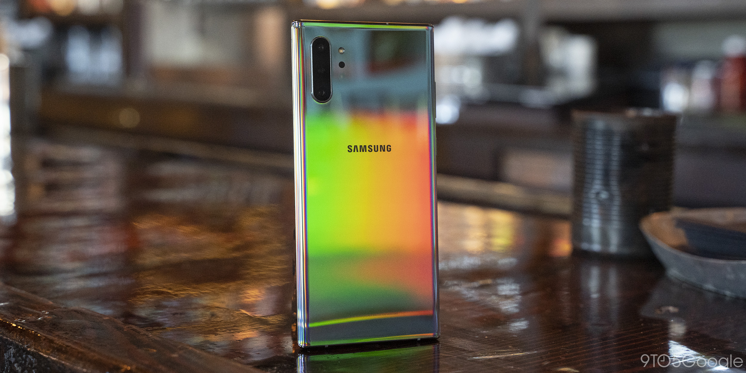
The curved glass around the display almost seamlessly transitions to the aluminum frame that then immediately turns back to the “Aura” rear glass. The attention to detail is great, too, with Samsung even putting in the effort to perfectly align all of the ports and cutouts around that frame.
At a glance, the Note 10+ is pretty much as good as smartphone design can get, at least for now. It’s beautiful without sacrificing much practicality to get there. The only really big sacrifice is the headphone jack, which will be missed more by some people than others. Personally, I couldn’t care less, but I’m shocked Samsung would opt to remove the port on what it considers its enthusiast phone, especially just for the sake of better haptics.
After you spend some time using it, the quirks of Samsung’s excellent design start to make themselves a bit more obvious, though.
One of those few quirks with Samsung’s hardware on the Note 10 comes with the buttons. Probably somewhat thanks to the location of the S Pen and lack of space within the phone, Samsung ditched the power button on the right side.
With that move, the device shifts everything to the left side with a single button pulling double duty for sleep/wake and Bixby, too. Above that is the typical volume rocker. This unorthodox setup leaves the Note 10 with some problems for which it has to find solutions. For example, by default, the “side key” will trigger Bixby with a long press, meaning you have to access the power menu in other ways.
Another issue for me was that these buttons made me pick up the phone upside down almost half of the time I pulled the device out of my pocket. This is probably something you’d get used to over time, but since most other phones put buttons on the right side of the phone, this is muscle memory you’ll have to break.
As someone who’s left-handed, this change was also frustrating from a usability standpoint. Taking a screenshot was uncomfortable with one hand, for example. Again, that’s something you can get used to; the buttons are still tactile and of good quality. Plus, these changes make it easier than ever to completely disable Bixby.
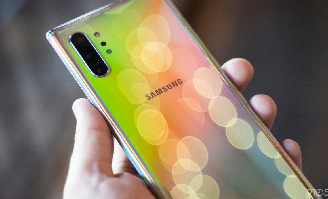
What really makes the Note 10+ stand out to me is the “Aura” colors Samsung has gone with. They’re all striking in person, but “Aura Glow” is especially unique. Unlike a standard gradient design, Samsung’s design holds just about every color of the rainbow, depending on how the light hits it. Everywhere you look at the Note 10 in Aura Glow, it’s going to look completely different.
This part of the Note’s design is legitimately hard to cover up because it’s just so much to look at. , it’s harder to find a phone that needs a case more than this one does. The Note 10+ is an absolute fingerprint magnet. That alone made me want to slap on a case, but add in how slick it is, and I was rushing to Amazon for something to use during my review period.
The quality of Samsung’s displays is just unmatched in the smartphone space today. There’s a reason everyone wants to use the company’s displays, with even Apple using the panels in its flagships.
The Note 10+ is, put simply, another winner for Samsung Display. Viewing angles are killer, colors and contrast are basically unmatched, and brightness is stellar, even in challenging scenarios such as bright sunlight or a pitch-black room.
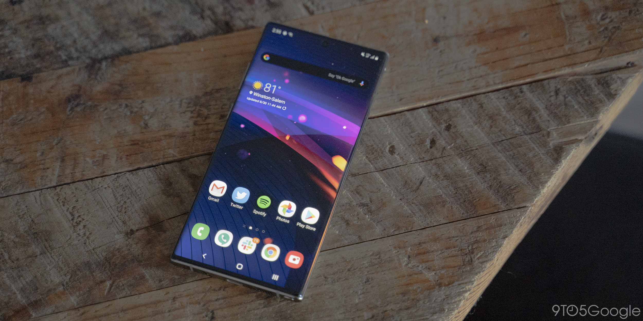
That’s not even to say just how futuristic the lack of bezels around this display look. Holding the Note 10+ feels like holding just a screen, with the only real bezel being along the bottom of the device. Even then, that bezel is considerably smaller than other devices that claim to be “all-screen.”
Better yet, Samsung has even improved on the inevitable cutout on this bezel-less wonder by moving its location. The Galaxy S10 series featured a camera cutout toward the right-hand top corner of the display, which felt intrusive to notifications and sometimes even video. By moving that cutout to the center and making it even smaller, Samsung essentially made it invisible in day-to-day use. My sole complaint is that, because of this design, there are no sensors to help with face unlock. Since the Note 10 only uses a camera for this feature, it is laughably easy to fool.
What makes that a bit more annoying is that Samsung is using the same ultrasonic fingerprint sensor as the Galaxy S10 and S10+. The sensor is unchanged from that device, meaning it works, but it’s slower than comparable in-display fingerprint sensors and often less accurate. It might be due to the size, but I did have fewer failures on the Note 10+ compared to the Galaxy S10. Regardless, I’d still prefer a good face unlock system or a rear-facing capacitive sensor over this.
The Galaxy Note 10+ is supposed to be the phone that “does it all,” and from a feature standpoint it certainly does. With this launch, Samsung is including more features for creators than ever before, mainly in the video department.
We’ll talk more about the camera quality and such in a later section of the review, but one thing I want to highlight is Samsung’s built-in video editor. Editing video to any extent is something I’ve felt Android has always lacked, whether that be built-in editors or options on the Play Store. Options like Adobe Premiere Rush are helping to close that gap, but with the Note 10, Samsung has introduced a video editor built directly into the Gallery app that’s easy to use but still supports some useful features like transitions and basic timeline arrangement. Some popular YouTubers such as Mr. Mobile, for example, have even used this editor to craft entire videos on their channel. I’ve only tested that feature briefly, but that feature alone is something I wish was standard to all phones or baked into Google Photos.
Samsung has built Live Focus Video into the Galaxy Note 10+ that can adjust the background of a subject in real-time. The default mode is… not great, but extra modes like “Glitch” could be fun in videos. There’s also a screen recorder that could be useful for creating app or games videos, and also AR Doodle that can use the S Pen to draw on a subject and track it to their face in real-time. There’s also a “Zoom-In Mic” which focuses audio recording on a subject in your video. It works just fine, but it’s nothing to write home about.
The problem with some of these features is that they often feel like gimmicks. The video editor and screen recorder are both genuinely useful, but most of the other new features on the Galaxy Note 10+ just remind me of the “everything the kitchen sink” mentality the Samsung of 2014 had. This extends over to some of the S Pen features we’ll get to below.
For a while, Samsung was using its hardware and some handy features to drive sales, but now we’re getting back to gimmicks that you’ll use once (if at all) and forget about.
Since the Galaxy Note is also popular among business users, Samsung is capitalizing on a partnership with Microsoft to enhance the experience for those potential buyers. This can be seen in three areas.
Firstly, all of Microsoft’s major apps are preloaded on the Galaxy Note 10+. If you’re deep in Microsoft’s ecosystem, that’s great. However, if you’re not, this is just more bloatware. Bloatware on the Note 10 is almost worthy of its own section in this review, but to condense that down to a single sentence, the Note 10+ has different email apps pre-installed, and that’s absolutely ridiculous.
Samsung and Microsoft also developed a “Link to Windows” button for the Note 10+. This button uses Microsoft’s “Your Phone” service and can mirror notifications, text messages, and your photos onto your computer. This allows the two devices to work closer together, and since the functionality is simply behind a toggle, it’s much easier and more convenient compared to other Android phones.
Finally, the Note 10+ can also directly output notes to Word. Using the S Pen and Samsung’s OCR text recognition, any notes on your device can quickly be converted to a Microsoft Word document. I’d bet that the average user will probably never use it, but for business users, this is almost a godsend. It’s one good example of how Samsung’s approach to features be a good thing.
It should come as no surprise at this point that Samsung’s Galaxy Note 10+ is one of the fastest phones you can buy today. With a Snapdragon 855, 8 GB of RAM, and UFS 3.0 storage onboard, this phone flies through daily tasks. This performance also tells me that Samsung’s DeX interface for computers will be very capable. Frankly, this still isn’t a feature I’ve been able to find a place for in my life by any means, but the ability to use it on a computer you already have is a good idea that should make it more useful for some people.
The only thing that holds back the performance on the Galaxy Note 10+ is the display, and specifically its refresh rate. As fast as it is, 90 Hz displays such as the one on the OnePlus 7 Pro just make everything feel faster than a traditional 60 Hz display. Otherwise, this is one of the fastest phones on the market today, plain and simple.
Far and away the biggest reason the Galaxy Note series hasn’t been absorbed into the Galaxy S family is the S Pen, and it just keeps getting better each year in terms of features.
As has been the case with past generations, the S Pen on the Note 10 can write notes as soon as you pull it out of its silo as well as enhancing other features such as screenshots. It’s also a more accurate tool for handwriting or even tasks like video editing, but there are some new features, too.
AR Doodle is one previously mentioned new function for the S Pen, but it’s a gimmick you’ll probably only use once. Another feature I thought would fall into that same category was the new Air Actions feature, but this has turned out to be something I actually quite like.
Air Actions uses new sensors within the S Pen to navigate some applications using wireless gestures in the air. The most advertised use case for this is the camera app. There, the S Pen can change camera modes and the zoom level with a flick of the wrist. In some niche cases, this could be useful. For me, though, I found Air Actions most useful in Google Chrome. A quick trip to the Settings allows Chrome to be enabled for this feature and you can easily assign gestures for scrolling up and down and flipping back and forth between pages. It’s still probably a niche use case to have your phone out of reach and reading content, but it’s one place I found this useful.
In the future I think it would be amazing to see Samsung further use this feature, perhaps somehow turning the S Pen into a Wii-style remote, but who knows if that’s even possible.
At this point in the Note line’s life cycle, the S Pen is becoming less of a unique offering than it is the sole reason you buy the phone. There’s a lot to love about the Note 10+, but 95% of it can be had on the Galaxy S10+, which is less expensive. Really, the S Pen is the only reason you should get a Galaxy Note 10+.
I’ve never been fully on board with having a stylus built into my phone, so perhaps I’m a bit more sensitive to minor changes than others. To that point, two parts of the Note 10’s S Pen irked me a bit.
For one thing, this S Pen is smaller than year’s past. The difference is barely noticeable in a side-by-side comparison, but I felt the change while using the pen on a pretty regular basis. It just feels a little bit off when I’m writing. This probably won’t affect everyone using the device, but it was something I noticed while using the device.
Another nitpick is that the Note doesn’t really cater to left-handed users. As I mentioned earlier in the post, the buttons already present some minor usability issues with someone who is left-handed, but Samsung has also adjusted the Air Command menu on the Note 10 to only appear on the right side of the screen. Design-wise, it probably makes sense, but it’s a frustrating change if you happen to be left-handed, just like scissors or binders.
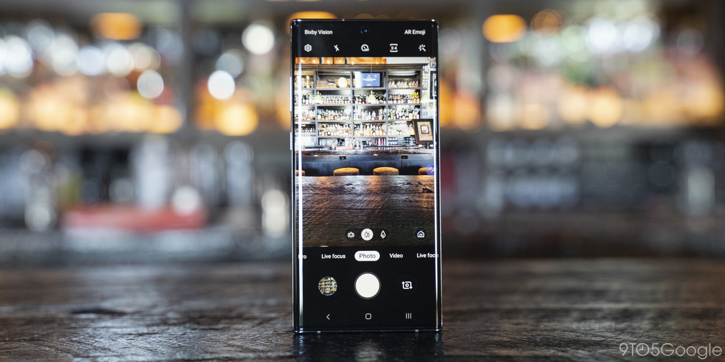
In the camera department, Samsung hasn’t really done anything super exciting since the Galaxy S9 with its dual-aperture lens. That’s also on the Galaxy Note 10+, and it’s paired with a telephoto lens and ultrawide lens as well. This triple-camera setup is the same thing we saw on the Galaxy S10 and S10+ earlier this year, and just like on those phones, it’s a great array for most people. There’s also an added depth sensor, but it’s really not used for anything you’ll find useful.
The flexibility of having these three viewpoints on a single shot is useful, and it lets me capture shots I simply couldn’t on other devices. I’ll personally still take a Pixel any day of the week, but extra-lens setups like this are mighty tempting.
Samsung also deserves credit where it’s due, as the Note 10+ can also pull off surprises. On the way to a wedding rehearsal in the mountains, I was able to capture some gorgeous sunset pictures with the Galaxy Note 10+ that my Pixel didn’t actually match up with. Low light is definitely still Samsung’s weakness, though.
Another area of improvement on the Galaxy Note 10+ in the camera department is the new “Super Steady” video setting. This is toggled off by default, but turning it on produces some great results.
During Samsung’s launch event, the company showed off a demo of this functionality that looked too good to be true. I still believe that demo was exaggerated, but the actual functionality is still impressive and works better than even Google’s video stabilization on the Pixel. Truly, Samsung is the best in the Android world when it comes to video.
I’ll keep it plain and simple on the battery life for the Galaxy Note 10+. It’s great.
While this isn’t a two-day smartphone with its 4,300 mAh battery, I never ended a day with less than 25% remaining, regardless of how hard I was on the device. Screen time often passed four hours on a charge, too. Obviously, your results may vary if you play more games or spend more time in power-intensive apps, but for the majority of people, this is a phone they won’t have to think about charging midway through a day.
Samsung has been using the Samsung fast-charging method on its phones for over four years at this point — that’s every device since the Galaxy S6. Finally, after all that time, Samsung is ditching Quick Charge 2.0 for USB-C Power Delivery, the standard that Google, Apple, and others have adopted.
Included in the box with the Galaxy Note 10+ is a 25W USB-C to USB-C charging system that powers up the phone very quickly. It pushes more power than what’s included with devices like the Google Pixel 3, and the Note 10+ can also use some 45W chargers to go even faster. Speedy or not, though, I’m just glad Samsung is finally moving on from an antiquated standard.
It’s a shame that the headphone jack is gone on the Galaxy Note 10+, but it’s even worse when you throw a set of awful speakers on top of that. The speakers on the Note 10+ output stereo sound, but it feels unbalanced, lacking any depth, and overall, it’s just not a quality experience. Even the Galaxy S10 series had better speakers than this, and it seems like the thinner bezels are somewhat to blame.
Like the Galaxy S10, the Note 10+ comes out of the box with a pre-installed screen protector. The thin plastic film is perfectly applied to the device, and I commend Samsung for doing that. However, this protector attracts just as many smudges as the glass back. Luckily, unlike the Galaxy Fold, this screen protector can be removed and replaced with something better.
Due to its huge size, the Note 10+ is begging for a better navigation system. Three-button works for two-handed use, but this is one phone that would greatly benefit from Android 10’s new gesture navigation. Not to mention, Samsung’s built-in gesture navigation is absolutely awful.
The Galaxy Note 10+ is a great smartphone in just about every way. It has powerful specs, a great design, and all the features you could ever want. Looking at it in its own world, there’s almost no reason not to buy it.
The sad truth for the Note 10+ is that it doesn’t live in its own world. There are a lot of phones that offer the same specs, same features, and equally great designs for a whole lot less money. At $1,100, the Note 10+ is a hard pill to swallow when the Galaxy S10+ can easily be had for under $800, and the OnePlus 7 Pro for even less than that.
The only thing that makes the Galaxy Note 10+ stand out is its S Pen. That’s a feature that has a very strong group of users essentially addicted. If you’re in that group, this phone is a no-brainer, even despite its hefty price tag.
Author:
Source: 9TO5Google
Tags:


