
What comes after One? Well, the HTC One (M8), of course! If we haven’t made our feelings clear, “One” is a terrible name. But we won’t go into that again, the HTC One was a promising phone that did things its own way. The M8 is the sequel to that and introduced a camera feature that is still very popular today. Or should we say “common” since popular implies that people like it.
We often mention the HTC EVO 3D (from 2011) as one of the first dual camera phones (along with the LG Optimus 3D). However, that wasn’t very useful since 3D was a gimmick that only seems to work in movie theaters (and even that is debatable). So, phones went back to a single camera for a few years.
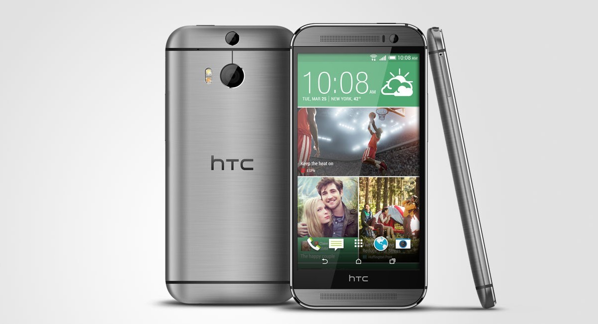
The HTC One (M8) from 2014, a sequel to the original One
Then in 2014 HTC released a sequel to the well-reviewed One. The HTC One (M8) had two cameras, but not for 3D – this was the first phone to use a camera as a depth sensor, which enabled all kinds of depth of field effects. Today you may roll your eyes at the words “depth sensor”, but back then it was a genuine innovation.
The Duo Camera brought back the UltraPixel module, HTC’s attempt to convince the world that fewer, bigger pixels are better than more, smaller pixels. So, the 4MP sensor had 2.0µm pixels despite being only 1/3.0” in size. Few phones these days get close, e.g. the new iPhone 13 Pro has 1.9 µm pixels, the Galaxy Z Fold3 1.8 µm pixels.
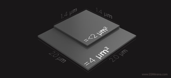
Another interesting thing to note is that this was a 16:9 sensor. Is your camera set to 4:3 or a wide aspect ratio? Because if it’s the latter, you are not using the sensor in your phone to its full potential (the top and bottom parts of the image get cropped). Not so with the HTC Ones, they gave you their best in wide mode.


HTC One (M8) camera samples
The second module also had a 4MP sensor that captured the scene from a slightly different perspective. This allowed the phone to calculate a depth map, basically a reading of how far away each part of the image is. This is what allowed it to render artificial bokeh – the soft, out of focus background that makes your subject pop.
Alternative modes tried to separate the subject from the background in other ways, e.g. putting a sketch or a cartoon effect on the background.
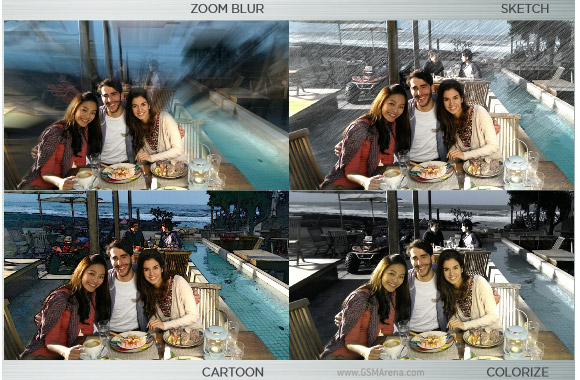
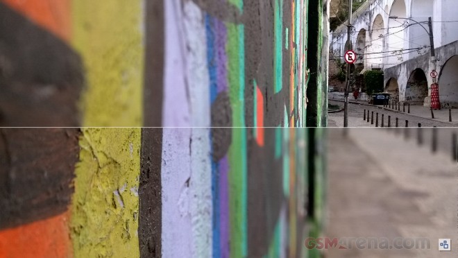
You didn’t have to decide on the spot, the depth information was stored alongside the photo, so you can go back and tweak the depth of field later. This is similar to how the new iPhones can adjust the focus in videos (they have much more processing power at their disposal, of course, which improves the effect significantly). Here is a before and after example:


UFocus photo effect: Before and After
The bokeh effect from M8’s camera was… not great. The depth map calculated by the phone just wasn’t very accurate and it would blur part of the subject or miss applying the effect to parts of the background. Usually it happened around the borders of the subject, making the defects quite noticeable.


Photo effects: Normal • UFocus • Foregrounder • Colorize • Seasons • Stereoscopic
Nokia was experimenting with refocusable photos in 2013. The Nokia Refocus app was released separately and wasn’t part of the Lumia camera app. It allowed you to pick which part of the image will be in focus (even after the fact) and there was an option to have everything in focus. And not just you – you could share the photos on the Internet and let everyone play with them. Unfortunately, this required a special viewer, which no longer works.
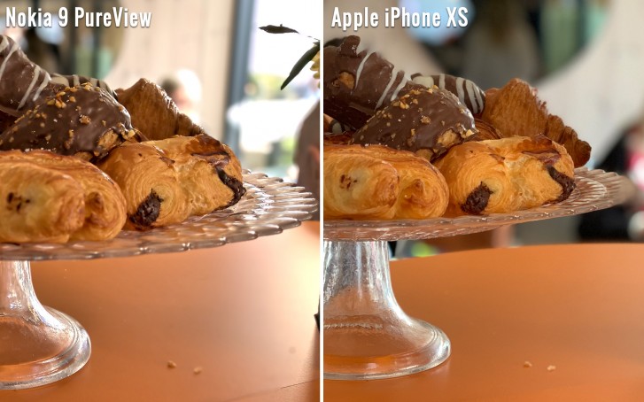
Nokia would attempt a much more advanced version of this with the Nokia 9 PureView and in our testing we found the results to be the best on mobile. It was difficult to pull off, however, requiring multiple cameras. Google showed that you can capture depth of field with a single sensor (thanks to the data normally used by the Phase Detection autofocus system).
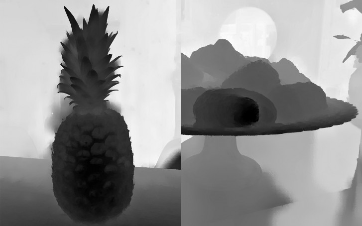
By the way, here is what a depth map looks like:
Moving on, there were other issues with M8’s camera setup too. First, it couldn’t record 4K video – not enough resolution, despite the sensor’s aspect ratio being perfect for video. This was bad because the first 4K-capable phone arrived the year before and in 2014 most high profile flagships advertised that feature.
Second, HTC removed the Optical Image Stabilization from the main camera. Rotating the lens of this camera would have thrown off the depth calculation. The new custom image processor, the ImageChip2, promised to handle stabilization (in addition to creating sharper images), but that didn’t work out. This harmed low-light photography as images with a slow shutter speed suffered from handshake.
But if you have a steady hand (or a tripod), the sensor did pretty well in the dark. Here is the shot we used for the Photo Comparison tool back in the day (note: you can click on the compare button on the right and pick two images for a side-by-side view).


HTC One (M8) (cropped to 4:3) • Samsung Galaxy S5 (cropped to 4:3) • Apple iPhone 6 Plus
The M8 looked very similar to the original HTC One (aka M7). It had a lovely metal exterior and front-facing stereo speakers, something of a trademark for the series. There were some internal improvements, though. For starters, HTC used more metal (90% vs. 70%) compared to the M7 and less polycarbonate. It made the phone heavier, but sturdier.
There are three available colors at launch
Also, the chipset was a top of the line Snapdragon 801. It made Android fly and not just Google’s OS – there was a second OS option for this phone, do you remember which one? We’ll get to that in a moment, let’s finish off with the hardware first. The new chipset also enabled Qualcomm’s Quick Charge 2.0, allowing the relatively large at the time 2,600mAh battery to charge at 18W.
The endurance rating was massively improved over the M7 (77h vs. 48h), despite the bigger 5.0” display (up from 4.7”). The larger M8 also found room to include a dedicated microSD slot, whereas the M7 had none.
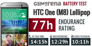
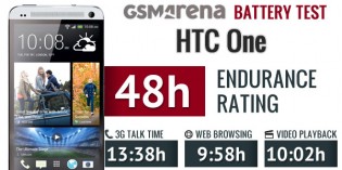
The HTC One (M8) (2,600 mAh) had much better battery endurance than the M7 (2,300 mAh)
The HTC One (M8) had some features that still feel modern. For example, it would live up to the current push for healthy living through smartphone tools with its pre-installed Fitbit app. It worked as a pedometer, allowing you to check how many steps you’ve taken today.
The HTC DotView case is a design that is still popular today:
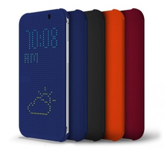
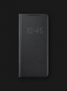
HTC One (M8) DotView case • Galaxy S21 Ultra LED Wallet Cover
There were some interesting variants of the HTC One (M8). The Google Play Edition cost $700 (the regular version was $650) and ran stock Android, without HTC’s SenseUI. GPE preceded the Android One program, but unfortunately wasn’t very successful (not that Android One phones are a hit). Check out our review if you are curious about this one. People soon figured out how to install the GPE ROM on regular M8 units, but you had to unlock the bootloader first.
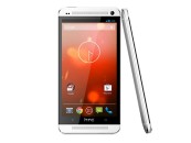
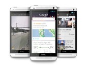

HTC One Google Play Edition official photos
There was also the Harman/Kardon edition, which launched on Sprint in the US. It featured a 24-bit, 192 kHz DAC for lossless HD audio playback. To fully appreciate the quality, a pair of Harman/Kardon AE-S headphones was included in the retail package. Also, the Harman Clari-Fi app made its debut on mobile, it promised to “rebuild” compressed audio to its original form. This version cost a total of $680 and came with a free six-month subscription to Spotify. Plus, you could get a huge discount on the Harman/Kardon Onyx Studio speakers – paying just $100, instead of the full $400.
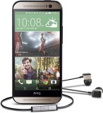
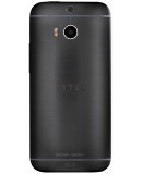
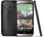
HTC One (M8) Harman/Kardon edition official photos
Then there was the HTC One (M8 Eye). This weird name was an admission that a 4MP sensor isn’t a good idea, so instead the phone came with a 13MP main sensor. It still couldn’t record 4K video, though. Also, the depth sensor was demoted to 2MP. Here are some photo samples from our review:


HTC One (M8 Eye) camera samples: a regular 13 MP sensor instead of the 4 MP UltraPixel sensor
We will quickly mention a few more fun versions like the Phunk edition of which only 64 were made as build up for the upcoming exhibition by the design studio. The S.H.I.E.L.D One M8 edition was even more limited – there were 10 units for the US and 4 for Canada. This was after Chris Evans was cast as Captain America, so we don’t know what was up with that dorky wallpaper.
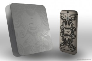
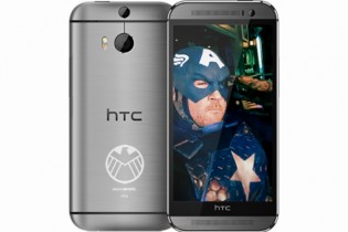
HTC One (M8) Phunk • S.H.I.E.L.D. One (M8)
Most interesting of the bunch was the HTC One (M8) for Windows. As the name suggests, this was the M8 hardware but with Windows Phone 8.1 pre-installed. This model arrived a few months after the Android version and offered users a choice: Microsoft or Google. It was an interesting experience – check out our review if you’re curious – but it suffered from all the same issues as the original M8.
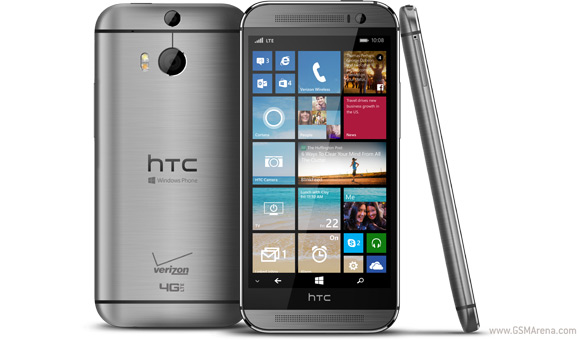
HTC was in a tough spot in 2013. The HTC One was praised by reviewers and while it sold well, supply chain issues limited its success. This led to HTC’s first ever quarterly loss. The first of many, unfortunately. The One (M8) was an attempt by the company to get back on its feet, but the once dominating Android maker was in a decline and the M8 (and the phones that followed) wasn’t enough to turn things around.
The HTC brand is still alive, though its focus has shifted towards Virtual Reality. Part of HTC’s phone division was bought by Google to continue development of Pixel phones in-house, so in a way the Pixels carry on the HTC phone legacy.
Author: Peter
Source: GSMArena


