
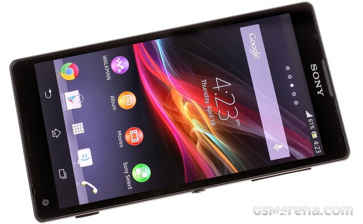
Previously we traced the history of Sony (Ericsson)’s Xperia line of phones, from the Windows Mobile beginnings through the switch to Android to the birth of the Compact line. All of these eventually lead to the Xperia 1 and 5 series, the latest of which were announced this week.
Today we wanted to look at the phone that prototyped the design language used by Sony today, the Sony Xperia Z. Before that there was the Xperia S, the first phone after the divorce with Ericsson (Sony got to keep the Xperia kids).
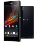
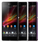
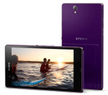
Sony Xperia Z official photos
The S featured one of the first 720p screens on mobile, a microHDMI port and a dedicated TV launcher. There was the PlayStation Store that emulated PSX games on the Snapdragon S3 chipset. Plus, the 12MP camera with 1080p video capabilities showed promise. The Xperia S sold well, but the mobile division was still struggling.

The aluminum shutter key was a trademark of the Omni-Balance design
The Xperia Z was unveiled the following year at CES 2013 and introduced the Omni-Balance design. It was rectangular with a flat glass back, a departure from the rounded backs of the S. Symmetry was key and the aluminum Power button was a signature decoration.
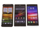
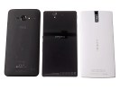
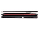
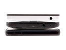
The Sony Xperia Z sized up against the HTC Butterfly and the Oppo Find 5
The chassis itself was made from glass fiber polyamide and was sandwiched between two different panes of glass: Asahi Dragontrail on the front, Corning Gorilla Glass on the back.
The Z phone carried an IP57 rating for dust and water resistance. It could spend half an hour under 1 meter (3 ft) of water. It was an early iteration of waterproofing, however, so Sony had to cover the vulnerable ports with flaps. And the phone would remind you to close them tightly every time you disconnected the charging cable.
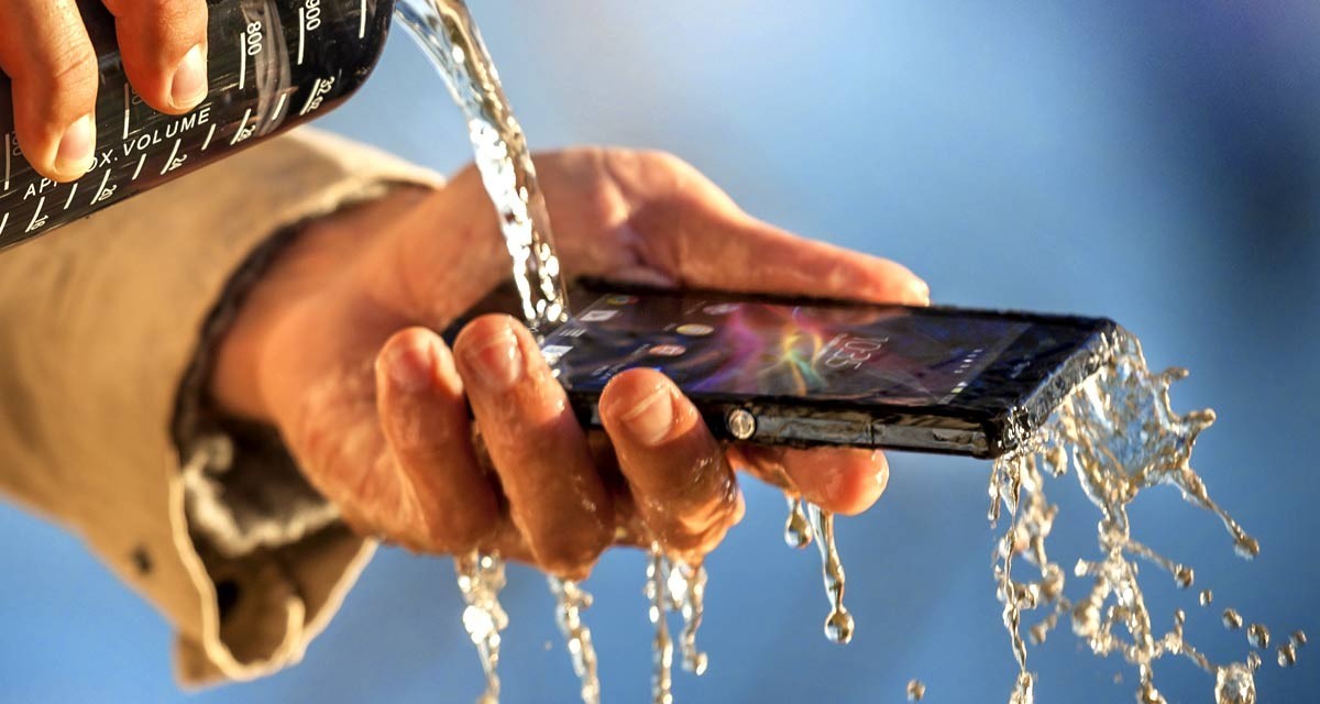
Sony Xperia Z’s IP57 water resistance was heavily advertised
If you wanted, you could simplify things by using a charging cradle (which connected to the exposed pogo pins on the side). Still, in those days waterproofing was not the kind of feature you saw on a sleek flagship, but on bulky rugged phones instead. Of course, it’s standard now and Sony deserves some credit.
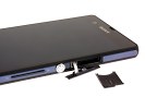
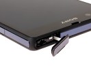
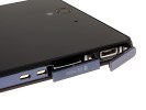
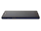
Flaps helped the Xperia Z achieve its IP57 rating • The pogo pins for charging in a cradle
Sony was also first of the big players to push mobile screens to 1080p resolution. The 5” panel was fairly large for its day, yet the phone was only a millimeter wider than flagships from the previous year. It was tack sharp and backed by the Bravia Mobile Engine 2. Sony’s passion for high resolution displays hasn’t waned and it is still the only maker offering a 4K display (the Xperia 1 III will soon bring the first 4K 120Hz OLED to the mobile market).
Despite invoking the veritable Bravia name, the screen was actually a bit of a disappointment. Viewing angles were poor and contrast was low. Colors weren’t great either, this was before Sony adopted Triluminos tech for its mobile displays. But those were just around the corner – we’ll come back to that in a bit.
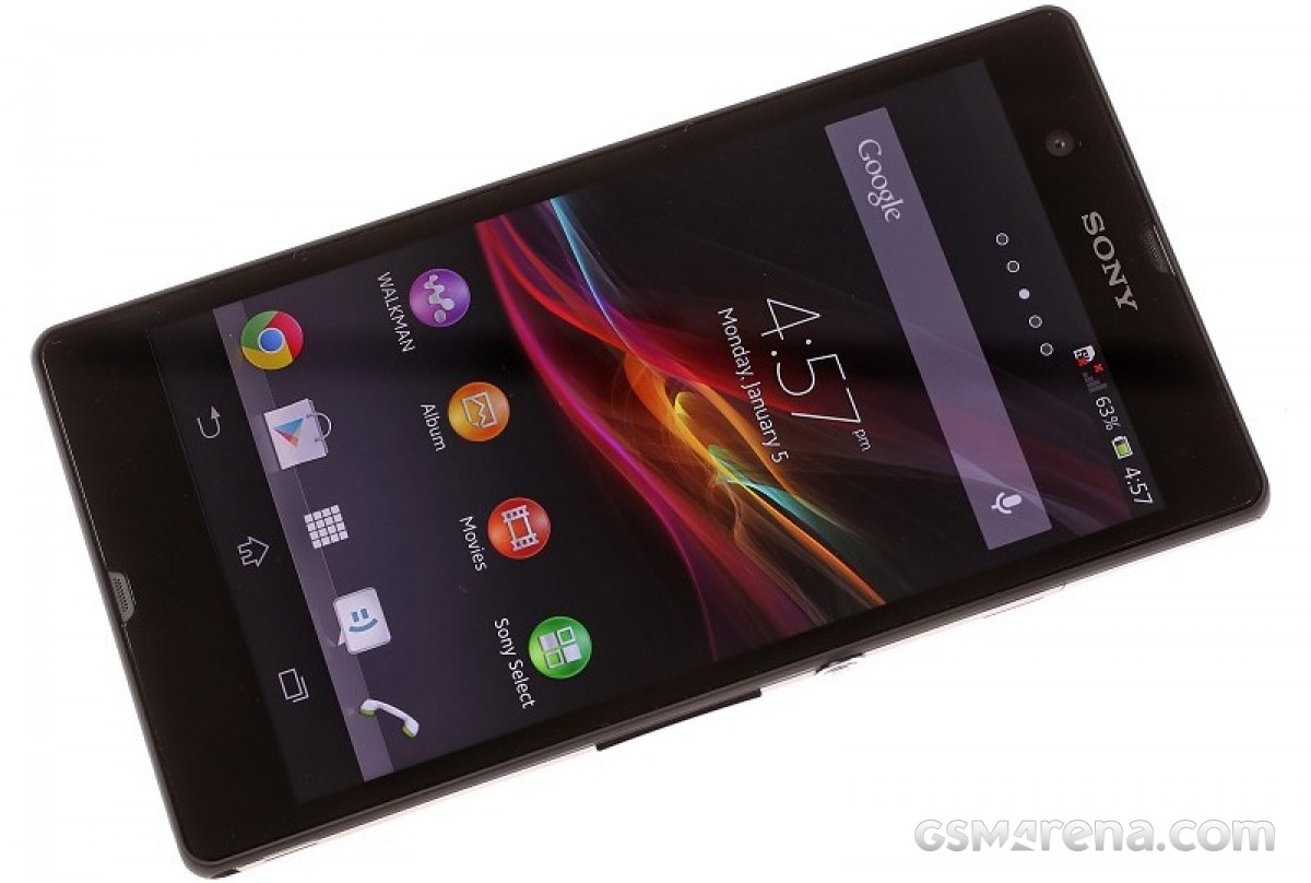
The large, high resolution 5″ 1080p display sounded impressive, but had poor viewing angles and contrast
The 13MP camera on the Xperia Z offered Superior auto mode, which borrowed wisdom from Sony’s digital cameras to automatically pick the best settings. Superior auto shots were pleasing if a tad oversaturated. Photos had excellent dynamic range, but sharpness and noise levels left something to be desired.


Sony Xperia Z camera samples, using the superior auto mode


Sony Xperia Z camera samples, using the regular auto mode
As for video, the camera was one of the first to support HDR video capture, second only to the Oppo Find 5. And (unlike stills), the 1080p footage was beautifully detailed and recorded at a rock-solid 30 fps. HDR wasn’t quite the game changer we hoped for, but it did make a difference. Side note: the Oppo Find 5 was also the first phone with a 1080p screen we reviewed, just days ahead of the Xperia.
The Snapdragon S4 Pro chipset was pretty much the fastest available for Android phones in early 2013. Its four Krait cores had excellent performance and the GPU was quick enough for 1080p gaming. The Epic Citadel test, a demo of Unreal Engine 3, reached 55.6 fps on the High Quality setting.
The Sony Xperia Z offered impressive audio quality through its 3.5mm jack, with loud and fairly clean output. It came with the Walkman player and a multitude of sound-enhancing tech originally developed for Sony’s other products. The loudspeaker was pretty poor, though, this was before Sony moved to stereo speakers. Anyway, there were some neat features, like the ability to run track ID on songs playing on FM radio.
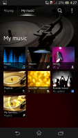

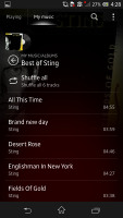

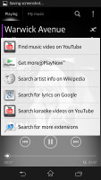
The music player carried the famous Walkman branding
Speaking of automatic ID, the video player automatically identified movies and displayed detailed info – if you had an MHL to HDMI adapter, the phone could double as a solid TV box (the microHDMI port of the Xperia S was removed, perhaps to avoid an extra flap).
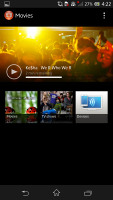
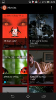

The Movies app offered a pocketable home theater experience
The Sony Xperia Z showed potential, which was recognized by fans and press alike – it won the ‘Best Smartphone’ and ‘Best of Show’ awards at CES 2013. While a strong contender, it couldn’t turn the fortunes of Sony’s mobile division around. But it wasn’t alone to bear that burden.
A month after the Z arrived in stores, Sony launched the Xperia ZL. It dropped water resistance, which helped it slim down its bezels significantly – it measured 131.6 x 69.3 x 9.8 mm vs. 139.0 x 71.0 x 7.9 mm for the Z. And this was with the same 5” screen, making for killer screen-to-body ratio in early 2013.
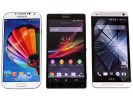
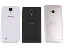
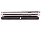
The Sony Xperia ZL (5.0″) with the Samsung Galaxy S4 (5.0″) and the HTC One (4.7″)
It was thick, yes, and the front-facing camera was awkwardly placed below the screen. While it lost the IP rating, the ZL gained two things over its single letter sibling – an IR blaster and a hardware shutter key (which later became standard on Xperias).
Also, the rear panel switched to a textured plastic, but that wasn’t an advantage as it was fairly wonky. It bent when pressed and had an ugly flap covering the card slots.
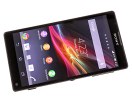
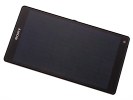
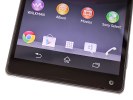
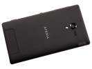
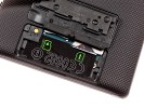
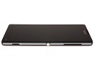
The Xperia ZL up front • camera below the screen • the questionable back • shutter key
When we said that the Xperia ZL had the same 5” screen we meant the same size – the panel was actually better with a much higher contrast. Viewing angles were improved slightly, though they still lagged behind the competition.
The Xperia ZL impressed with its slim bezels around its 5″ screen
While the ZL was small, the Sony Xperia Z Ultra was large – huge even. It had a 6.4” display, which was properly massive. This was back in the 16:9 days, mind you, so the phone was 92.2 mm wide. We are not even sure phone is the right word here – it was more a small tablet, really. It was stunningly thin at 6.5 mm, but at the same time it was unwieldy.

Sony Xperia Z Ultra stunned with its huge 6.4″ screen and slender 6.5 mm frame
It was released only a few months after the Z and ZL, but the Z Ultra brought on key upgrades. For starters, it switched to the more powerful Snapdragon 800 chipset with upgraded CPU and GPU.
The upgrades didn’t end here. The 6.4” display was actually a Triluminos panel with the X-Reality engine. Viewing angles were much improved and colors were nice and punchy, contrast was pretty good too. Overall, this new display made for an excellent viewing experience. And despite having to light up all 6.4”, the 3,050 mAh battery actually posted improved battery life over the other Z phones.
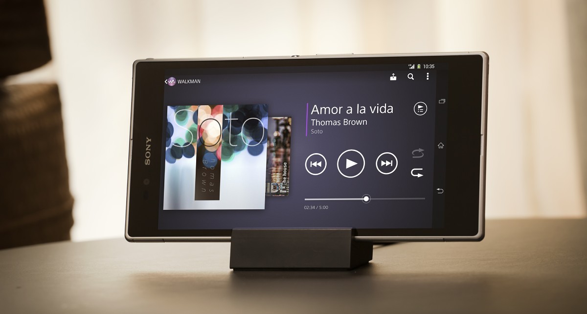
The 6.4″ 1080p Triluminos display on the Sony Xperia Z Ultra was a sight to behold
Here’s one curious feature of the Xperia Z Ultra display – you could use any ordinary pen or pencil as a stylus. How about that, Galaxy Note?
Interestingly, the Z Ultra shipped with a very barebones package – just a charger and a charging cradle. There was no USB cable or headset. This wasn’t great for traveling, but the cradle let you make better use of the expansive screen. Watching movies would have been even better if it had stereo speakers.
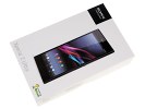
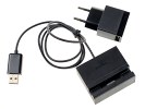
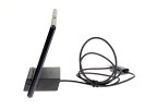
Sony was ahead of its time, removing stuff from the retail package
The Z Ultra had a flat, rectangular glass sandwich design like the Z. Waterproofing was improved to IP58, enabling it to dive deeper (1.5 m or 5 ft for half an hour). Great progress in just a few months.
It wasn’t all good, however. The camera was downgraded to an 8MP sensor and the results were even less impressive. Also, the rare HDR video feature was gone – plus, the S800 chipset supported 1080p recording at 60fps, but that wasn’t enabled on the Z Ultra.
The first batch of Xperia Z phones were each unique in their own right. And looking back, we can see the building blocks for new models like the Xperia 1 III starting to develop. Sony was still fighting for market share back then – and losing. These days the company has carved a niche for itself and is happy to serve a small but devoted fanbase that appreciates all of its design choices.
Author: Peter
Source: GSMArena


