Previously, we’ve explored how Huawei’s relationship with Leica began with the P9 and P9 Plus. This week’s introduction of the new Mate 40 series had us thinking of Huawei again, so it’s time to cover the company’s other 2016 flagships – the Mate 9 trio.
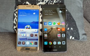
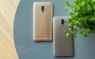
Huawei Mate 9 Pro (left) and Huawei Mate 9 (right)
This was the generation that drafted the blueprint for Huawei’s current releases: one vanilla phone, one Pro and one “out there” Porsche Design model. This game plan was only changed earlier this year when the company added another tier, the Pro+.
The Huawei Mate 9 Pro had a 5.5” AMOLED display, which was tack-sharp with its 1440p+ resolution (534 ppi). But that wasn’t the first thing you noticed about it.
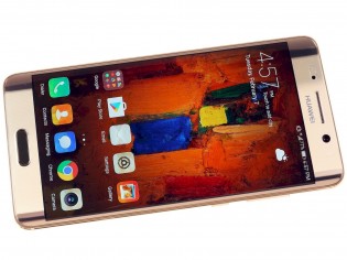
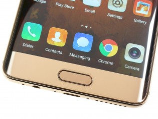
The 5.5″ OLED display was striking with its curved sides
The sides were curved – not as much as on more recent models, but it was an attention-grabber. The only problem with it was that it made the phone look very similar to the Galaxy S7 edge that came out earlier that year.
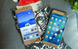
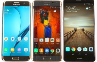
Huawei Mate 9 Pro next to a Galaxy S7 edge • S7 edge, Mate 9 Pro, Mate 9
The camera was similar to the one Huawei and Leica created for the P9, though the few months of extra development time paid off with a couple of notable upgrades. First, the 12MP sensor (1/2.9”, 1.25 µm pixels) was given Optical Image Stabilization (OIS). Second, the Black & White helper was upgraded to a 20MP sensor.
This enabled the phone to render 20MP color photos by combining exposures from both cameras. This didn’t work so well, but the 12 MP photos were quite nice and had the coveted “Leica look”. And even better, the additional info from the 20MP camera had definite benefits when using digital zoom. We talked with Huawei and Leica engineers back then, who explained more about how the camera works.
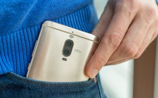
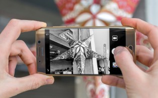
12 MP RGB + 20 MP B&W cameras • The Leica look was a major selling point
Anyway, the bigger upgrade was the ability to record 4K video. The P9 phones couldn’t do it, which was a bit embarrassing for a 2016 phone. The Mate 9s fixed that, though they weren’t the first Huaweis to go 4K – that honor goes to the Nexus 6P. The videos were encoded using the H.265 codec, which was so new back then that YouTube didn’t even support it.
You can check out the Mate 9 Pro vs. Mate 10 Pro camera shootout for even more samples and a look at how the Leica cameras continued to progress
The Mate 9 Pro was powered by a 4,000 mAh battery with an early version of Huawei’s fast charging. It maxed out at 22.5W and was pretty fast. A half hour charge brought a dead battery up to 55%. Okay, a modern Mate 40 Pro can reach 87% in that time and it’s filling a larger battery to boot, but still, those results were impressive for 2016.
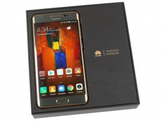
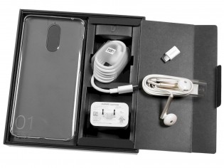
The Mate 9 phones came with a 22.5W fast charger
The Huawei Mate 9 was the larger phone – it had a 5.9” screen. A flat LCD, specifically, and while that was a tad boring, the bright, high contrast screen was quite good. As was the phone itself, we reviewed it before we got our hands on the Pro and it set expectations quite high.
The vanilla model had the same camera setup and was powered by the same Kirin 960 chipset. HiSilicon stuck with 16nm for this one, but compared to the Kirin 955 used in the P9 phones, the upgrade to Cortex-A73 big cores meant that CPU performance was top notch (though the chipset was let down by a weak GPU).
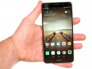
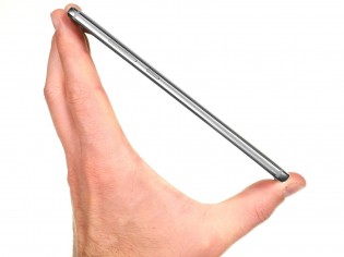
The vanilla Huawei Mate 9 was larger than the Pro – with a 16:9 aspect ratio, even a 5.9″ display is big
The Mate 9 even got the same battery and charging hardware as well. Just about the only reason to go with one or the other was whether or not you wanted that curved OLED display or not.
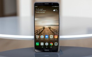
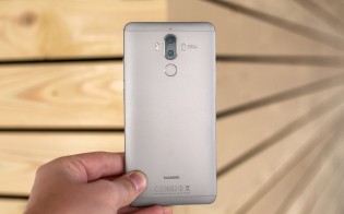
The Mate 9 had a flat display and the fingerprint reader was on the back
The Huawei Mate 9 Porsche Design was the equivalent of an auto company building a super car – they don’t expect to sell many, but it makes for great marketing. So, picking the design company behind the iconic Porsche 911 was a smart move.
As a halo product, this phone was – it cost a whopping €1,400! Insane, right? Jokes aside, this was a fairly tame design – besides painting the phone in graphite black and slapping a Porsche Design logo on the front, the designers didn’t do much. The PD phones didn’t develop a distinct look until the Mate 20 RS.
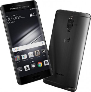
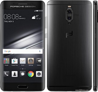
The Porsche Design Mate 9 Pro didn’t look all that different from the regular 9 Pro
With the P9 and Mate 9 Huawei was starting to become a serious threat to other smartphone makers. Its commitment to evolving the camera and speeding up battery charging was evident even back then.
Author: Peter
Source: GSMArena


