
The beta version of the second quarterly Android 13 update includes work toward desktop mode, a new Back gesture animation, separate ringtone and notification volume controls, and much more.
With each release of a new Android Beta, there are often quite a few new features that everyone can enjoy as soon as the update is installed. Under the surface though, Google keeps many upcoming features disabled, which our team is able to showcase with some additional effort.
Typically, these features are left disabled because they’re not quite ready to be tested. As things are still actively in development, it’s too early to know whether they’ll launch with the Android 13’s second quarterly update in March (or ever launch at all). That being the case, take these feature previews as interesting insights rather than a firm roadmap of Android’s future.
In some cases, it’s even easily possible for you to try these work-in-progress features for yourself. However, by doing so you accept the risk that your device could become even more unstable than the pre-release software already makes it.
That being the case, we only suggest that you try these on a secondary device and only if you’re already familiar with using Android’s ADB tool. To disable any of these features, run the same command shown but change “true” to “false.”
Table of contents
Revamped Back gesture animation
Since Android phones got gesture navigation back in 2019, the back gesture has remained essentially the same, with a simple arrow appearing on the side of the screen to show that your current swipe will bring you back. You can also cancel that back swipe gesture by returning to the edge of the screen, which flattens the arrow to a line.
Within Android 13 QPR2 Beta 1, our Dylan Roussel has uncovered a fully redesigned back gesture indicator. Once enabled, the simple arrow is placed within a circular blob that delightfully stretches to match your gesture motion.
Should you choose to cancel the back gesture, the blob flattens a bit and sticks to the edge of the screen when it’s close enough. Another minor detail in the animation is that the arrow no longer flattens but instead folds in on itself.
‘Quick Launch’
The search bar of the Pixel Launcher is also getting a bit of love with this latest Android Beta with the addition of a new “Quick Launch” feature. If you type the name of an app on your phone, you can hit the Enter key (including on Gboard) to launch directly into that app.
While Gboard offers a decent experience with this particular tweak, Quick Launch seems, to us, like a prime candidate for the forthcoming Pixel Tablet. Google has not yet shared any plans to release a keyboard accessory for the Pixel Tablet, but we’ve seen signs of a Pixel Tablet “Pro” in the works that could be well-suited to a keyboard.
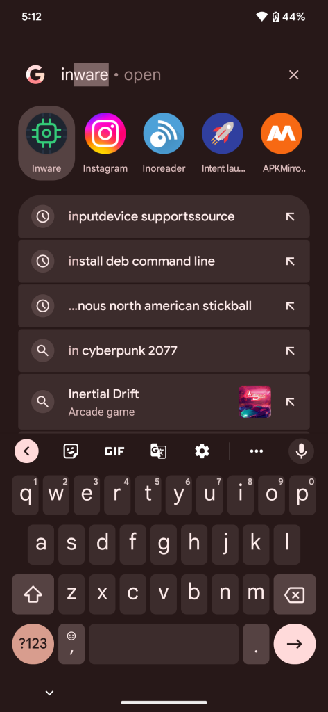
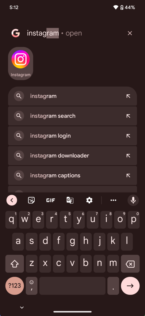
You can easily try Quick Launch on your own device with the command below. We’ve also included a second command you’ll likely want to try, as it lets Gboard know to show the Enter key when using Quick Launch.
adb shell device_config put launcher ENABLE_QUICK_LAUNCH_V2 true
adb shell device_config put launcher GBOARD_UPDATE_ENTER_KEY true
Separate ringtone/notification volume
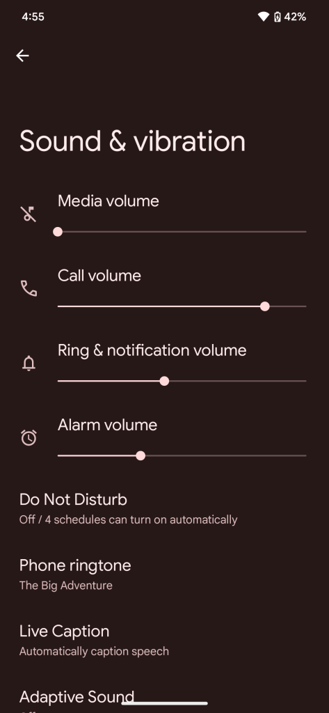
For years now, Android has tied together the volume levels for your ringtone and notification sounds. However, there are many who don’t want that to be the case, perhaps preferring to have a loud ringtone and soft notifications.
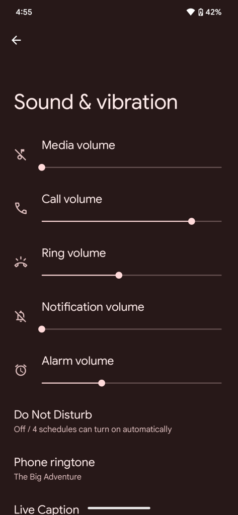
Android 13 QPR2 includes the ability to separate ringtone and notification volume, but it’s disabled and hidden for now. Thankfully, it can be enabled with one simple command. Once enabled, the Volume section of the Settings app now separately lists ringtone and notification levels.
adb shell device_config put systemui volume_separate_notification true
Redesigned taskbar
One of the biggest changes for Android tablets and foldables in recent years has been the addition of a taskbar to keep your favorite apps accessible. With the latest Android Beta, we have our first look at Google’s next iteration of the taskbar, the “transient taskbar,” which acts a bit like the taskbar on ChromeOS tablets.
Instead of an ever-present bar taking up screen real estate on your tablet, you can do a small swipe upward from the bottom of the screen to reveal the new taskbar. This may be a tiny bit tricky for some as too large of a swipe will simply bring you back to the home screen.
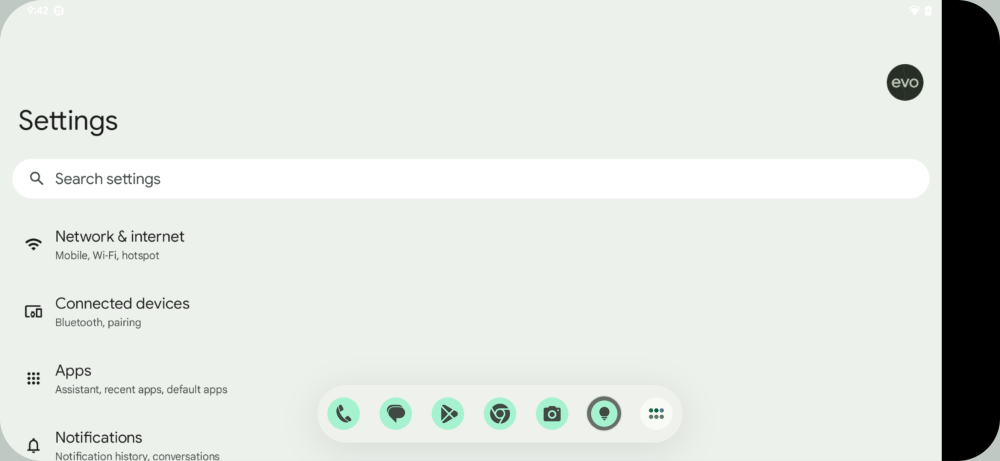
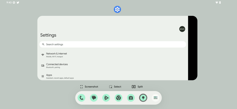
Just like the taskbar available on Android today, the revamped version merely includes shortcuts to the apps you’ve pinned to the bottom row of the Pixel Launcher. To the right of these, you’ll also find the usual button to open the full app drawer. More importantly, all of this is now presented in a clean-looking Material You style, complete with dynamic colors.
Desktop mode
The revised taskbar isn’t the only big change in progress for owners of Android tablets. Google has long been working on a “desktop mode” for Android, and the Android 13 QPR 2 Beta includes our best look yet at the work-in-progress feature.
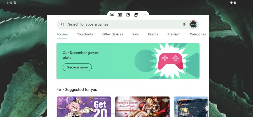
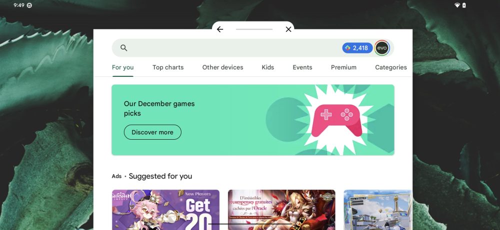
In desktop mode, all apps are treated as if they were put into freeform windows and can be dragged around the screen. To help do this, each app window is given a new control bar with useful controls.
The main piece of the control bar is a simple line which you can use to drag the window around, and to the sides you’ll find buttons to go back or close the window. By tapping the bar, another set of controls is revealed, though most of these don’t seem to work just yet. Judging by the icons, it looks like they’re quick options for fullscreen, split screen, and a few others.
From our little bit of time testing it, we don’t think desktop mode will be launching anytime too soon, but it’s still exciting to see the progress.
Home screen organization revamp
It seems Google is also working on a revamp to the way Pixel owners reorganize the apps and widgets on their home screens. The overhaul, dubbed “Home Gardening,” is still early in development, but a few noteworthy tweaks are already working.
For starters, the “Remove” and “Uninstall” drag targets have moved from the top of the screen to the bottom. On Android 13 today, these options are outside of thumb’s reach, making this a welcome change for one-handed use.
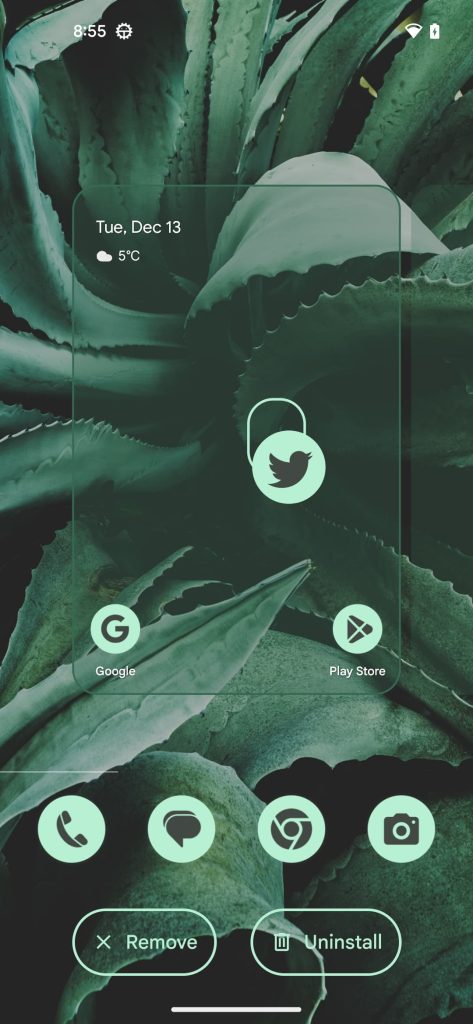
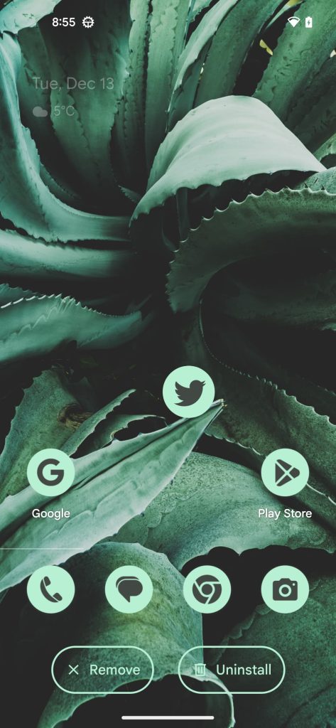
Additionally, with Home Gardening enabled, the home screen doesn’t move backward and scale down like it once did. This may make it a bit easier to place an app or widget since you can drag it exactly where it needs to go. We believe this part of the home screen organization revamp is unfinished for now, but it could shape up into something exciting.
Grayscale Material You theme
When Material You and its dynamic color theming arrived for Pixel phones, Google put in quite a bit of effort to allow Android apps to use those same colors. Over time, this has made Android apps feel surprisingly consistent, even between Pixel and Samsung Galaxy phones.
However, the dynamic color system has some unfortunate drawbacks that need to be addressed. In particular, we’ve heard a first-hand account from a 9to5Google reader that the introduction of more color tones can be detrimental to someone prone to seizures.
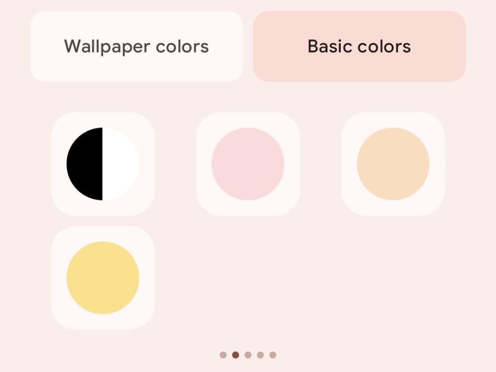
With Android 13 QPR2 Beta 1, our team has spotted the beginnings of a new “monochromatic” (or grayscale) theme option. From what we can piece together, the theme is built from two colors — #666666 and #333333, a light and dark shade of gray, respectively. This should result in a less visually demanding experience across all of Android 13.
While we were able to get the theme to appear in the list, it doesn’t seem to work as intended yet.
Dylan Roussel contributed to this article.
Author: Kyle Bradshaw
Source: 9TO5Google


