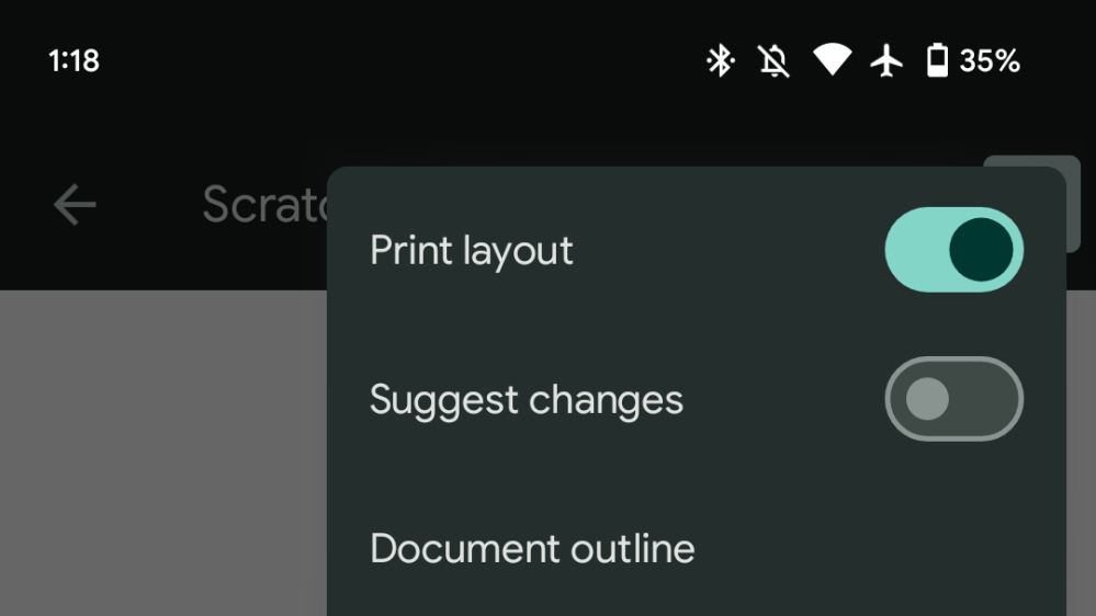
Google’s biggest apps already feature the main elements of Material You but additional aspects are now making their way through, with Docs, Sheets, and Slides using the new toggle design.
The Material 3 switch is larger and even more of a pill than before as the entire container is shaped that way. According to Google:
- M2: Switches have circular thumb that extends beyond the edge of the track.
- M3: Switches have a taller and wider track, new color mappings, and the ability to hold an icon in the switch thumb.
Google Docs, Sheets, and Slides use the switch directly in the editor’s overflow menu for Print layout, Suggested changes, Available offline, and Star. It does not leverage the optional icon (checkmark) within the circle, which grows in size from the off to on state.
Compared to toggle in system Settings on Android 12/13, it’s now as wide and more compact.
- Accessibility: Visual presentation is more accessible
- Color: New color mappings meet non-text-contrast requirements in addition to compatibility with dynamic color
- Icons: Ability to have an optional icon within the switch thumb
- Layout: Track is taller and wider
Since it’s in overflow, you don’t get to appreciate the animation fully since the menu quickly disappears after a selection is made. This change is not live anywhere else in the app, like Settings.

The Material You toggle is rolled out with version 1.22.442.03.90 of Google Docs, Sheets, and Slides. The Google app, as part of its Material You redesign, will use the new element in settings.
More on Material You:
- [U: Pulled] YouTube for Android getting Material You homescreen widgets
- Here’s a sneak peek at the Google app’s Material You redesign [Gallery]
- Gmail’s integrated Material You redesign is fully replacing the ‘original view’
- Google Contacts getting a large Material You homescreen widget
Add 9to5Google to your Google News feed.
google-news
Author: Abner Li
Source: 9TO5Google


