![]()
In spite of my great fondness for my Fujifilm cameras, I have some constructive criticism. My biggest pet peeve with Fuji is their frustrating lack of consistency among bodies. It drives me a little nuts when switching between my Fujifilm bodies that are different models.
Design Inconsistency in Fujifilm’s Lineup
As Fuji brings out new models, it moves the button placements, not to mention the size and feel of the controls, and even omits controls on some bodies and not others. I can’t think of any two models that have the same layout other than the X-Pro3 and X100V though that isn’t a totally fair comparison considering the X100V is specialized and doesn’t have interchangeable lenses.
Having owned Sony systems alongside Fujifilm allows me a comparison with another innovative camera manufacturer. I believe Sony’s common body form and consistent physical interface help contribute to customer happiness and retention. One can buy additional bodies that are different models or upgrade an individual body and still operate them quite naturally.
Comparing Sony and Fujifilm Camera Bodies
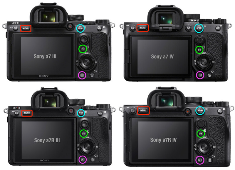
Below, I’ve highlighted some frequently used controls on various Sony and Fujifilm bodies. Look at the difference in consistency between the two brands.
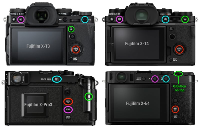
I color-coded the equivalent controls the same way for easy comparison (AF buttons in light blue, Menu buttons in red, Fn/Q menu buttons in green, and playback buttons in magenta.) I chose these controls because other than being able to program the AF button, the other 3 are not changeable in their function, yet I use them frequently. I realize every photographer has different favorite controls but these are a good illustration of the concept.

These are different generations and model types of Sony cameras. Compare Sony’s consistency of placement and layout to Fujifilm below. I should note that Sony’s upper line a1 and a9 II bodies have the same layout as these.
Sony menu screens have changed over time but my comparison is for the location of controls one would tend to use while shooting and switching between bodies (as opposed to setting things up in the menus in preparation for shooting). I didn’t highlight them all, but Sony bodies are also consistent with most other controls such as top dials, control wheel, multi-selector/joystick, etc.
The only notable change of layout for Sony is the video button on their latest model, the a7 IV, where it has moved it to the top.

Here is a sample of different generations and model types from Fujifilm to compare with Sony above. Of course, one can customize some of the controls and I have done that, but it is at best a workaround.
Notice also that the 4-way selector has been omitted completely on the X-Pro3 and X-E4. Although I love that Fujifilm has more variety in their line with unique offerings like the X-Pro3, it still could have been more consistent. Even the otherwise similar X-T3 and X-T4 have different layouts.
I realize Fuji tries to improve things with each model but there’s something to be said for considering the end-user with consistent layouts.
My Real World Experience with Fujifilm Cameras
I currently own 3 Fujifilm bodies. I have two X-T3s and one X-E4. I actually got rid of an X-T4 body in favor of having two identical (X-T3) bodies because of the differences when switching quickly between bodies. One of my X-T3s is dedicated to infrared (IR).
I generally take both IR and visible light bodies with me so I switch back and forth often. Because my X-E4 is so different from the X-T3s I find it a little easier to be conscientious of having to think about the differences than I did going between an X-T3 and X-T4.
Sometimes I want a lighter kit or to have two visible light bodies and I bring my X-E4 body so I end up switching between two different models. Even though I know them all well, I feel I lose shots sometimes when shooting quickly, such as sports or wildlife, because of having to pause and think about where the controls are that I need.
I sort of understand Fuji omitting some controls to keep the X-E4 compact, but even if one were to use it as a companion body to the similarly styled X-Pro3, several key controls are still in different places. This is rarely an issue when switching quickly between Sony bodies that are different models. In my case, I have regularly used an a7R III and a7 II side by side, with no problems.
Fujifilm Should Take a Page from Sony’s Book
Unfortunately, Fujifilm seems to look at each model in isolation and only thinks about “improvement” just within that one model with little concern for consistency. In addition to photographers simply upgrading a single camera, there are also many enthusiasts and pros that want to have two or more bodies.
If you are using Sony, you can own any number of different models and comfortably switch among them. But if you own two or more different models of Fujifilm bodies, you will have to consciously think about which one you are using and where that Q button or AF button or Play button, etc. resides, each time you switch. Of course, if you use them a lot you can train your brain to some extent but in the end, you will likely miss more shots with Fuji than Sony due to this frustrating lack of consistency.
Fujifilm really has fantastic gear and I hope it will recognize this area of potential improvement and work on consistent control layout on their cameras moving forward. I believe it would improve both customer happiness and create more Fujifilm loyalists.
About the author: Joel Wolfson is an internationally published photographer who loves teaching as much as shooting. The opinions expressed in this article are solely those of the author. He shares his 30 years of experience as a working pro with other photographers and enthusiasts by way of his workshops, 1 on 1 training, webinars, articles, blog and speaking engagements. He is one of the pioneers of digital photography, having conducted digital photography seminars for Apple and other corporations starting in the early 90s. This article was also published here.
Author: Joel Wolfson
Source: Petapixel


