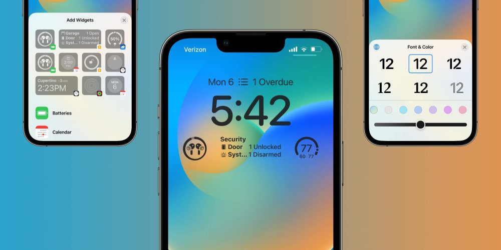
With the WWDC 2022 coming to an end, Apple execs Craig Federighi and Alan Dye are now talking about one of the main changes with iOS 16, the Lock Screen redesign. In an interview with TechRadar, both executives highlight why Apple decided to revamp this part of the iPhone now.
It all started with iOS 14 when the company allowed users to add customizable widgets to the Home Screen. In addition, the company also brought the App Library, which let users remove from the Home Screen apps they didn’t want to see all the time, but needed them.
Then, with iOS 15, Focus Mode helped users decide which app should notify them or appear depending on the time of the day. With iOS 16, on the other hand, Apple knew that the Lock Screen would be the next venue.
“We saw a real opportunity to take that area that really has evolved slowly over time but has never seen this kind of massive step forward, and to do something really big — but something very Apple and very personal. So, this is an act of love this year,” said Craig Federighi.
Alan Dye said Apple’s goal “was to make the iPhone even more personal” since the Lock Screen is “the icon of the iPhone.”

TechRadar reported Apple considered changing the Lock Screen completely because since ever, iPhone’s very recognizable thanks to its large, centered clock on the top. Instead, Dye reaffirmed the path its design team took by adding custom versions of Apple’s San Francisco typeface.
“Typography is such a huge passion of ours, the design teams,’ and we have a number of other Apple design typefaces, even some non-Latin scripts. So, for the first time, we’re letting users choose their favorite,” said Dye.
Still talking about the Lock Screen, Apple borrowed an idea from the Apple Watch to the iPhone by letting a portrait photo appear in front of the clock, bringing a depth effect. Craig Federighi explains the company’s use of machine learning to add this capability:
“[There are] actually about a dozen neural networks that judge the photo based on whether it’s a desirable subject, if there are people there, how they’re framed and cropped in the photo, their expressions. All these things that allow us to surface automatically really great, compelling options for people and then to render them on the screen in a way that makes them feel almost all-new,” said Craig Federighi.
As a matter of fact, it was not only the Portrait Watch Face that inspired Apple to change the Lock Screen but the Watch’s complications as well.
“Of course, we took a lot of inspiration for Apple Watch complications in designing these widgets that make it very easy to get information at a glance,” said Dye.
Craig Federighi also explained the intentionality behind the placement of the widgets by balancing personalization with the coherence of the iPhone interface. “It would’ve been very easy for us to say, ‘Hey, drag anything anywhere.’ Honestly, technically, this would not have been a challenge,” said Federighi.
The interview touches on a lot of other points such as Focus integration, the ability to cut an object from a photo with ease, and more. It’s totally worth reading it in full – and getting a few more tidbits from Craig Federighi itself here.
What do you think about iPhone’s new Lock Screen with iOS 16? Share your thoughts in the comment section below.
Read more:
- iPadOS 16: These are the new features exclusive to M1 iPads
- Some iOS 16 features require an iPhone XS or newer; here they are
- These macOS Ventura features are exclusive to Apple Silicon-powered Macs
- Everything new with Focus Mode on iOS 16
Author: José Adorno
Source: 9TO5Google


