In October, Google announced that they were going to eventually move their iOS apps away from Material Design and introduce more native-looking user interfaces. While we still haven’t gotten a glimpse at what some of the most used apps on the planet may look like built with native UIKit components, I thought it’d be cool to draw up some concepts and imagine what they might entail.
Google introduced Material Design to its iOS apps shortly after they introduced Android Lollipop back in 201, but they’ve had shared user interface elements for a bit longer. They’ve updated their iOS apps as their design language has evolved over the years. But this year Android took a major turn in a new design direction with Material You, and it’s clear that Google has no intention of bringing it to iOS.
So I took six of the most used apps on the App Store: Google, Chrome, Google Maps, Gmail, YouTube, and Google Docs and redesigned them with Apple’s own user interface elements. The first thing that struck me is just how drastically different they look. Google’s design language is great, but it’s dramatically different from that of native iOS, and it can be off-putting for users when they switch between lots of different design styles. With native iOS elements, the Google apps feel right at home.
Google Maps
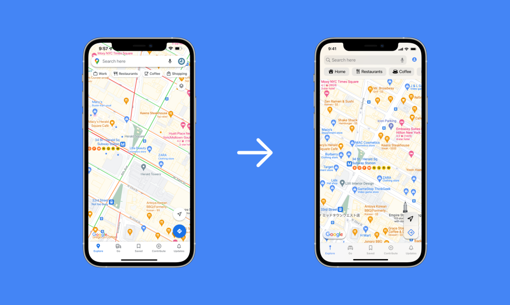
Let’s take a look at Google Maps. The first thing that has to be done is to eliminate that floating search bar with the heavy drop shadow. I’ve replaced it with a standard navigation bar that has a search field, an account button, and below them a series of filters with more native-looking buttons. The floating buttons in the lower right and left corners of the screen also need to get updated. I’ve given the Google logo a blurred background and used a floating button design that’s more reminiscent of the one in Apple Maps for current location.

Google’s apps use a custom tab bar at the bottom of the screen that reacts a bit differently from the native version. Google’s version has slightly different icon formatting and placement, so I’ve swapped it for Apple’s own version. It would also no longer have the pulsating animation when tapped. This is just one example of how a Google app could be adapted to look more native on iOS, at least on a surface level.
Google Chrome
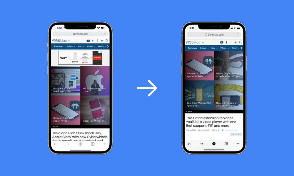
Here’s a Google app, with ironically, very little user interface chrome. Google’s Chrome browser uses a unique tool bar at the bottom and a custom search field at the top. I’ve simply replaced both with their native counterparts. Sure, the app looks much more like Safari. But the tweaked layout is still clearly Google’s.

Gmail, Docs, and Search
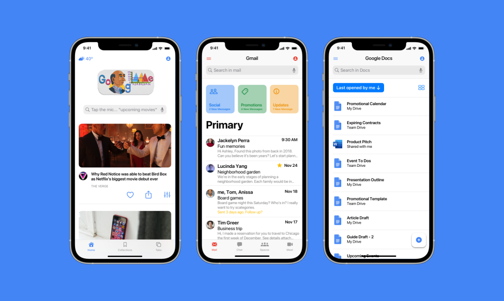
Moving onto the Google app, there’s very little work that needs to be done. All Google has to do is tweak their choice of icons, swap out the search field, and change a handful of buttons. The app doesn’t even look that different with native elements.
Gmail, on the other hand, looks extremely different when imagined with native elements. I’ve taken a little creative liberty here and done some slightly unusual things, so this could look extremely different in reality when it arrives in the future. I’ve taken the square button design from the Home app and adapted it for the other three mailboxes that float above your primary inbox.

Like the Google app, Google Docs doesn’t require too much tweaking. It looks unquestionably like Google Docs, but it is also clearly a native iPhone app. There’s no trace of material design left here.
YouTube
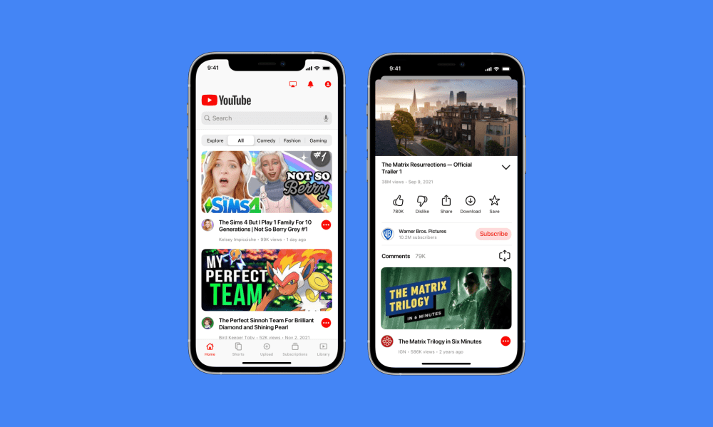
The YouTube app perhaps requires the most radical rethinking. It’s an app full of heavily custom user interface elements, so it would essentially be redesigned from the bottom up. Just to give you a bit of background on some of my choices here, you can see that there’s an Apple-designed stacked modal view now when watching a video rather than Google’s full-screen custom modal.

I’ve also switched out all of Google’s icons for Apple’s and cleaned up the user interface with better spacing. Eagle-eyed readers will notice I’ve also replaced the Chromecast icon in the top toolbar with an AirPlay button, an obvious change to make for people living in the Apple ecosystem.
Conclusion
This exercise has been a really interesting one for me, because there are so many ways that Google could reimagine their apps with native elements. These are very safe takes on redesigns for these apps, but Google could do something much more radical and truly rebuild them for iOS.
What do you think about Google getting rid of Material Design in their iOS apps? Let us know in the comments below.
Author: Parker Ortolani
Source: 9TO5Google


