
Apple’s newest Safari design in iOS 15 has been controversial, to say the least. It’s a complete overhaul of one of the iPhone’s most popular apps that follows entirely different design philosophies. Countless folks, including myself, have tried to come up with ways to “fix” the new design and make it more familiar and comfortable to use. This is my latest try. What I wanted to do was to follow the same principles and aim for the same goal. A mobile browser that’s easy to use in one hand and one that makes switching between sites on the fly a breeze.
Let’s start with the fundamental problem. Safari’s new url bar in iOS 15 floats on top of your content and recedes when you scroll. It has proven to be a particular pain for websites that have tab bars on the bottom. So it’s clear to me that the floating url bar isn’t going to go over well with a lot of users if it sticks around through the end of the beta cycle. Apple has been continuously improving it with each beta, but it feels like they just keep lobbing on more UI elements.
For inspiration, I looked to the Maps app. Apple redesigned Maps in iOS 10 with a brilliant draggable modal view that holds all of the necessary buttons and controls. It can be hidden when you want to explore the map, and it can be fully expanded when you need to get directions or find a point of interest.
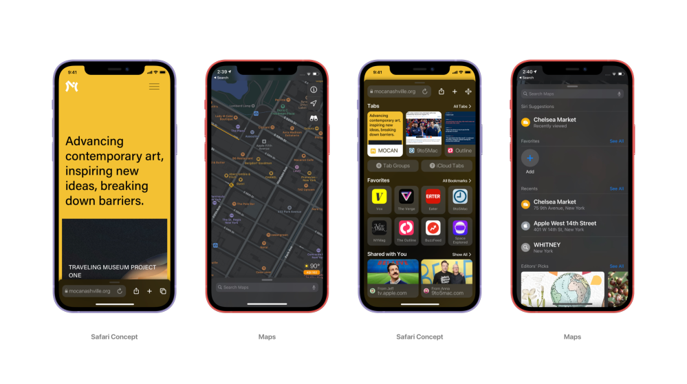
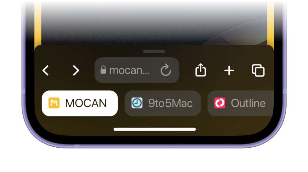
This UI element works perfectly for a web browser. Below you can see the four stages I’ve come up with for this draggable modal view in Safari. At its shortest point, which is when one tab is open, it displays only the core elements. It shows the url bar, a reload button, a share button, a new tab button, and a tab view button.
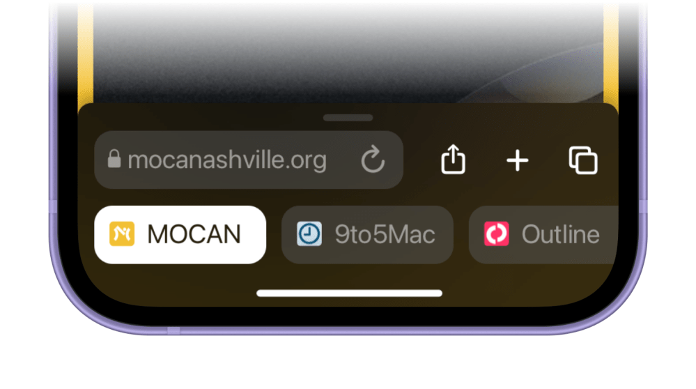
When you open multiple tabs, you can flick between them below the url bar. You can easily just tap on another tab to switch over to it so that gestures don’t interfere with the home indicator.
Tapping on the tab view button or continuing to drag the modal up will reveal tab previews. Instead of separating the new tab view from the new start page, Apple could combine them to create a single hub.
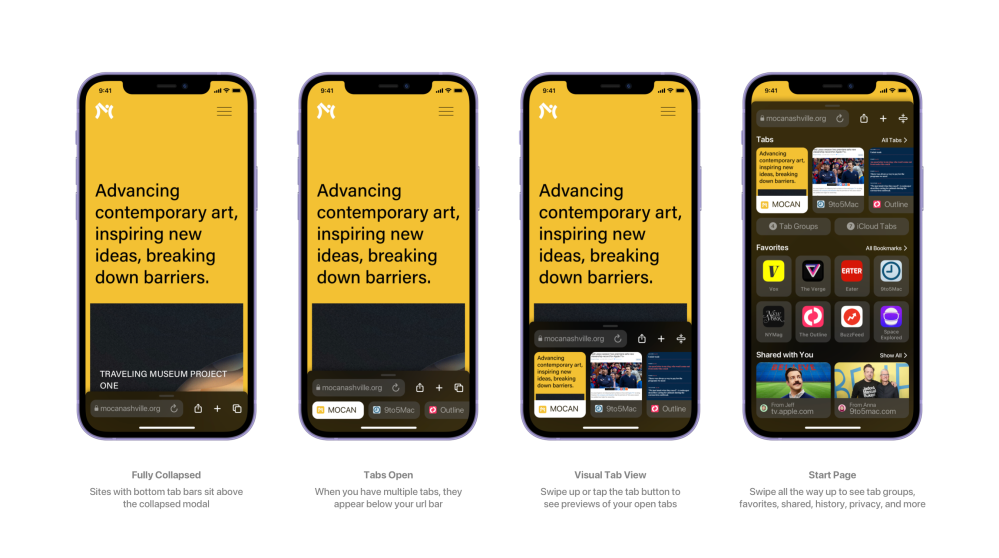
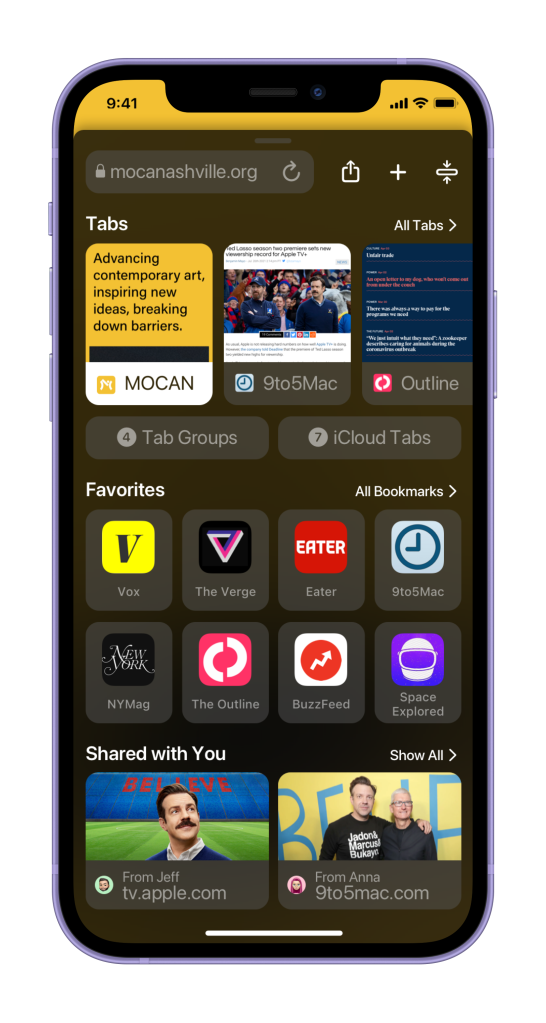
If you drag the modal all the way up, you’ll see all of the new components Apple has included in Safari’s new start page. Here though, you can also see all of your tabs. There’s a shortcut to all of your tab groups and one for your iCloud tabs as well. Below tabs, you can see your favorites with a link that will go to all of your bookmarks and history. Under that, shared with you, and under that everything else.
Lots of folks testing the new Safari actually like the new tab view. But it’s completely disjointed from the rest of the interface and honestly, a bit complex. It should be as simple as possible to switch between your open tabs and seeing visual previews right below the url bar and on the fly can make for a much better experience.
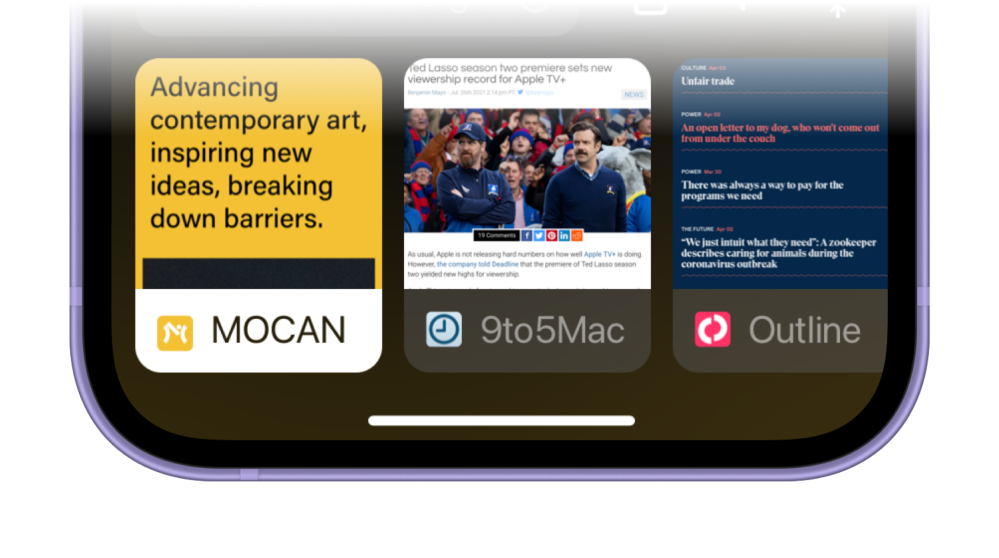
Of course, you can tap the “All tabs” button to see the new grid view. That’s the best part of Safari’s redesign, but it shouldn’t be the core tab view. Apple was very keen on promoting its new gestural tab switching, but the gestures themselves try to replicate a UI element directly beneath it.
Another issue with the new design is the lack of space for clear, easily tappable back and forward buttons. It’s still difficult to fit them into this design, but it can be done in a much clearer way. I’d expect them to be optional in Settings. The back and forward swipe gestures are very common and easy to use. The buttons don’t really need to be there at all. But if you want them, they’d work better here.
What do you think about the new Safari design in iOS 15? Do you think the changes we’ve suggested make sense? Let us know what you think in the comments below!
Author: Parker Ortolani
Source: 9TO5Google


