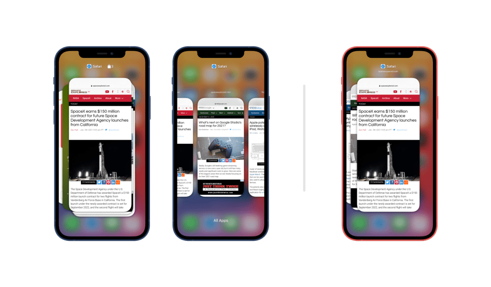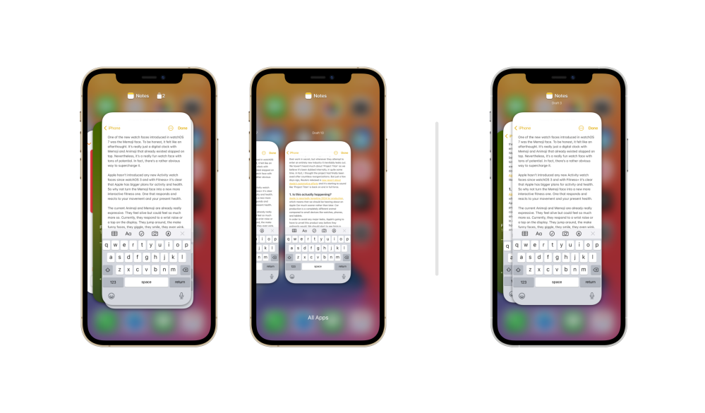
With iPadOS 13, Apple introduced the ability for apps to have multiple instances. In other words, you can have multiple Safari windows open or multiple notes, for example. It’s an incredibly useful feature and it turned the iPad into a much more powerful computer. We think it would turn the iPhone into a much more powerful phone, too.
Over a decade ago, Palm introduced the first version of webOS with support for multiple cards. Each browser tab lived in its own separate card rather than as tabs in one card. Safari’s tab view has been in need of an overhaul for years, and this is a perfect way to solve the problem.
Two different proposals
Here’s what I propose: Apple could offer two distinct layouts for the app switcher on iPhone, the first being stacked app instances. All of your Safari tabs stack on top of each other in multitasking, and the same would go for notes, reminders, any app that offers multiple instances. With a tap they would fan out and you could switch between websites. You could close them just like any other app with a quick swipe up.

An alternate layout could let each tab and each instance live on its own within the multitasking stack. This would be a great improvement for people who use lots of web apps or who like to switch between multiple sites on the fly.
In Safari, tapping on the tab icon could instead fan out all of the instances as it does within the app switcher. Even better, this would enable users to quickly swipe between tabs with a swipe on the home indicator like you can currently do between apps.
This change would be useful not just for Safari, but also for apps like Notes. You could work on two different notes and quickly swipe between them.

Reconfiguring labels
With the introduction of multiple instances on iPhone, Apple would have to reconfigure the way app labels appear in the switcher. Instead of attaching each icon and name to a card, Apple could offer one dynamic label and icon centered above the main card that changes as you swipe between them. Below it, an app could display pertinent information to help you distinguish between instances.
We think this would be a huge improvement to iOS multitasking. What do you think about these ideas? Let us know in the comments below!
Author: Parker Ortolani
Source: 9TO5Google


