
The iPhone’s lock screen has gone through a small handful of design changes over the years, but it’s never truly been supercharged. With iOS 5, Apple improved the way multiple notifications appear. In iOS 6, they introduced the persistent camera shortcut. In iOS 8, notifications gained quick reply. iOS 10 brought widgets with a quick swipe to the left. The last major change was with iOS 11, when Apple added two haptic shortcuts and merged the lock screen with the Notification Center giving way to the “cover sheet.” But here we are in 2022 and the Lock Screen still isn’t truly customizable. It’s also nowhere near as proactive as other areas of the operating system that have been upgraded over the years.
Redesigned clocks
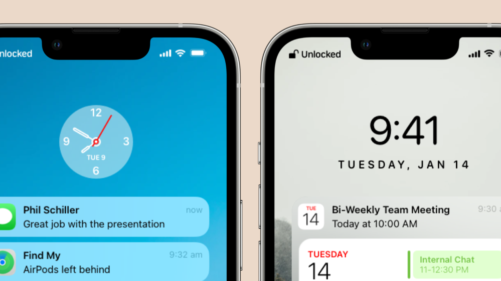
The clock at the top of the Lock Screen has remained nearly the same since Apple switched to the San Francisco font in 2015 with iOS 9. It’s still digital and has no visual flourishes whatsoever. Personally, I am a fan of a minimalistic aesthetic but it has no personality. This is made more evident when you look at the watch faces that the same team designs for Apple Watch. They’re capable of much more.
There are plenty of things that they could do here, but I’ll propose two designs. A new analog clock that’s impeccably simple. It could just float above your notifications and change color based on your wallpaper. The digital clock could be switched over to San Francisco Rounded to give it a subtle new look, while the date below it could be completely capitalized with increased kerning. These have a nicer more modern aesthetic to them.
Customizable shortcuts
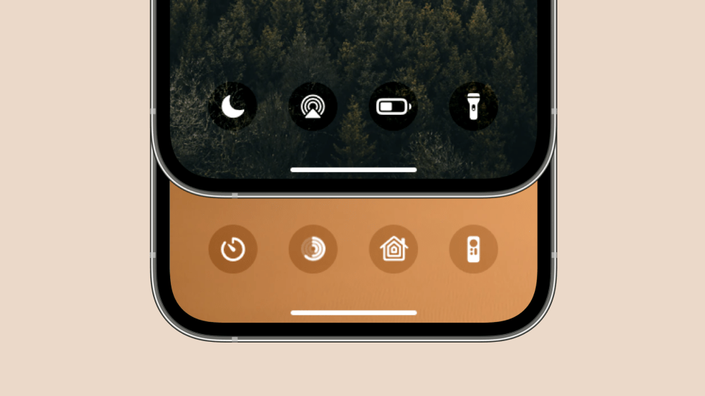
This is something that people have been clamoring for a long time now. But, I think there’s a very Apple-like solution to the problem that minimizes clutter and customization. Apple is no fan of letting users really customize their devices, so I doubt the company would ever allow users to launch a third party app from the Lock Screen using these shortcuts. What I can see them doing though, is letting you swap out the camera and flashlight shortcuts for other control center modules.
I’d also propose that they add the ability to show four shortcuts on the Lock Screen rather than two. Two is very limiting for power users who might want rapid access to some features on their iPhone. In the example below you can see shortcuts to the Apple TV remote, low power mode, AirPlay, Focus modes, Fitness rings, HomeKit, and a timer.
Proactive widgets
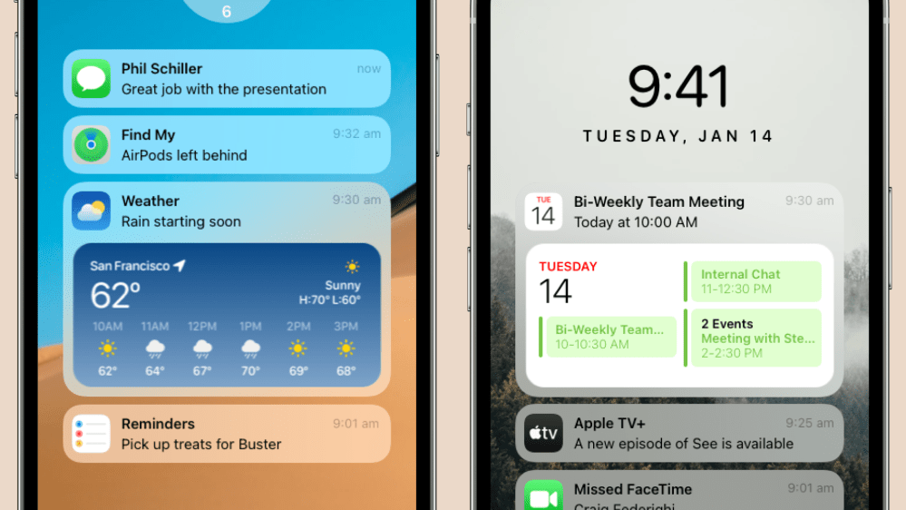
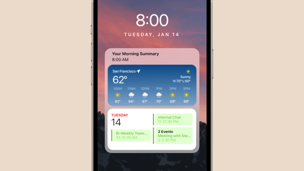
Widgets are great on the iPhone Home Screen, but they could be used in more places. What if notifications could surface widgets for proactive alerts? The weather app could give you quick access to an hourly forecast widget if it notifies you that it’s about to start raining. When you receive a calendar event alert, your iPhone could show you more meetings that are part of your day.
These widgets could be nestled inside of notification modules right on the Lock Screen inline with other ones. And there’d be no need to change their design on the part of developers. They fit right in.
Always-on display mode
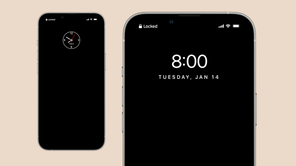
A feature that iOS is missing is an always-on display mode. Android devices have had it for years, but it’s finally time for Apple to match them. They’ve got amazing displays in the latest iPhones that are capable of variable refresh rates. An always-on display was rumored for the iPhone 13 family but hasn’t materialized.
An always-on display for the iPhone really only needs to display the time, date, battery, network indicators, and lock status. Apple could add notifications here, but the way iOS handles notifications would likely force your device to constantly need to update the display with content. It could be a drain on battery.
Morning summary
Your iPhone can currently offer you a summary of notifications at the end of your day. The company is even redesigning this user interface in iOS 15.2, which is in active development. I propose a morning summary that could stack up widgets that your iPhone thinks you frequently look at. Some of you may want to just let your iPhone show weather and events persistently. But that clutters up the experience. They really only need to show up when you absolutely need them. By combining morning summary with proactive widget notifications, they’ll be there every time you need them and never when you don’t.
Conclusion
What do you think about some of our ideas for the iPhone’s lock screen? Let us know in the comments below.
Author: Parker Ortolani
Source: 9TO5Google


