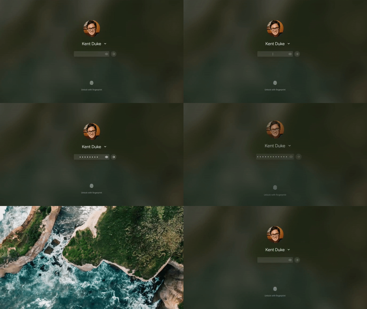
Chrome OS’s login page is set to get a minor design change next year, giving the password field a design inspired by the Google Material Theme.
Google’s successor to Material Design is “Material Theming,” which gives developers the tools to craft their own unique theme while remaining true to the spirit of Material Design. Google’s own apps use the Google Material Theme to be relatively consistent between apps.
Over the past few years, Chrome OS has slowly and steadily gotten enhancements to UI, including some to be more in line with the Google Material Theme. The biggest change to Chrome OS’s UI in recent years is the addition of a light mode to contrast the default dark mode, which is also set to get darker.
The latest Chrome OS tweak, spotted by Android Police, is far more subtle, adding a bit of Material Design flair to the login screen. Specifically, the password field on the Chrome OS login page now has a rounded rectangle background, making it just the smallest bit more in line with the overall Material Theme designs used by Chrome OS. Previously, the login page simply used a transparent “box” with a white underline to indicate where to type.

With any luck, this is just the first of many Material Theming changes coming to the login screen, which hasn’t seen too many updates in recent memory. For now, this design tweak is only available on the latest Canary builds of Chrome OS, version 89, which is set to reach stable sometime in March.
More on Chrome OS:
- Chrome OS 87 rolling out w/ Tab Search, Bluetooth device battery levels, new wallpaper, more
- Google Play Services preps to sync Wi-Fi passwords between Android and Chrome OS
- Chrome OS is getting a revamped Connectivity Diagnostics app
Author: Kyle Bradshaw
Source: 9TO5Google


