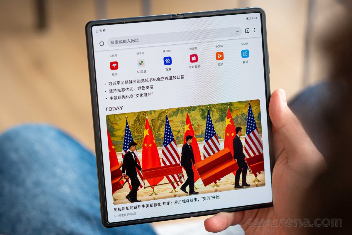
The Harmony OS 2.0 is Huawei’s in-house platform that should be available by June to customers. It is already in the final stages of development, and we now have the first video, showing how the OS looks like on a Huawei Mate X2. Check it out:
At first the UI has a lot of similarities to Android, especially around the notification bar, the icon layout and design. Swiping down anywhere on the home screen brings the search engine of the phone, and we expect Petal Search to be incorporated for the global devices.
The control center can be pulled down from the top right corner, while notifications come with the same gesture from the opposing side.
The apps demoed are Huawei’s understanding of Calendar and Notes, and it appears the new OS will have a different kind of widgets that will allow you to use a gesture to provide more info without opening them.

What we also don’t know is whether these gestures are reserved for tablets and foldable devices or we will have three types of downward swipes even on smartphones with smaller screens. There are many unknowns but there’s a hope we’ll get more answers in the next month or so leading up to the launch.
Author: Yordan
Source: GSMArena


